What: Top 10 public traded companies by market capitalization every year. Saudi Aramco is not included, because only a small fraction of its shares are traded publicly. When: 1997-2020Q2 Where: I hope it’s the whole world. Source: https://en.wikipedia.org/wiki/List_of_public_corporations_by_market_capitalization
Imagine the situation – we want a beautiful and interactive chart on our website but have no knowledge of D3 or other fancy stuff, so, to pick a solution I am quickly trying them all and making a recommendation based on this experience.
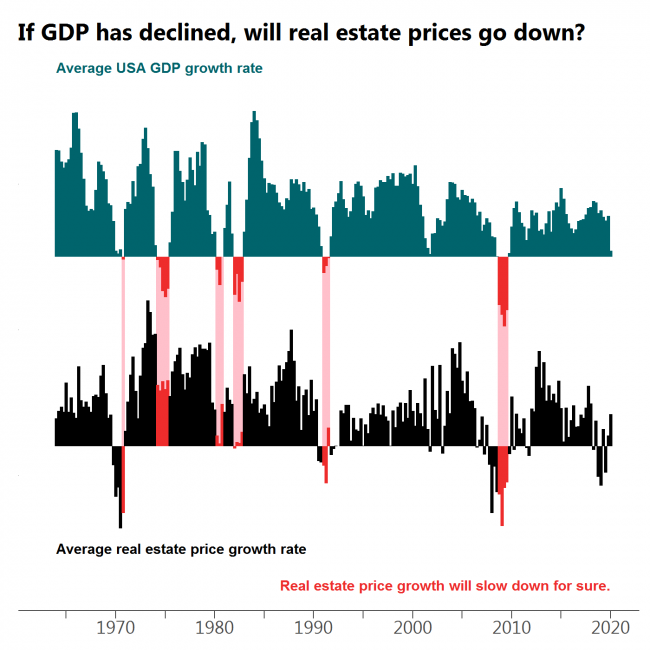
Every drop in GDP is followed by a decline in real estate prices or at least a significant slow down in growth with the most obvious case at the beginning of ’80s.
What: Moving average of quarterly USA GDP growth (GDP in billions of chained 2012 dollars, seasonally adjusted) and moving average of quarterly median sales price of houses sold in the United States. When: 1964Q1 – 2020Q1 Where: USA only. Source: FRED
Often when the market turns red there is at least a dip in GDP growth. However, there are cases when this does not happen.
What: Moving average of quarterly S&P500 index growth and moving average of quarterly USA GDP growth (GDP in billions of chained 2012 dollars, seasonally adjusted) When: 1948Q1 – 2020Q1 Where: USA only, because S&P is populated by mostly American companies. Source: Yahoo Finance for S&P500 and FRED for GDP.
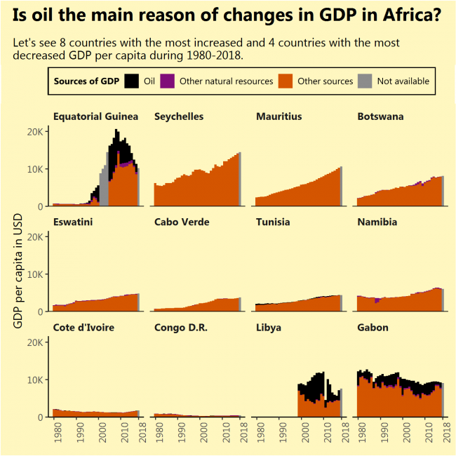
I saw that Equatorial Guinea, the African country that increased its GDP per capita the most during 1980-2018 had done this due to newly found oil. I saw that Gabon, the African country that decreased its GDP per capita the most during the same period, had done this due to diminishing its oil reserves. So I thought, the same applies to the most of rapidly growing (or contracting) African economies, but that is not true (except for Libya).
The sources of growth might not be very sustainable just like oil, but finding them requires a deeper analysis of every separate country.
What: GDP per capita divided into oil rents, rents from other natural resources and GDP from other sources. Grey bars indicate full GDP value with the unknown division. When: From 1980 till 2018. Not all countries had a full range of data. No country had its GDP divided for 2018. Where: Countries of the African continent with the biggest GDP per capita growth during 1980-2018 (top 8) and biggest fall (bottom 4, except South Sudan, which had very short data range) Source: WB
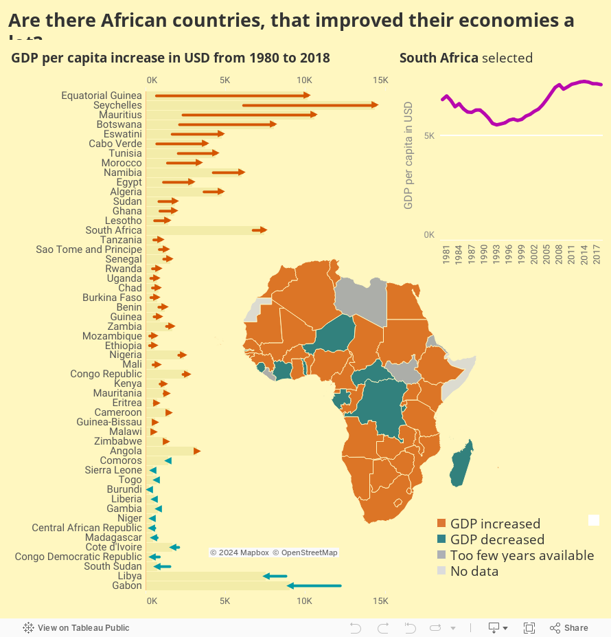
I will consider that improving economy simply means increasing GDP per capita.
And that happened in a handful of countries. What are the reasons for this increase? That is a question for the next image, but I expect to find oil. Also, what happened to Gabon?
What: GDP per capita. When: From 1980 till 2018. Not all countries had a full range of data. Where: Countries of the African continent Source: WB
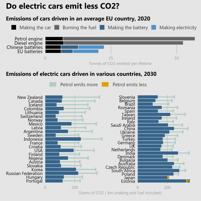
Many people still have doubts about whether the lower emissions of driving an electric car outweighs the additional impact on the environment caused by manufacturing the batteries.
Two studies (the latter is more trustworthy than the former) show that electric cars do help to reduce the CO2 emission. But how much – it depends. If the batteries are produced in a country where the industry is polluting more (China), reductions will be lower. If the car is driven in a country where electricity is produced by burning things (like Estonia or Poland) the reductions will be lower or even negative. A special case is Japan, where cars are so fuel-efficient, that electric cars even raise emissions.
So, YES, electric cars are more often better than not.
What: Top = Lifetime emissions of cars in tonnes of CO2. Bottom = Lifetime emissions of cars in grams of CO2 per 1 kilometer. When: Top = Estimate for 2020, Bottom = Estimate for 2030 with “current technological trajectory” scenario. Where: Top = EU countries, Bottom = selected countries of the world. Source: Top = European Federation for Transport and Environment, Bottom = Knobloch, F., Hanssen, S., Lam, A. et al. Net emission reductions from electric cars and heat pumps in 59 world regions over time. Nat Sustain (2020). https://doi.org/10.1038/s41893-020-0488-7
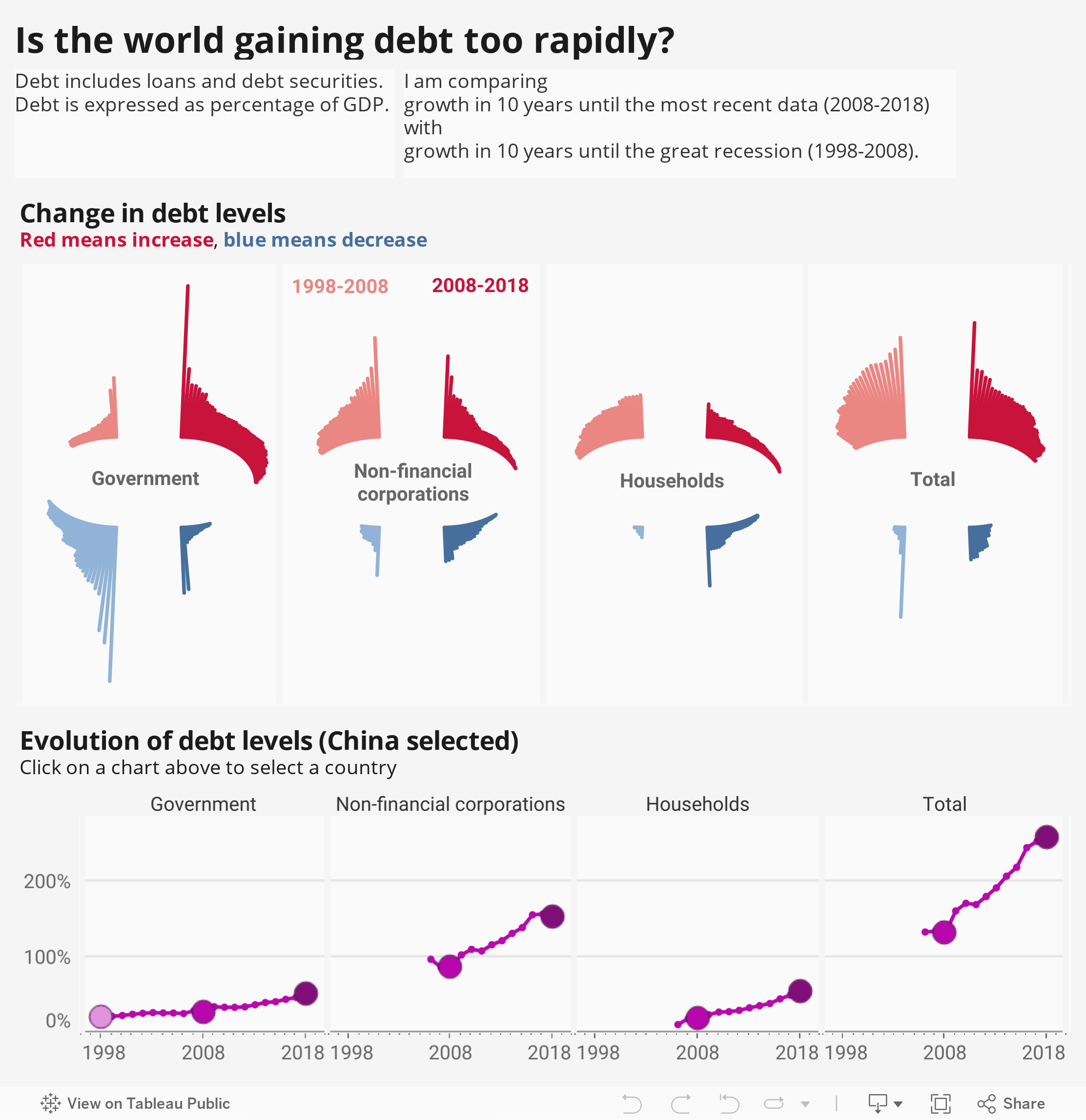
To see nominal numbers of debt increasing won’t tell us much, so it is better to look at debt expressed as percentage of GDP. Also we need to compare current growth to something, so I am comparing growth in 10 years until the most recent data (2008-2018) with growth in 10 years until the Great Recession (1998-2008).
One thing is seen at once – the governments in most countries are getting more debt than before.
Corporations and household are increasing their debt in more countries than decreasing, but the rate of increase is slower now and more countries are decreasing than before. We’re less crazy than in those crazy times.
What: Debt made of loans and debt securities expressed in % of GDP. When: 1998 – 2018 Where: 103 countries of the world. Iceland was removed from the chart and they know why. (Because of extreme numbers, debt levels reaching over 700%). Also, there might be some bias in the data, because not all countries have data for all periods and all debt receivers. Source: BIS
I have seen lots of images where all R colours are arranged alphabetically or in some other strange order, including all grays and greys.
Here colours are grouped by name, sorted according to their hue and arranged by lightness inside a group, and saturation among groups. The table is not perfect since all the positions were calculated – my “colour recognition algorithm” was not perfect. (This is how “mediumspringgreen” finished among cyans.) But it is definitely better than most tables.
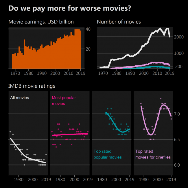
We spend more and more money on movies even in times of television and the internet. So, not a big surprise, that more and more movies are being made.
Median rating of all movies in the IMDB database is declining. Is it a sign of movies getting worse? No, its a sign of more movies being made, when this art is accessible to not only exceptional talents but mediocre talents as well. Anyway, who watches 2000 movies a year? Let’s become picky.
Let’s pick the most popular 200 movies each year and calculate their median. Now there is a stable trend – median popular movie usually has a rating of just around 6.4. (Movie popularity is measured in the number of ratings on IMDB). That’s good.
Now let’s take 200 top-rated movies each year with at least 25 000 ratings. A sharp decline becomes visible! And before the 80s not many such movies existed at all. So, if you like only top-rated popular movies, you might experience deterioration in their quality. Sequels of Transformers are getting worse and worse.
However there are great lesser-known movies, especially those made in non-English speaking countries, so they get less attention and therefore fewer ratings. I’d subjectively say that a good lesser-known movie has at least 4000 ratings. If we pick 200 best such movies, we get a different view – often a median movie will have a rating higher than 7, and no permanent downward trend is present. Great!
What: Movie earnings in USD billion adjusted for inflation. The number of movies – with more than 100, 4000 and 25 000 ratings. IMDB movie ratings indicate the median rating calculated for every year, and a trend line fitted using a generalized additive model. All movies – those which have at least 100 ratings Most popular movies – 200 most rated but having at least 100 ratings (because there were times when less than 200 movies were made). Top-rated popular movies – 200 top-rated movies from those having at least 25 000 ratings. Top-rated movies for cinephiles – 200 top-rated movies from those having at least 4000 ratings. If less than 40 movies left remaining after filtering – no rating calculated for that year. When: 1968 – 2019 Where: Movie earnings represent earnings around the globe. Source: IMDB for ratings and number of movies the-numbers.com for movie earnings. WB and IMF for inflation used to adjust earnings.