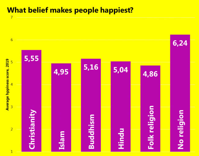
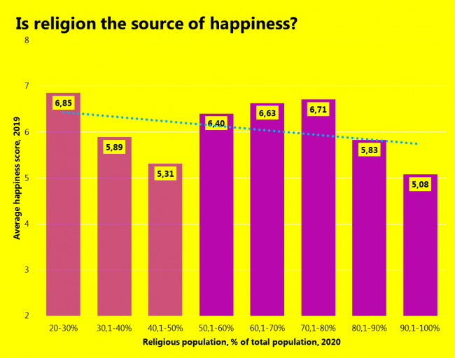
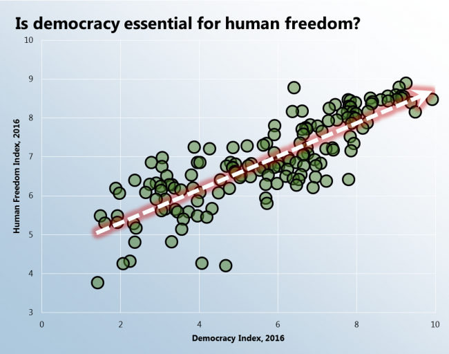
↓
 

chart planet

insights design storytelling

chart planet

insights   design   storytelling

  • charts
    • charts EN
    • charts LT
    • applications
  • blog
  • blog LT
  • links
  • about

Post navigation

<< 1 2 … 5 6 7 8 9 10 >>

Is religion the source of happiness?

chart planet Posted on 2019-11-20 by Chart Planet2023-03-18
Is religion the source of happiness?

Religion has a strong influence on people’s attitudes towards their lives. Maybe being religious makes people happier? As seen from the graph it seems directly the opposite – the more religious the society the less happy they are!

The first three columns are transparent because there are less than 3 countries in their value range.

What: Percentage of the total population in a country affiliated with any religion, and happiness score from the World Happiness Report. Countries are grouped into bands of 10 percentage points by religiosity.
When: 2019 for happiness, 2020 for religion (it’s an estimate) because the latest actual data were of 2010.
Where: 155 countries of the world.
Source: WHR and Pew Research Center

Posted in charts EN | Tagged Bar chart, Excel, Happiness

Are sunny days the source of happiness?

chart planet Posted on 2019-11-18 by Chart Planet2023-03-18
Are sunny days the source of happiness?

It seems like it’s the opposite. Maybe the less sun people have, the more they work to survive, the more developed they become and thus – more happy.

African countries have been made dim in this graph because they show less clear relationships – in the Sub-Saharan region, they all occupy the bottom part of the happiness chart, in the Middle East & North Africa, they occupy just a narrow band in the sunshine spectrum.

What: Happiness score from World Happiness Report and Yearly sunshine hours. Since it’s impossible to calculate sunshine hours for the whole country which might be as diverse as the USA with Florida and Alaska, a simple average of available cities was calculated.
When: 2019
Where: Countries that have both statistics. Western & European countries include Europe, USA, Canada, Australia and New Zealand.
Source: WHR and W: https://en.wikipedia.org/wiki/List_of_cities_by_sunshine_duration

Posted in charts EN | Tagged Excel, Happiness, Scatterplot

Is development the source of happiness?

chart planet Posted on 2019-11-13 by Chart Planet2023-03-18
Is development the source of happiness?

As we can see, it clearly is. The more developed the country, the more people are happy about living in it. But this particular index of happiness does not measure daily emotional experience, so, this “happiness” is not about being euphoric and excited, it’s more about overall reflection on life. Then it makes sense, that being healthy, literate and having money makes a person happy.

What: Human Development Index compared to Happiness score from World Happiness Report
When: 2017
Where: Countries that have both statistics.
Source: WHR and UNDP

Posted in charts EN | Tagged Excel, Happiness, Scatterplot

What world regions are the happiest?

chart planet Posted on 2019-11-11 by Chart Planet2023-03-18
What world regions are the happiest?

As already expected – western regions (including North America and Oceania which consist only of Australia and New Zealand in this dataset) tend to be happier than the rest of the world, and Africa and most of Asia are least happy. What is interesting, that the world average seems quite low – this is due to a large number of countries in Sub-Saharan Africa, and really small numbers of countries in the happiest regions.

What: Happiness score from the World Happiness Report. Not weighted averages by country. For most regions, maximum and minimum values were removed from the calculation.
When: Published 2019
Where: World regions modified from WB classification.
Source: WHR

Posted in charts EN | Tagged Bar chart, Excel, Happiness

What countries are the happiest?

chart planet Posted on 2019-11-06 by Chart Planet2023-03-18
What countries are the happiest?

The answer is simple – Scandinavian countries. General trends are seen quite clearly – western countries (including Australia and New Zealand) take the lead, those from the far east are rare, and Africa is not present at the top at all.

What: Happiness score from the World Happiness Report. I am aware that this measure of happiness is disputed.
When: They say it’s 2019, but it’s the date of publishing.
Where: Top 30 countries of the world.
Source: WHR

Posted in charts EN | Tagged Bar chart, Excel, Happiness

Does investment correlate with growth?

chart planet Posted on 2019-11-04 by Chart Planet2023-03-18
Does investment correlate with growth?

I dare to say some very general upward trend is visible by a naked eye. The correlation coefficient is only 24%, but positive after all.

What: Investment or gross capital formation as a percent of GDP in current local currency, GDP per capita growth.
When: Investment in 2017, and GDP growth in 2018 (because there should be a lag before the investment kicks in and GDP starts to grow)
Where: Countries that have both statistics.
Source: IMF for Investment and WB for GDP

Posted in charts EN | Tagged Excel, GDP, Scatterplot

What countries invest the most?

chart planet Posted on 2019-10-28 by Chart Planet2023-03-18
What countries invest the most?

Behold these exotic countries! It seems that out of often mentioned countries only China is at the top of this list.
The graph makes sense – the less developed the country, the more investment it needs.

What: Investment or gross capital formation as a percent of GDP in current local currency. It is measured by the total value of the gross fixed capital formation and changes in inventories and acquisitions less disposals of valuables for a unit or sector.
When: 2018
Where: World
Source: IMF WEO report April 2019

Posted in charts EN | Tagged Bar chart, Excel, GDP

How related are government debt and GDP per capita?

chart planet Posted on 2019-10-23 by Chart Planet2023-03-18
How related are government debt and GDP per capita?

This graph is for you to observe the nonexistence of any relationship. The correlation between these two datasets is only 9%. Every region has values across a wide range of debt values, however, each regions’ GDP variation is specific to that region. Conclusion – debt does not mean a better life. I guess – ways of using it do.

What: General government gross debt as a percent of GDP and GDP per capita at constant prices of 2010 in USD.
When: 2018
Where: Countries that have both statistics.
Source: IMF and WB

Posted in charts EN | Tagged Debt, Excel, GDP, Scatterplot

What governments are the most indebted in the world?

chart planet Posted on 2019-10-21 by Chart Planet2023-03-18
What governments are the most indebted in the world?

As expected – overdeveloped Japan and troublesome Greece lead, however, the following positions are really versatile, there are absolutely no clues to support the idea that more developed countries are indebted more.

* I have read rumours that China is hiding their actual debt via various schemes with government-owned banks. Their debt might be larger. It’s 50% according to the data I have.

What: General government gross debt as a percent of GDP. I wanted to use net debt, but it was not available for most countries.
When: mostly estimates for 2018
Where: World
Source: IMF WEO report April 2019

Posted in charts EN | Tagged Bar chart, Debt, Excel

How indebted are governments around the world?

chart planet Posted on 2019-10-16 by Chart Planet2023-03-18
How indebted are governments around the world?

Seems like the more advanced the economy the more indebted it is. Is debt a fuel for growth? Or is it a by-product of it?

What: General government gross debt as a percent of GDP. I wanted to use net debt, but it was not available for most regions.
When: estimates for 2018
Where: regions provided by IMF
Source: IMF WEO report April 2019

Posted in charts EN | Tagged Bar chart, Debt, Excel

Which market is the biggest?

chart planet Posted on 2019-10-14 by Chart Planet2023-03-18
Which market is the biggest?

I tried to find which market is the biggest in terms of average daily trading volume. Seems that the one we talk least about is the biggest one – it’s derivatives market. What are they? Many people don’t even know!

What: Daily turnover, USD billion
When: Indicated on the graph
Where: World
Source: WFE, BIS, CMC

P.S. The use of a 3D chart requires additional justification: here I have no excuse I did not know what I was doing!

Posted in charts EN | Tagged Bar chart, Excel, Stock market

What countries dominate the world in terms of capitalization of public traded companies?

chart planet Posted on 2019-10-09 by Chart Planet2023-03-18
What countries dominate the world in terms of capitalization of public traded companies?

It’s quite obvious the USA should be the first, so the most interesting are the following positions. I’m surprised by the amount of Asia at the top!

What: Market capitalization of listed domestic companies, current USD
When: 2018
Where: Top 25 countries
Source: WB

Posted in charts EN | Tagged Bar chart, Excel, Stock market

What are the biggest stock exchanges in the world?

chart planet Posted on 2019-10-07 by Chart Planet2023-03-18
What are the biggest stock exchanges in the world?

I expected the USA to take the lead but not to such extent!!!

What: Capitalization, USD trillion
When: July 2019
Where: Top 12 world’s stock exchanges
Source: WFE

Posted in charts EN | Tagged Bubble chart, Excel, Stock market

What are the most traded currencies in the world?

chart planet Posted on 2019-10-02 by Chart Planet2023-03-18
What are the most traded currencies in the world?

It was expected – US dollar, euro and yen. All the cryptocurrencies are still far away from leaders.

What: Daily averages of OTC foreign exchange turnover by currency, “net-net” basis (which means the total is 200%), percentage share.
When: 2019 April
Where: World
Source: Triennial Central Bank Survey, BIS

Posted in charts EN | Tagged Currency, Donut chart, Excel

Which currency has the biggest value of coins and banknotes in the world if we include cryptocurrencies?

chart planet Posted on 2019-01-14 by Chart Planet2023-03-18
Which currency has the biggest value of coins and banknotes in the world if we include cryptocurrencies?

I assume cryptocurrencies are coins. At the end of 2017, there were 3 cryptocurrenciens among top 15.

What: Total banknotes and coins in circulation for normal currencies, market capitalization for cryptocurrencies, USD billion
When: 2017, end of year
Where: 21 major world currency + cryptocurrencies
Source: BIS and CMC

Posted in charts EN | Tagged Bar chart, Currency, Excel

Post navigation

<< 1 2 … 5 6 7 8 9 10 >>

subscribe to blog posts

Please check your email to confirm subscription

fb fb rss rss rss
©2023 - chart planet privacy policy
↑