↓
 

chart planet

data-human interaction

chart planet

data-human interaction

  • charts
    • charts EN
    • charts LT
    • applications
  • blog
  • blog LT
  • links
  • talks
  • about

Post navigation

<< 1 2 … 6 7 8 9 10 >>

Which market is the biggest?

chart planet Posted on 2019-10-14 by Chart Planet2024-04-10
Which market is the biggest?

I tried to find which market is the biggest in terms of average daily trading volume. Seems that the one we talk least about is the biggest one – it’s derivatives market. What are they? Many people don’t even know!

What: Daily turnover, USD billion
When: Indicated on the graph
Where: World
Source: WFE, BIS, CMC

P.S. The use of a 3D chart requires additional justification: I wanted to show that Cryptocurrencies do exist – they would be invisible without 3D.

Posted in charts EN | Tagged Bar chart, Excel, Stock market

What countries dominate the world in terms of capitalization of public traded companies?

chart planet Posted on 2019-10-09 by Chart Planet2023-03-18
What countries dominate the world in terms of capitalization of public traded companies?

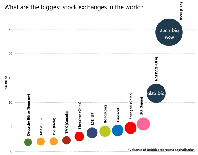
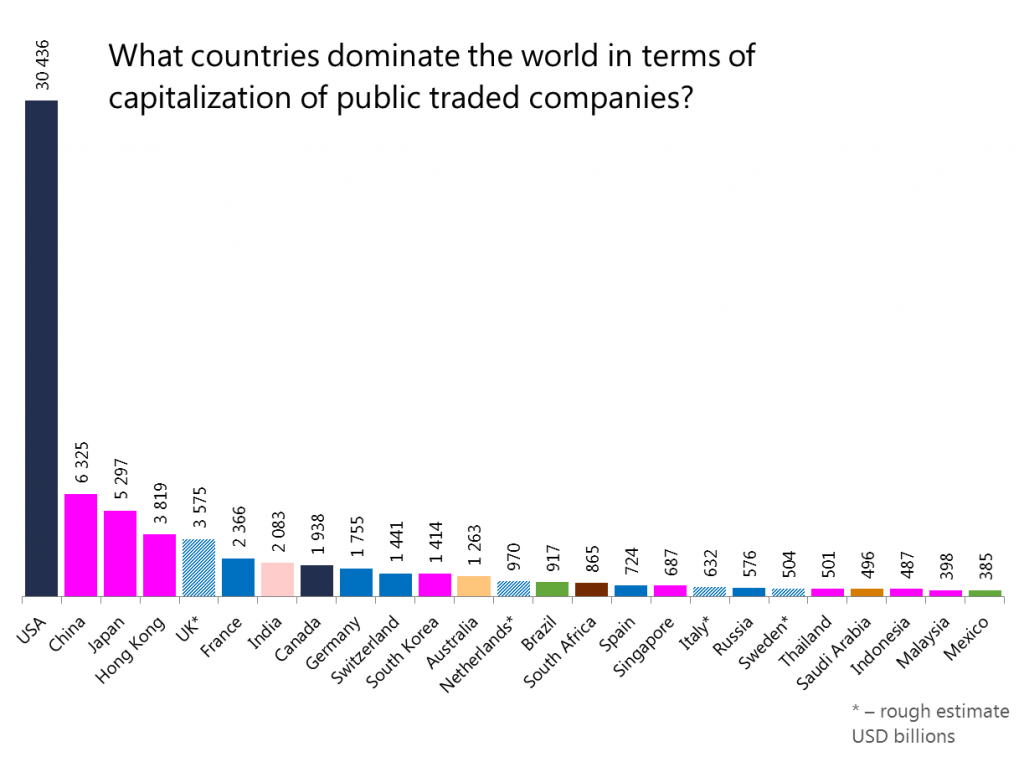
It’s quite obvious the USA should be the first, so the most interesting are the following positions. I’m surprised by the amount of Asia at the top!

What: Market capitalization of listed domestic companies, current USD
When: 2018
Where: Top 25 countries
Source: WB

Posted in charts EN | Tagged Bar chart, Excel, Stock market

What are the biggest stock exchanges in the world?

chart planet Posted on 2019-10-07 by Chart Planet2023-03-18
What are the biggest stock exchanges in the world?

I expected the USA to take the lead but not to such extent!!!

What: Capitalization, USD trillion
When: July 2019
Where: Top 12 world’s stock exchanges
Source: WFE

Posted in charts EN | Tagged Bubble chart, Excel, Stock market

What are the most traded currencies in the world?

chart planet Posted on 2019-10-02 by Chart Planet2023-03-18
What are the most traded currencies in the world?

It was expected – US dollar, euro and yen. All the cryptocurrencies are still far away from leaders.

What: Daily averages of OTC foreign exchange turnover by currency, “net-net” basis (which means the total is 200%), percentage share.
When: 2019 April
Where: World
Source: Triennial Central Bank Survey, BIS

Posted in charts EN | Tagged Currency, Donut chart, Excel

Which currency has the biggest value of coins and banknotes in the world if we include cryptocurrencies?

chart planet Posted on 2019-01-14 by Chart Planet2023-03-18
Which currency has the biggest value of coins and banknotes in the world if we include cryptocurrencies?

I assume cryptocurrencies are coins. At the end of 2017, there were 3 cryptocurrenciens among top 15.

What: Total banknotes and coins in circulation for normal currencies, market capitalization for cryptocurrencies, USD billion
When: 2017, end of year
Where: 21 major world currency + cryptocurrencies
Source: BIS and CMC

Posted in charts EN | Tagged Bar chart, Currency, Excel

Which currency has the biggest value of coins and banknotes in the world?

chart planet Posted on 2019-01-09 by Chart Planet2023-03-18
Which currency has the biggest value of coins and banknotes in the world?

Bank of International Settlements has some statistics for this. The dollar is leading, but not as much as in reserves!

What: Total banknotes and coins in circulation, USD billion
When: 2017, end of year
Where: 21 major world currency
Source: BIS

P.S. The use of the donut chart requires additional justification. All the currencies together make 100%. I’m curious how much 2 biggest, 3 biggest, 4 biggest currencies make up together.

Posted in charts EN | Tagged Currency, Donut chart, Excel

Is dollar losing its power in the world?

chart planet Posted on 2019-01-07 by Chart Planet2023-03-18
Is dollar losing its power in the world?

(I don’t know where did I get this hypothesis from)

Let’s analyze the reserves. So, it’s losing just a bit, but Euro is losing too. And they’re not losing to any particular currency, seems the world is diversifying.

What: Shares of Allocated Reserves
When: 2000-2018Q1
Where: World
Source: IMF

Posted in charts EN | Tagged Area chart, Currency, Excel

Do the development of a country cause higher suicide rates? Or is it culture?

chart planet Posted on 2018-12-21 by Chart Planet2023-03-18
Do the development of a country cause higher suicide rates? Or is it culture?

After quickly analyzing the most developed countries (HDI >0,8), I noticed that grouping countries according to some culture related patterns is quite easy. More analysis should be done (by someone else), but seems, that suicides have more to do with culture than development. Some cultures are able to handle development better, some – worse.

What: Suicide rate vs human development index
When: Suicide rate – 2016, HDI – 2017
Where: Countries with HDI > 0,8
Source: Suicide rate – WHO, HDI – UNDP

Posted in charts EN | Tagged Excel, Scatterplot, Social issues

Do the development of a country cause higher suicide rates?

chart planet Posted on 2018-12-19 by Chart Planet2023-03-18
Do development of a country cause higher suicide rates?

Seems like not really. Look, there are high rates among less developed countries, and low rates among more developed ones. What is clearly visible – it’s the higher distribution among well-developed countries!

What: Suicide rate vs human development index
When: Suicide rate – 2016, HDI – 2017
Where: Countries of the world
Source: Suicide rate – WHO, HDI – UNDP

Posted in charts EN | Tagged Excel, Scatterplot, Social issues

Do people kill themselves more in well-developed countries?

chart planet Posted on 2018-12-17 by Chart Planet2023-03-18
Do people kill themselves more in well-developed countries?

Seems like yes. First world problems – they might be real!

What: Average suicide rate for countries in each human development index decile. Not population-weighted.
When: Suicide rate – 2016, HDI – 2017
Where: World
Source: Suicide rate – WHO, HDI – UNDP

Posted in charts EN | Tagged Excel, Line chart, Social issues

Which countries have the biggest share of oil in their GDP?

chart planet Posted on 2018-12-03 by Chart Planet2023-03-18

This time it’s Arab countries. That’s why they’re associated with oil, they’re dependent on it.
P.S. Region is coded in color and Arabs are orange.

What: Oil rent, % of GDP
When: 2016, except Libya (2011) and Venezuela (2014)
Where: World. Top 25.
Source: WB

Posted in charts EN | Tagged Bar chart, Commodities, Excel

Which country has the biggest oil reserves?

chart planet Posted on 2018-11-30 by Chart Planet2023-03-18
Which country has the biggest oil reserves?

Apparently it’s not an Arab country. It’s Venezuela which is still poor??? Maybe Arabs are not just lucky to have this oil, maybe they’re smart enough to use it for their advantage?

What: Crude oil including lease condensate, proved reserves, billion barrels
When: 2016, because data for 2017 is not full yet
Where: World. Top 20.
Source: EIA

Posted in charts EN | Tagged Bubble chart, Commodities, Excel

Did membership in EU helped new countries to grow their GDP faster?

chart planet Posted on 2018-11-23 by Chart Planet2023-03-18
Did membership in EU helped new countries to grow their GDP faster?

The graph tells me that further analysis would be purposeless. For most countries, which entered EU in 2004 the fifth year in the union was the time of global crisis. Would have they been better without EU? Well, this is a topic for a deeper analysis.

What: The graph shows 3-year moving averages of annual GDP per capita growth, with value at year 0 (entering the EU) subtracted from all the data series for visual purposes. The “average” is a simple average of all growths without the topmost and downmost values.
When: Years are different for each country depending on its date of joining the European Union.
Where: Countries joined the EU in 2004 and later.
Source: ES

Posted in charts EN | Tagged Dot chart, Excel, GDP

Did Euro adoption cause faster growth of prices?

chart planet Posted on 2018-11-21 by Chart Planet2023-03-18
Did Euro adoption cause faster growth of prices?

At the first year seemed that inflation was higher with euro, this was the case for 5 countries out of 7, but after 3 years have passed – only 3 out of 7 had bigger price increase with euro during the whole period. Seems that inflation rise due to euro was a temporary one-time effect which later leveled out for at least half of the countries. In short, I’d say that Euro does not cause inflation in a significant way.

What: Consumer price growth in one, two and three years before the adoption of euro subtracted from consumer price growth in one, two and three years after the adoption of euro. The number on the graph shows how much faster prices grew with Euro than without.
When: Years are different for each country depending on its date of joining the Eurozone.
Where: Countries which joined the Eurozone later, not with the initial group
Source: ES

Posted in charts EN | Tagged Excel, Line chart, Prices

How are central banks fighting inflation? ECB example.

chart planet Posted on 2018-11-19 by Chart Planet2023-03-18
How are central banks fighting inflation? ECB example.

Whenever inflation goes above the target level of 2%, ECB increases their refinancing rate. Same as FED.

What: Indicated on the graph.
When: 2000 January – 2018 August
Where: Eurozone
Source: ES, ECB

Posted in charts EN | Tagged Excel, Interest, Line chart

Post navigation

<< 1 2 … 6 7 8 9 10 >>
<<< How are central banks fighting inflation? FED example.
Did Euro adoption cause faster growth of prices? >>>

subscribe to blog posts

Please check your email to confirm subscription

fb fb rss rss rss
MJDC privacy policy
↑
Cookies are used on chart planet.OKprivacy policy