↓
 

chart planet

numbers become images

chart planet

numbers become images

  • charts
  • dataviz ideas
  • LT
    • LT grafikai
    • LT apie grafikus
  • links
  • about

Post navigation

← Where do people live the healthiest lives?
Where do people die from war? →

Why do people die?

chart planet Posted on 2020-03-23 by Chart Planet2021-05-30

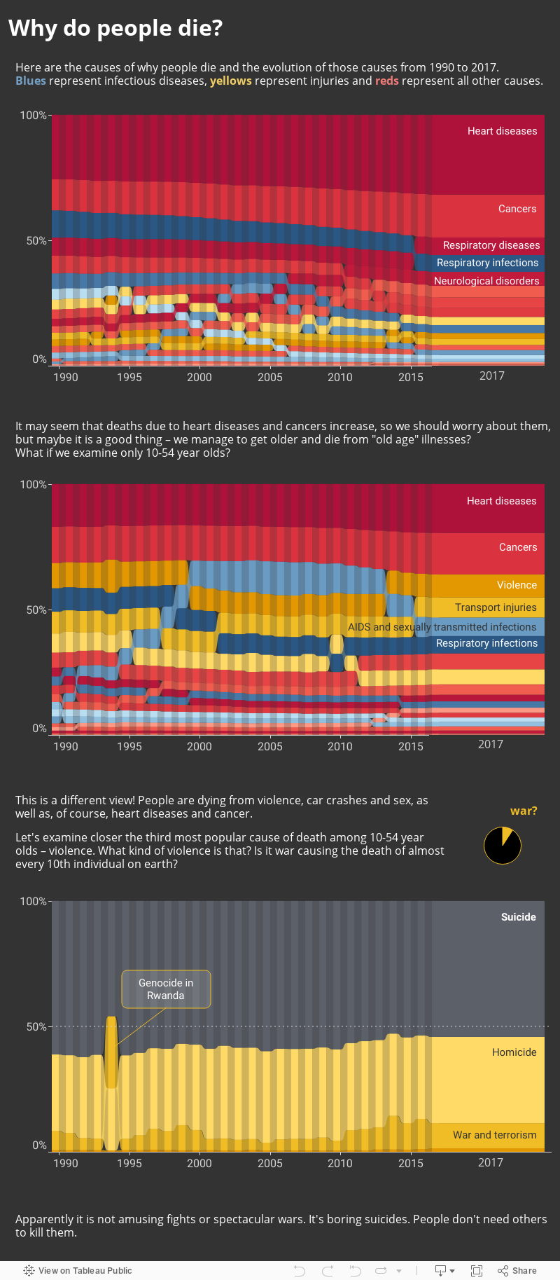
This is a slightly deeper look into “People die from heart diseases and cancer, so don’t be afraid of terrorism or viruses” idea.

What: Distribution of death by causes.
When: 1990-2017.
Where: Global data which seems to cover most of the world.
Source: Institute for Health Metrics and Evaluation, Global Burden of Disease Study 2017 Results.

Posted in charts Tagged Death, Interactive, Ribbon chart, Tableau permalink

Post navigation

← Where do people live the healthiest lives?
Where do people die from war? →
<<< Where do people live the healthiest lives?
Where do people die from war? >>>
fb fb rss rss rss
©2023 - chart planet
↑