
↓
 

chart planet

data-human interaction

chart planet

data-human interaction

  • blog
    • dashboard design
    • data visualisation
    • Power BI asteroid
    • reviews
  • visuals
    • charts
    • interfaces
  • LT
    • grafikai
    • apie duomenų vizualizaciją
  • inspirations
  • talks
  • about

Tag Archives: Contour plot

Do richer countries produce more waste?

chart planet Posted on 2020-09-16 by Chart Planet2023-03-18

If the waste generated per GDP euro is compared to GDP per capita, then no trend is visible. Seems that required additional waste for additional euro per capita is more or less fixed (at least in Europe) except for 4 countries.

Math goes like this: to increase GDP per capita in 1 €, the total amount of waste should increase by w/(GDP per capita), where w is the current total amount of waste. Then the additional amount of waste is equal to (waste per GDP euro) * population.

What: Waste generated, tonnes per GDP euro & GDP, chain-linked volumes (2010), euro per capita
When: 2016
Where: European countries.
Source: Eurostat
Posted in charts | Tagged Contour plot, JMP, Waste

Do richer countries produce more waste?

chart planet Posted on 2020-09-14 by Chart Planet2023-03-18

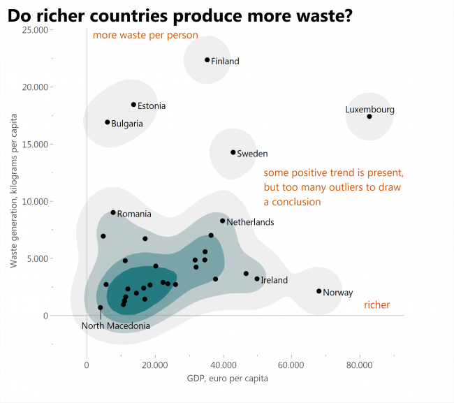
If waste generated is compared to GDP (both per capita), then some positive trend is visible, but still there are too many outliers to draw conclusions. Amounts of waste each country generates depend on specific features of that country.

What: Waste generated, kilograms per capita & GDP, chain-linked volumes (2010), euro per capita
When: 2016
Where: European countries
Source: Eurostat

Posted in charts | Tagged Contour plot, JMP, Waste

subscribe to blog posts

Please check your email to confirm subscription

linkedin fb bluesky instagram tableau sessionize rss
MJDC privacy policy
↑
Cookies are used on chart planet.