
Accessibility in Power BI – what is even possible and do you have time for it?

What is next after you learned data visualisation? Accessibility is one of the topics gaining more attention in the field of Business Intelligence (BI).
However, there is a shared sentiment, that “serious” Power BI developers simply do not have time for “unnecessary” work on accessibility – it’s just a nice to have thing. I’ve heard such comments after presentations on this topic in conferences, and presenters usually have hard time addressing them.
So, is it a useless waste of time, or do you absolutely have to dedicate time here, the more, the better?
Do you have time for accessibility?
The answer is neither of the two.
First, if your report readers cannot read your report, what is even the point of making one?
Second, in reality a lot of accessibility things are not something you do. It is more about what you consider when you do your usual dashboarding things like adding a visual or setting up a measure format. You can add accessible visual, or a non-accessible one. If you create a report and after that go through all of it to make it accessible, why not doing it accessible right away?
To be able to make it on the first iteration, you have to know what works and what not, this usually comes from experience or learning. Both require time investment.
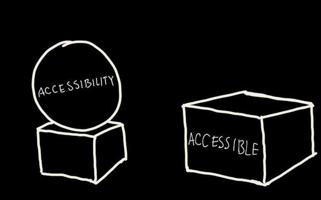
Finally, think about accessibility as polishing your visuals. This takes a fraction of your overall project time anyway. If the whole project takes a week – you will have roughly a day for visuals. If it takes two months – of course you will have more time for this activity.
Are you convinced you can absolutely care about accessibility?
What is accessibility in Business Intelligence?
If you have heard just a thing or two about accessibility, it was probably about adapting websites for screen readers. Just make a text only version of your website, add alt-text to your images and you’re done.
This is very far from truth, people might have extremely diverse disabilities – one has low vision and rely on screen reader to understand images, the other has dyslexia and rely on images to understand context, the third one has motor disabilities and is simply unable to use a mouse.
Even further – you do not “do accessibility” for disabled people. Everyone benefits for professional looking and intuitive to use report. Tell me, who doesn’t?
A finance analyst checking your dashboard at night after staring at Excel all day acts as low vision person. Managers often act as having attention disorder and are easily distracted by salary expenses in your financial report – “Why don’t we fire all the people and use AI for everything?”
It is convenient to watch YouTube video in silence with captions on – either in the traffic or while your spouse is sleeping. It is convenient to use keyboard to navigate Excel. Those could be considered accessibility things, yet no one says – “I ain’t using keyboard in Excel because it’s for disabled people, not me”.
Every effort on accessibility benefits your regular user.
But then if you tried to learn about accessibility you probably got overwhelmed with HTML specific technical stuff – how to correctly set focus, ARIA attributes, and properly define links. We simply do not do those things in dashboards. Either because it is irrelevant or because it is impossible with the tools we have.
Suddenly, we are left with the single most common advice about accessibility in BI – do not use the most natural colour combination for good/bad indicators – avoid using red together with green. Is that all we can have?

If you’ve been through this, now you understand the problem this topic has. Everyone says it’s important, no one wants to do it, but what to actually do is vague at most.
Because it truly is vague for dashboards. While actual accessibility best-practices dissect HTML properties, there are little tool-specific technical explanations of what to do if you want an accessible Power BI report. So here I am trying to fill this gap.
Everything boils down to one of the four considerations, which I adapted from the website dedicated to web accessibility called WebAIM. I rearranged them to fit the BI context.
1. Clarity & consistency – is your dashboard clear enough, that even someone in a rush just before a meeting could check numbers? Is it consistent enough, that someone can do it twice? Clarity includes visual clutter, right contrast, clear titles. Most of it is not very measurable, thus quite vague.
2. Respect to attention – does your dashboard respect analysts who dedicate time to explore data? Can they swiftly navigate between pages, find measures they need or are they distracted by unnecessary visuals and dysfunctional filters? Is this vague? Yes, again!
3. Tolerance to error – does your dashboard prevent overfiltering (when mutually conflicting filters render the report empty) and misclicks (when the button or row height in the table is too small)? Well, this one is less vague, it not that difficult to catch such cases in advance.
4. Multi-modality and customisation – this accessibility thing actually requires additional effort besides just “considering”. Making sure that the same information can be accessed in different ways allow for more people to access it on their terms.
Chart? That is nice. Now can we switch the chart to a table? It’s better! Make that chart full screen – awesome! Export to Excel? Sometimes it’s also OK. Then, what if the same information can be presented as text? Copilot can help! How many ways of access are enough? Depends on the audience and how much time you have for your project.
We often do things like these to “improve adoption”, but eventually, accessibility stuff overlaps greatly with data visualisation and UX best practices. Probably you’re doing it already.
Now let’s go through most common accessibility advice and see how to address them in Power BI. There will be a focus on what to change and why, rather than how.
Here are the most common accessibility advice and how to address them in Power BI
Most of the “common advice” was taken from the various places in WebAIM website. Their adaptation for Power BI are based on my knowledge and experience.
Here I provide only the most basic, fundamental considerations not to overwhelm you at once. Find link to an article about “next step” considerations at the end.
Clarity & consistency
Is it even readable? If I interact with one place, can I interact similarly with another?
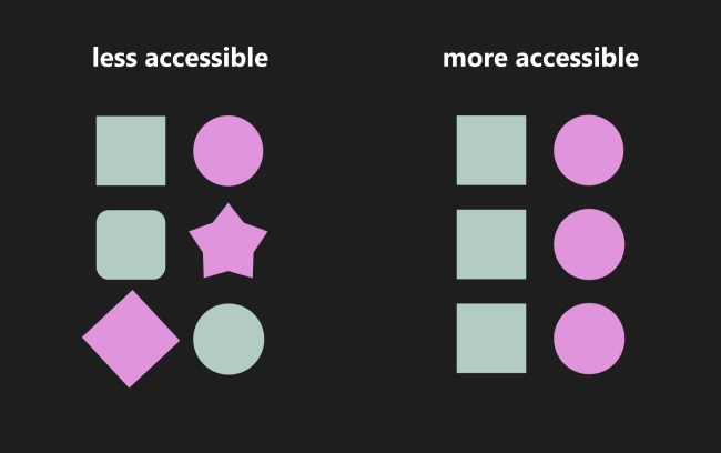
Organize content into well-defined groups.
If the structure of a page and the whole site (in our case – dashboard) is obvious and clear, most users will have easy time navigating it. Usually it means adding distinct sections in the document with headings, lists.
For dashboards that means dedicating special sections for navigation, for filters and for general content. Then general content could be divided further by the metric they are covering or some other distinction.
In Power BI that is usually done by preparing the background image to use for all the pages with clearly indicated sections for title, filters and navigation. Of course, you can create a reusable design using native Power BI objects, the point is to stick to it everywhere. See example of a possible layout below, it is quite obvious where to look for the slicers:

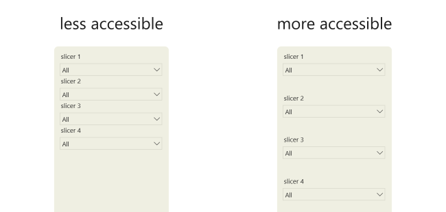
Add white space
Instead of squeezing information in a page, add enough white space around everything.
In Power BI that means:
- moving charts away from each other
- keeping enough whitespace between separate sections of the report
- keeping gaps between slicers
- adding padding between buttons in button slicers and navigators
While most chart placing in Power BI is best done manually, you can use Format > Align > Distribute option to spread your slicers uniformly.
Use clear and simple language
Compare: “No one does not benefit from unsophisticated language” versus “Everyone benefits from simple language”. This recommendation is difficult to evaluate, but you can always get an idea about what language to use by listening how users talk when stating their requirements.
I had cases when users call a metric their own way (“orders”), despite it being called differently in the database (“goods_incoming”). At first I used “goods_incoming”, to which I occasionally received requests to clarify what that thing means. After switching to “orders” – there were no further problems.
For Power BI sometimes it is best to avoid specific insider terms:
- “drill-through” (if you’re not a native English speaker, chances are you cannot even pronounce that) – better say “click here for more details”,
- a “measure” – better call it indicator, calculation, metric,
- “semantic model” – only those who know knows, others don’t,
- “dataset” – prepare for confusion hell if you ever use that word,
- “slicer” – truly a silly name, you can safely call it “filter”, even when filter is a different object in Power BI,
- “report” – those are dashboards!
Furthermore, even if your audience are specialists, double check if they truly understand their own jargon. Chances are all subgroups might have their interpretation of what’s included into gross sales. Double check even obvious terms.
Have clear and descriptive headings
In traditional web design that means texts within <h1> and similar tags.
In BI that means that the heading of the page should explain what information to expect in that page. Heading of the chart should explain what information to look in that chart. This somewhat contradicts storytelling techniques where a heading of the chart already provides the insight. In our case, a simple indication what insight to look for is enough.
In Power BI it is a good idea to replace default chart headings with custom ones. Also, sometimes it is nice to add dynamic DAX measures as headings, so they reflect current state of indicators or current slicer (filter!) selection.
Similar things behave similarly, different things behave differently
In traditional web-design it means ensuring every button, navigation link, icon are styled and behave similarly and have consistent textual hints. How do you indicate “show the rest of the article” after summary? Is it “read more” or “continue reading”?
For BI, it simplifies a lot of our work:
- Once you decided about navigation – stick to it, every page behaves the same.
- Once you decided about buttons – stick to it, every button behaves similarly.
- Once you decided about colour encoding – stick to it, every colour means similar thing.
In Power BI you can save lots of time for larger reports by defining a theme, especially the most commonly used elements – the bar chart, table, slicer, buttons.
If report is relatively small, you can always use a format painter to transfer visual settings from one chart to the other.
Link use
In web design it is important to define links well with alternate texts, focus-non-focus settings.
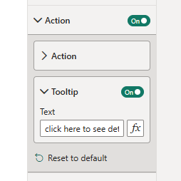
In Power BI that is less relevant simply because not much can be done. One thing – always provide a tooltip for a button, so a user will understand what happens when they click it.
Contrast
That is an obvious one. You have to see text and images.
I already covered contrast in a more detailed article. In short – use various tools to check if your colours make sense in greyscale or for colour-blind people. If objects are contrasting enough for those edge cases, chances are people without any disabilities will also be able to perceive them well.
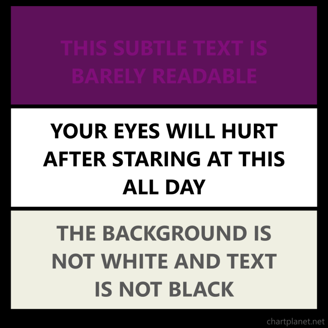
In BI colour coding is a special thing because it helps people to categorize information easily. Every time you add a colour to a dashboard make sure it carries a meaning. This one is for slicers. This one is for sales numbers. This one is for last year numbers. It is OK to have more colours if they have clear and well-defined meanings. Usually, it is great to have 3 colours – one for background objects, one for charts, and one for highlighting. This way you can reduce time spent on making sure that all your 15 colours have enough contrast between each other. That’s rather hard.
Respect to attention
Am I guiding the user? Am I distracting the user?
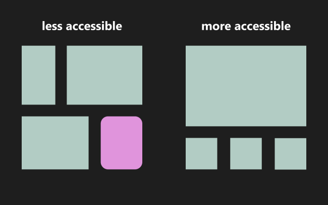
Place most important information at the beginning
In web design that means the user should not search for the main point of information it has to be there right away.
In BI that is more subtle because the main message might be hidden in more analytical details. But still the most important chart with the most important metric should be available right away.
Usually, this is achieved by putting a card visual at the top right with the number and indicators saying is it going up or down compared to a certain benchmark.
More about guiding attention you can read in this article.
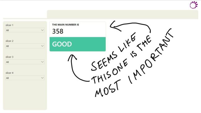
Use softer colours for background elements
In BI that usually boils down to phrase “Gray is your best friend”. All non data elements should be brought as much to background as possible and should not interfere with the data elements – the bars, the lines, the markers, the numbers.
In Power BI make sure you use bright colours only for line charts, columns, values. All dividers, borders, backgrounds are grey or really light colours.
Pro tip – use warm greys, those are grey colours with slight disbalance between R G and B parts. Only do that if you are confident in editing RGB codes directly. This might give a surprisingly fresh and lively look to the report.
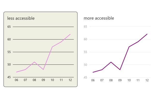
Limit types of fonts
The general advice is to go with a single font for content and maybe another one for major headings. Also avoid italics or ALL-CAPS.
In Power BI that usually means a single font for the whole report – be it numbers, text or titles. Deviations are possible when the default font (usually some fancy brand font) does not look well in a table. Fonts with unified number width should be used for tables, no matter how angry marketing department gets. It is rather OK to use different font for page and chart titles, but that should be it.
There is this interesting suggestion by Cole Knaflic – to use ALL-CAPS for axis titles. They are often rotated, so ALL-CAPS give them structured and tidy feel.
I would add that ALL-CAPS can make sense when there is an extremely short title, maybe a single word with a very well-defined meaning. I did that when creating dashboard about products that flopped. I’d say “TOP 5 FLOPS” look clearer than “Top 5 flops”. FLOP was all-cap in all places.
Finally – sizing must be very consistent – every page, chart and axis title must have the same size and weight (boldness).
Tolerance to error
Can users mess up the report by simply being users?
Ask users to confirm choices.
You might have noticed those “Are you sure you want to delete this item” dialogues everywhere in Windows? The ones you immediately regret your choice, regardless of what you clicked. This is actually a good practice because it prevents you from simple misclicks.
The only place where we can ask user to confirm choices in Power BI is with “Apply all slicers” button. It improves performance on more complex reports when every click on a slicer triggers a query against the model. Users might misclick, then unclick, and then reclick what they intended. “Apply all slicers” button just triggers one query after the user is done tweaking their selection.
Such misclicks often happen when there is no consistency between how a slicer deals with multiple selection: one has Ctrl+click the other has simple click. You can be consistent with this one as well.
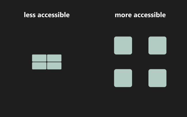
Provide large clickable area
Users with motor disabilities might have difficulty clicking with a mouse on a very tiny link.
Dashboard users might not have such disabilities, but they might lose dexterity if they navigate a dashboard on a colleague’s laptop using touchpad while talking to someone. Touchpad – the thing you are stuck with if you forgot to bring a mouse to the meeting.
In Power BI you cannot just drop a link on a tiny text, it always has to be a button and this is good. Make sure it is as big as it is reasonable for it to be.
Multi modality & customisation
Can user get the same information in a non-default way?
Provide colour adjustments
In web design than means turning on and off images, adjusting contrast settings: for example switching between light and dark modes, turning on high contrast setting.
In BI this makes a lot of sense because the information provided is primarily visual, and letting people adjust how they see visuals is very beneficial. However, the problem lies in the implementation – how difficult is to implement such dark-light-high contrast mode switches.
I believe that as of now (2026) it is still difficult, we can achieve that either by creating multiple versions of the same page (which is more viable for small dashboards) or encoding every colour of a visual as DAX (which is more viable for large dashboards). Both of which might introduce usability glitches and require significant additional time investment.
I’d say let’s stick with a single well tuned option for now, and add switching if you have time-budget-enthusiasm left.
Allow for text to be enlarged
You might have seen font size adjustment buttons on some websites.
In BI this is not advised, since adjusting fonts would render some labels truncated and thus not recognizable. What would benefit much more is a possibility to enlarge the whole section of the report.
In Power BI we can rely on “Focus mode” button which enlarge a single visual to full screen. Just make sure your users know about this button by explaining it within the report or during a training session.
If it is still not enough, anyone can enlarge view in their browser. Why duplicate this functionality?
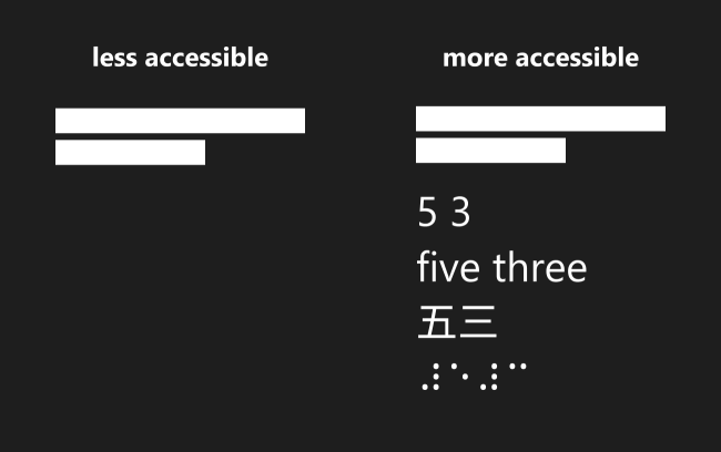
Do not provide text as image
Always provide text as text, not an image of text. Image of text is bad because if anyone adjusts scaling of the page – text becomes pixelated rather than larger, also if anyone uses screen reader – the text might be skipped whatsoever.
In Power BI you might be tempted adding text as image for cooler visual effects, especially on buttons. My suggestion is to stick with available styling options, they are powerful enough already! Text as image is only allowed in the logo.
I saw advice insisting on SVG type images for smooth resizing. Since the images that matter in Power BI are the charts, I find this largely irrelevant. Just check if the image you use does not take too much time for rendering.
Provide text only version of the content
The goal of this advice is to make sure that everyone who uses text-to-speech engine can consume the content, regardless off whether they have visual impairments or simply do this while jogging.
I would argue that this is not something we have to care in BI because dashboard as a way to provide information is not suitable to direct conversion to speech. I’d say if text version is of any concern a special dynamic paragraph could be provided instead of converting every single chart to text.
How to make this in Power BI? Create a long dynamic text with DAX. Or use AI capabilities in Power BI – Narrative visual, chat with Copilot, or even a specialized Data Agent. Robust testing has to be done to check whether AI truly returns the answers we expect, and semantic model has to be AI-ready.
Provide illustration for the text
Providing text as image is exactly the opposite of the previous (providing image as text), and it is at the heart of multi-modality – same content should be available via different modes.
In BI it is obvious that we provide plenty of charts and not so much texts, so you would say this is irrelevant. But there are many cases when the first thing that meets you in a dashboard is a huge Excel-like table with tiny numbers. If this is something some users need – let them have it, but at least the greeting should be accessible and provide paths to different modes – go left, and you will find charts, go right and you will have your table.
Provide captions and transcripts for audio content
Captions for audio content is a very common technique which benefits greatly everyone.
However, this is not relevant to BI, unless you do provide videos in your dashboards. Then do provide captions and transcripts.
Provide a way to navigate your page with a keyboard
Navigating a page with a keyboard might be a complex task.
Navigating a dashboard with a keyboard doesn’t look any easier. Luckily, we have a place in Power BI to adjust navigation order for all the items on the page – you can do it in “Tab order” tab in Selection pane. Always review it because the default orders often make no sense.
Excel users boast their ability to use spreadsheet with keyboard only. They might to use your report the same way as well, because their mouse sits there forgotten in a dark corner.
That’s it for now
This article was intended to cover basics, but after getting deeper into the rabbit hole it grew into something bigger, so I decided to split it. If you do not feel overwhelmed yet, there will be Level 2 of accessibility in Power BI – rarer, more special, and maybe more time-consuming accessibility features, for those who really care. (Subscribe to be notified)
If you want to do a quick auditing of your dashboards, there is also a free tool available called PBIX A11y. It says: “Upload a .PBIX file and get an instant, plain-English accessibility audit covering contrast, alt text, clutter, titles, and font sizing – mapped to WCAG 2.2 AA guidance where applicable”. Basically – a lot of things covered in this article. Try PBIX A11y here.
And finally, if you have reached this point, it means that you care about your report users, and providing the best experience for them. A noble endeavour, keep up the good job!