
You can still cheat in Tableau! Examples of dark practices
Tableau is famous for following the best of the best practices in the DataViz world – it has no 3D effect, the pie chart is marginalized, there are no curved lines, no dashed lines, and the colour palettes are near perfect. One will question whether dashed lines are really a bad practice, another one will easily recreate curved lines with the “data-densification” technique, and here I will argue that there are still plenty of ways to make misleading charts in Tableau.
May this article draw your attention to what the dark practices might be, and whether to use them or to recognize and fight them is the decision to make for each reader.
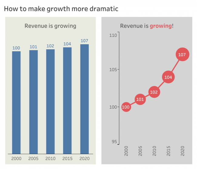
Dramatic growth
This is the simplest and probably most used dark practice in real life – simply cutting the axis above zero. Whether it is a good or dark practice depends a lot on the context. Line chart allows to do this “legally”, but here I’m adding some more distortion by changing colours to a more dramatic hue and additionally encoding the size of a bubble to a variable.
Not so easy comparison
Tableau allows for bubble charts that look cool, but are rarely useful to communicate changes in values until your aim is to hide that subtle change. If there is a KPI on your dashboard you don’t really want anyone to see changing – use bubbles. Leaving out the printed numbers would render this visualization practically useless.
However, the same bubbles could actually emphasize the difference if placed one above the other – this would be more like an unnecessary overdesigning rather than dark practice.

Not so easy comparison again
Bubbles are very effective to obscure comparisons between categories. The same could be achieved also with colour, and Tableau allows it to happen so easily! Of course, the top and bottom values are easily seen, but the middle is quite muddy, it would be very difficult to sort them without printed numbers.
Both dark practices shown here would be difficult to reproduce on Excel.

Not so easy comparison by stacking
I’ve seen such stacking more as a result of trying to make a cooler chart rather than a dark practice (it was a donut chart by the way). But it could be used to conceal the true difference in numbers. Additionally – make the part you want to look bigger much more saturated, and put the border of the same colour around both bars. No smart reader would be fooled by such arrangements, but if there are more charts to digest on the page, the message might slip unnoticed.

Hiding a relation
Scatterplots are not that easy to read and get for the untrained audience and that is why they are not used often, however they are perfect to show a relation between two variables. Line charts might be used to show the relation, but they could be used to hide that relation – removing lines and making markers a bit oversized effectively obscures the actual direction of data.

Disguised negative number
This was the actual problem I faced in my job – how to explicitly show profit numbers and somehow make the loss at one period be not that very visible. First of all, we could make the profit and loss to be the same colour, then move the number of loss above – as those of profit, then remove the reference line and finally make the bars thinner. Again – acute reader would quickly recognize dark practices used against him, but only if he is not overwhelmed with charts.

3D still possible
And finally the trick as old as Excel – 3D pie charts are notorious for distorting reality and more often than not they distort it unintenionally, however clever masters of dark practices utilize this feature to their benefit.
With smart preparation of data, dynamic 3D charts are still possible in Tableau. The one seen here is drawn “by hand”, feeding Tableau exact coordinate of each point. A more saturated colour and annotation further serve exaggeration of our company’s market share.
Click the tabs in the visualization above to see all the interactive versions of charts in this article.
Dark practices
Dark practice is not making bad decisions about data vizualizations. It’s making smart intentional decisions to distort viewers’ perception of the data.
Dark practice is not faking the data, it is making the data to appear showing what it might not be showing.
Dark practice is not lying, it is not telling the truth.