
↓
 

chart planet

data-human interaction

chart planet

data-human interaction

  • blog
    • dashboard design
    • data visualisation
    • Power BI asteroid
    • reviews
  • visuals
    • charts
    • interfaces
  • LT
    • grafikai
    • apie duomenų vizualizaciją
  • inspirations
  • talks
  • about

Tag Archives: R

Post navigation

<< 1 2 3

Does money spent on military means more deaths?

chart planet Posted on 2020-04-08 by Chart Planet2023-03-18
Does money spent on military means more deaths?

After seeing that military spending has no visible relation to deaths in most regions I decided to investigate the special relation the USA has with the wars in the East.

Some major wars in the East are indicated on the chart. During those, the military expenditure of the USA seems to climb up. Data for deaths are available only from 1980, and I filtered out only the relevant region.

Is the USA the reason for those deaths? Or are those people just fighting among themselves, and the USA just gets involved? Does it worsens the situation, or improves? I’ll leave those questions open for now.

What: Military expenditure in constant USD + Deaths due to Conflict and Terrorism.
When: Expenditure: 1949-2018, Deaths: 1980-2017
Where: Expenditure: USA only, Deaths: Middle East, North Africa, and Afghanistan
Source: Institute for Health Metrics and Evaluation for deaths + Stockholm International Peace Research Institute for expenditure.
Posted in charts | Tagged Country specific, Death, Line chart, R

Does money spent on military means more deaths?

chart planet Posted on 2020-04-06 by Chart Planet2023-03-18
Does money spent on military means more deaths?

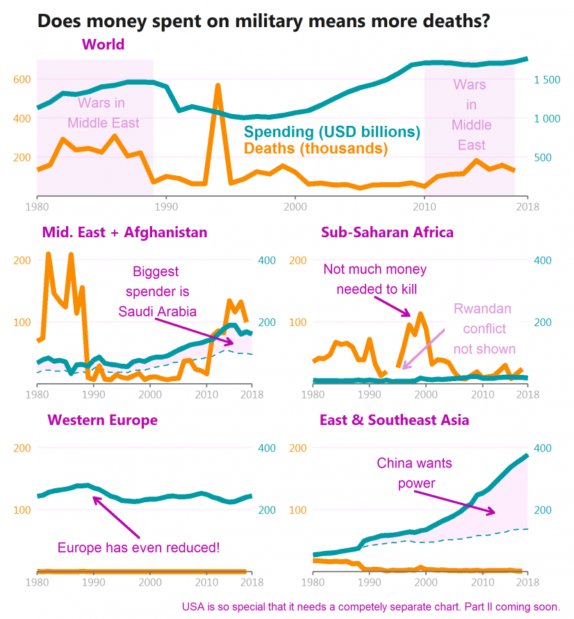
That seems not to be the case. There are many wars in Africa, but not so much money spent. Also, China and countries in Western Europe spend a lot, however, they’re not actively fighting (some missions to some hot spots do not count).

In the Middle East – the boiling point of wars – the biggest spenders are Saudi Arabia, which fights satellite war in Yemen, and Israel which fights against Palestine (as I understand it). But many more casualties come from Iraq, Syria, and Afghanistan, all of which seem to be a mixture of civil wars and satellite wars.

The special case is the USA which will have its separate chart.

This topic is so geopolitical, that I refrain from diving into deeper conclusions, but it’s tempting to say, that more weapons do not make more deaths. More stupidity does.

What:
> Military expenditure in constant USD – some data for USSR and UAE were interpolated using very rough methods – just to fill the gaps and avoid fake jumps. This data have lots of gaps.
> Deaths due to Conflict and Terrorism.
When: 1980-2018 (Data for deaths until 2017)
Where: Probably the whole world
Source: Institute for Health Metrics and Evaluation for deaths + Stockholm International Peace Research Institute for expenditure

Posted in charts | Tagged Death, Line chart, R

Ar tikrai 2020 m. sausio orai buvo tokie ypatingi?

chart planet Posted on 2020-03-14 by Chart Planet2023-03-16
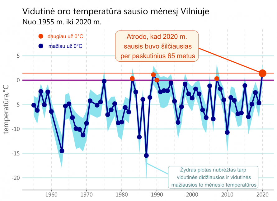
Ar tikrai šio sausio orai buvo tokie ypatingi?

Daugumai žmonių – tai tikrai buvo pats šilčiausias sausis per jų gyvenimą.

Duomenys – tai meteorologinės stoties nr. 267300 esančios Vilniuje įrašai paimti iš JAV agentūros NOAA. Keista, bet patys lietuviai šitų duomenų pasiekti neleidžia.

Posted in grafikai | Tagged Line chart, R

Post navigation

<< 1 2 3

subscribe to blog posts

Please check your email to confirm subscription

linkedin fb bluesky instagram sessionize rss
MJDC privacy policy
↑
Cookies are used on chart planet.