↓
 

chart planet

data-human interaction

chart planet

data-human interaction

  • charts
    • charts EN
    • charts LT
    • applications
  • blog
  • blog LT
  • links
  • talks
  • about

Tag Archives: Line chart

Post navigation

1 2 >>

Are the largest cities dominating their countries?

chart planet Posted on 2020-10-12 by Chart Planet2023-03-18
Are the largest cities dominating their countries?

There are countries where they do, with notable examples being Kuwait, Puerto Rico, Djibouti, Mongolia and Uruguay.

Since rural populations are declining everywhere, relative weights of urban populations, as well as those in the largest cities, are increasing, so largest cities now are more dominating than they were in the ’60s.

The most concentrated region seems to be East Asia, but that is because they have Hong Kong and Macao with almost 100% of people living in the only city.

What: Median proportion of the population in the largest city, the urban area without the largest city, and the rural population.
When: 1960 and 2019
Where: The whole world, with some exceptions having a total of 26 million inhabitants, the biggest being Botswana, Lesotho and Slovenia. Many of those exceptions are small, possibly one-city countries which do not have needed statistics in the Worldbank database.
Source: Worldbank

Posted in charts EN | Tagged Demographics, JMP, Line chart, Post-design

Does self-observation help to improve?

chart planet Posted on 2020-08-05 by Chart Planet2023-03-18
Does self-observation help to improve?

This is my last data selfie for now.

I tracked down the time when I start my working day, what percentage of weekly goals I do achieve and whether I do many other daily routine things (meditation, exercise, proper meal, not checking social media after 6 p.m. etc.) which I aggregated into “Level of discipline”.

During the time of self-observation I began to wake up and start working earlier, I started to achieve more goals, but this “discipline” thing did not improve. I guess that trying to do many “useful” things during the day is not as useful and productive as it may seem.

What: Weekly average time of starting to work, the proportion of weekly goals achieved, and “level of discipline” measured in points. Moving averages are calculated using 5-week intervals. There are omissions in the data, as one may see.
When: 38 weeks during 2019-2020
Source: self-observation

Posted in charts EN | Tagged Bar chart, Data selfie, Line chart, Lollipop chart, R

How well are we reducing poverty?

chart planet Posted on 2020-05-06 by Chart Planet2023-03-18
How well are we reducing poverty?

There are good news and sad news.

The good news is that we are really reducing poverty. Fewer and fewer people live for 1,90 dollars a day, fewer and fewer experience hunger, fewer and fewer experience struggle to get water.

The sad news is the realization that behind nice world trends there are still countries where one-third of the total population are poor, experience hunger and struggle to get water. And even worse – while over 40% of people in low-income countries don’t have access to BASIC drinking water service, 73% don’t have access to SAFE drinking water service.

But we’re reducing. There is still much to achieve and let’s hope for the best.

What:
Very poor people = Poverty headcount ratio at $1.90 a day (2011 PPP) (% of population),
Hungry people = Prevalence of undernourishment (% of population),
People not having water = People not using at least basic drinking water services (% of population)
When: Improvements by income class are shown between 2000 and 2017 with possible deviations a year or two for different category combinations.
Where: Total world + the world divided into 4 income groups by the World Bank.
Source: WB

Posted in charts EN | Tagged Bar chart, Line chart, Poverty, R

Is it a good idea to invest when stocks go down?

chart planet Posted on 2020-04-29 by Chart Planet2023-03-18
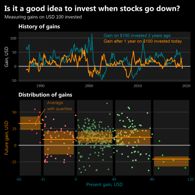
Is it a good idea to invest when stocks go down?

Yes, but only if the market has crashed very seriously. The same is with selling – historically it is good to sell only when markets have skyrocketed unprecedently.

Suppose I have invested USD 100 in stock two years ago. It has gained some positive or negative amount of dollars since then. What gains could I expect after one year if I invest USD 100 today? After analyzing historical data I see that future gains are almost certainly positive only when markets have had dropped more than 35% in two years from their original value. Also, future gains are almost certainly negative when markets have had grown more than 80% from their original value.

What: “Gain” is the amount in dollars one’s investment would change from the initial USD 100 invested. Investment is divided equally between Dow Jones Industrial Average and Nasdaq Composite indices.
When: Monthly data between February 1985 and April 2020
Source: investing.com

Posted in charts EN | Tagged Investing, Line chart, R, Scatterplot

Will there be a recession?

chart planet Posted on 2020-04-20 by Chart Planet2023-03-18

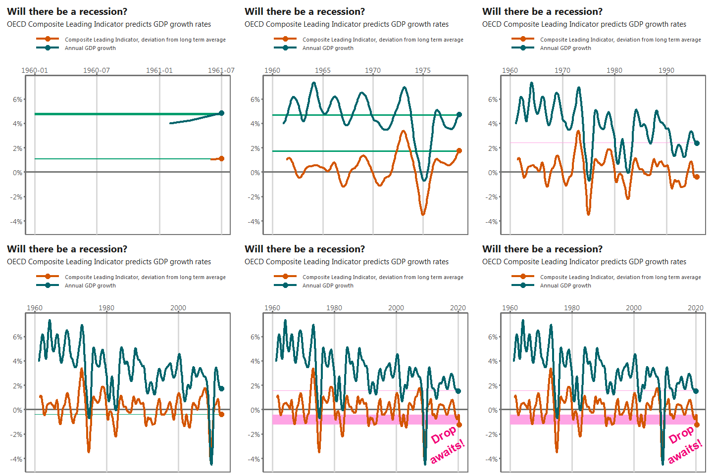
Sure. OECD Composite Leading Indicator (CLI) indicates it. It is surprising how sudden a drop in March 2020 is. Obviously, the only reason for it is the virus.

Will the recession become a crisis of a wider scope? Sadly, CLI does not reach that far into the future.

What: Composite Leading Indicator of OECD countries, amplitude adjusted, percentage deviations from long term average. GDP growth rate of OECD countries comparing month to the same month of the previous year. Both indicators are seasonally adjusted.
When: February 1961 – March 2020.
Where: OECD total, ~40 countries.
Source: OECD

Posted in charts EN | Tagged Animation, GDP, Line chart, R

Does money spent on military means more deaths?

chart planet Posted on 2020-04-08 by Chart Planet2023-03-18
Does money spent on military means more deaths?

After seeing that military spending has no visible relation to deaths in most regions I decided to investigate the special relation the USA has with the wars in the East.

Some major wars in the East are indicated on the chart. During those, the military expenditure of the USA seems to climb up. Data for deaths are available only from 1980, and I filtered out only the relevant region.

Is the USA the reason for those deaths? Or are those people just fighting among themselves, and the USA just gets involved? Does it worsens the situation, or improves? I’ll leave those questions open for now.

What: Military expenditure in constant USD + Deaths due to Conflict and Terrorism.
When: Expenditure: 1949-2018, Deaths: 1980-2017
Where: Expenditure: USA only, Deaths: Middle East, North Africa, and Afghanistan
Source: Institute for Health Metrics and Evaluation for deaths + Stockholm International Peace Research Institute for expenditure.

Posted in charts EN | Tagged Country specific, Death, Line chart, R

Does money spent on military means more deaths?

chart planet Posted on 2020-04-06 by Chart Planet2023-03-18
Does money spent on military means more deaths?

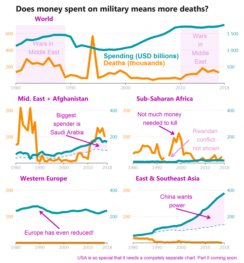
That seems not to be the case. There are many wars in Africa, but not so much money spent. Also, China and countries in Western Europe spend a lot, however, they’re not actively fighting (some missions to some hot spots do not count).

In the Middle East – the boiling point of wars – the biggest spenders are Saudi Arabia, which fights satellite war in Yemen, and Israel which fights against Palestine (as I understand it). But many more casualties come from Iraq, Syria, and Afghanistan, all of which seem to be a mixture of civil wars and satellite wars.

The special case is the USA which will have its separate chart.

This topic is so geopolitical, that I refrain from diving into deeper conclusions, but it’s tempting to say, that more weapons do not make more deaths. More stupidity does.

What:
> Military expenditure in constant USD – some data for USSR and UAE were interpolated using very rough methods – just to fill the gaps and avoid fake jumps. This data have lots of gaps.
> Deaths due to Conflict and Terrorism.
When: 1980-2018 (Data for deaths until 2017)
Where: Probably the whole world
Source: Institute for Health Metrics and Evaluation for deaths + Stockholm International Peace Research Institute for expenditure

Posted in charts EN | Tagged Death, Line chart, R

Ar tikrai 2020 m. sausio orai buvo tokie ypatingi?

chart planet Posted on 2020-03-14 by Chart Planet2023-03-16
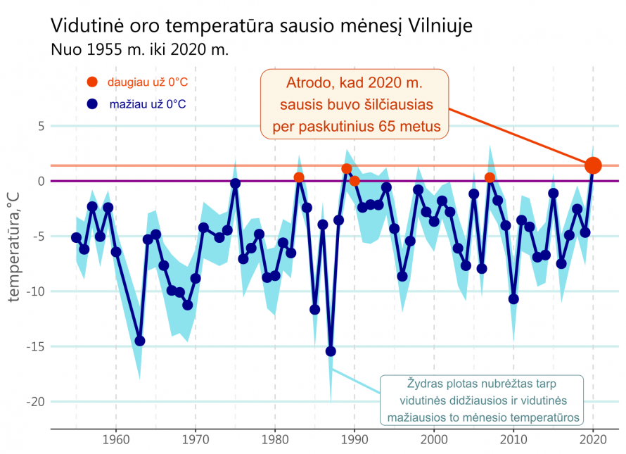
Ar tikrai šio sausio orai buvo tokie ypatingi?

Daugumai žmonių – tai tikrai buvo pats šilčiausias sausis per jų gyvenimą.

Duomenys – tai meteorologinės stoties nr. 267300 esančios Vilniuje įrašai paimti iš JAV agentūros NOAA. Keista, bet patys lietuviai šitų duomenų pasiekti neleidžia.

Posted in charts LT | Tagged Line chart, R

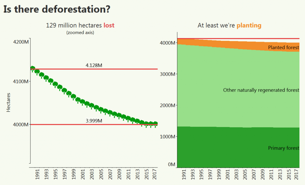
Is there deforestation?

chart planet Posted on 2020-02-19 by Chart Planet2023-03-18
Is there deforestation?

After zooming in the axis, the constant decrease is clear. I don’t know whether 129 million hectares is a big deal or not, but we were happier if the trend were the opposite. However people are also planting forest, and since they cut more and more, they plant more and more too. Now the rate of planting is less than the rate of cutting, but I believe one day the trend will be reversed.

What: Land used as forest and types of forest. Mind the axis on the left graph which does not start at zero.
When: 1990-2017
Where: The world
Source: FAO

Posted in charts EN | Tagged Area chart, Line chart, Nature, Tableau

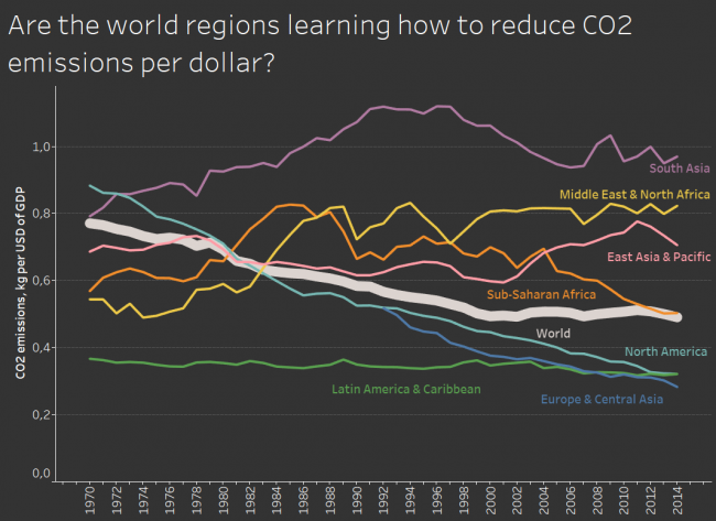
Are the world regions learning how to reduce CO2 emissions per dollar?

chart planet Posted on 2020-01-31 by Chart Planet2023-03-18
Are the world regions learning how to reduce CO2 emissions per dollar?

Seems like kind of yes, they do. Some regions rely on polluting industries like the Middle East, some struggle to find their direction like South Asia, but most regions do reduce. Good news for future us.

What: CO2 emissions (kg per 2010 US$ of GDP) and GDP per capita.
When: 1970-2014
Where: World regions according to WB
Source: WB

Posted in charts EN | Tagged CO2 emissions, Line chart, Tableau

What are the sources of CO2 emissions?

chart planet Posted on 2020-01-20 by Chart Planet2023-03-18
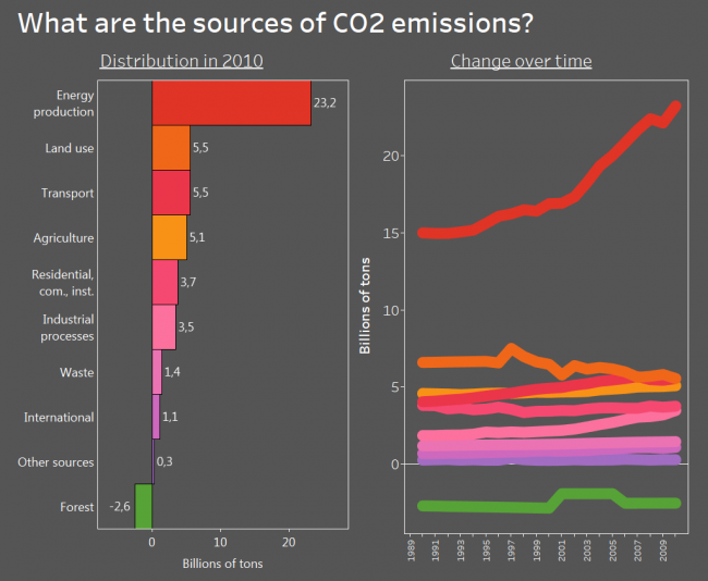
What are the sources of CO2 emissions?

I know, the data is old, but back in 2010 energy production was the main source of CO2 and other greenhouse gas emissions. Transport had the potential to overtake the land use and I bet despite all those electromobiles everywhere it did.

And the beautiful thing is – the forest is a net absorber of greenhouse gas! I knew it all along, but it is nice to see it on the graph. And it’s depressing at the same time because its absorption is tiny compared to our emissions.

What: Emissions of various greenhouse gasses (CO2, CH4, PFCs and so on) expressed in the equivalent of CO2 emissions. May not the question mislead – initially I asked about CO2, but then I found stats for all greenhouse gases. “Land use” is emissions by cropland and grassland and is not included in agriculture. “Residential, com., inst.” is emissions by residential, commercial and institutional activities. I believe the weird shape for the forest is due to inconsistency in data rather than actual changes.
When: From 1990 to 2010
Where: World aggregate
Source: FAO

Posted in charts EN | Tagged Bar chart, CO2 emissions, Line chart, Tableau

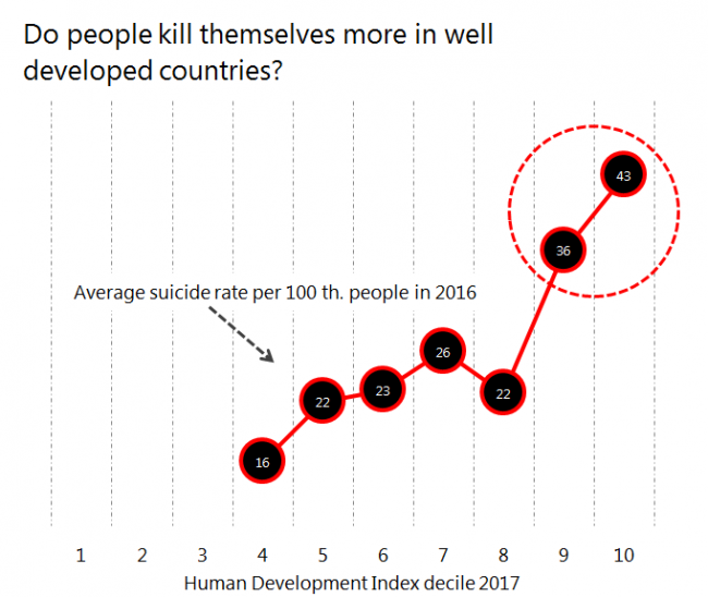
Do people kill themselves more in well-developed countries?

chart planet Posted on 2018-12-17 by Chart Planet2023-03-18
Do people kill themselves more in well-developed countries?

Seems like yes. First world problems – they might be real!

What: Average suicide rate for countries in each human development index decile. Not population-weighted.
When: Suicide rate – 2016, HDI – 2017
Where: World
Source: Suicide rate – WHO, HDI – UNDP

Posted in charts EN | Tagged Excel, Line chart, Social issues

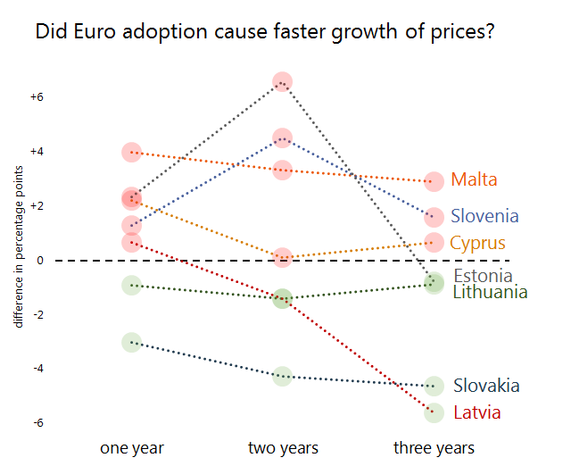
Did Euro adoption cause faster growth of prices?

chart planet Posted on 2018-11-21 by Chart Planet2023-03-18
Did Euro adoption cause faster growth of prices?

At the first year seemed that inflation was higher with euro, this was the case for 5 countries out of 7, but after 3 years have passed – only 3 out of 7 had bigger price increase with euro during the whole period. Seems that inflation rise due to euro was a temporary one-time effect which later leveled out for at least half of the countries. In short, I’d say that Euro does not cause inflation in a significant way.

What: Consumer price growth in one, two and three years before the adoption of euro subtracted from consumer price growth in one, two and three years after the adoption of euro. The number on the graph shows how much faster prices grew with Euro than without.
When: Years are different for each country depending on its date of joining the Eurozone.
Where: Countries which joined the Eurozone later, not with the initial group
Source: ES

Posted in charts EN | Tagged Excel, Line chart, Prices

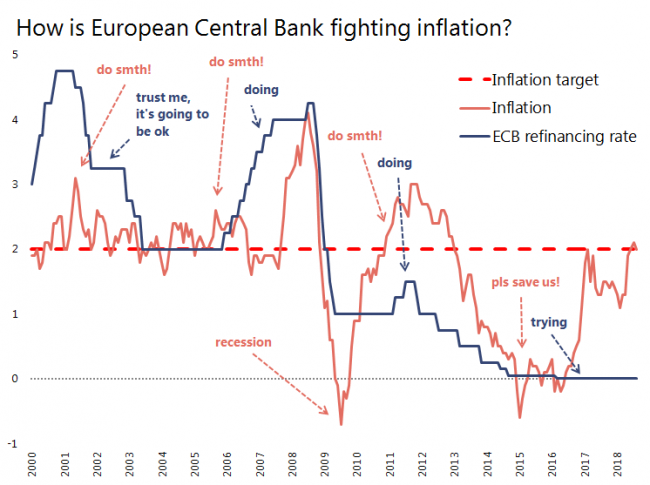
How are central banks fighting inflation? ECB example.

chart planet Posted on 2018-11-19 by Chart Planet2023-03-18
How are central banks fighting inflation? ECB example.

Whenever inflation goes above the target level of 2%, ECB increases their refinancing rate. Same as FED.

What: Indicated on the graph.
When: 2000 January – 2018 August
Where: Eurozone
Source: ES, ECB

Posted in charts EN | Tagged Excel, Interest, Line chart

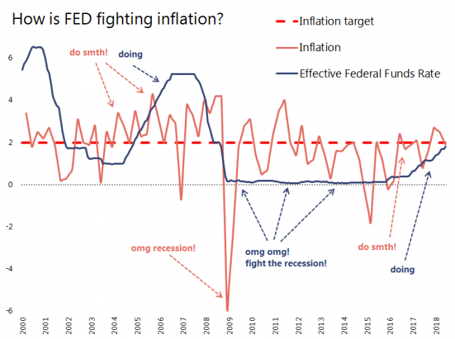
How are central banks fighting inflation? FED example.

chart planet Posted on 2018-11-16 by Chart Planet2023-03-18
How are central banks fighting inflation? FED example.

Whenever the inflation goes above the target level of 2%, FED increases their refinancing rate.

What: Indicated on the graph
When: 2000 January – 2018 June
Where: USA
Source: FRED and BEA

Posted in charts EN | Tagged Excel, Interest, Line chart

Post navigation

1 2 >>

subscribe to blog posts

Please check your email to confirm subscription

fb fb rss rss rss
MJDC privacy policy
↑
Cookies are used on chart planet.OKprivacy policy