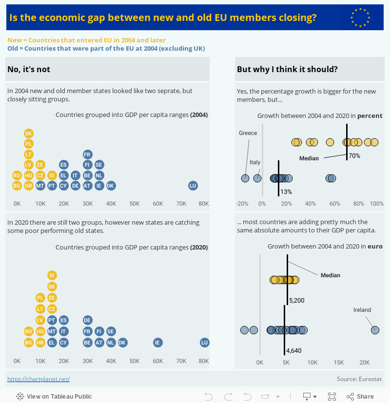
What: GDP per capita, chain linked volumes (2010) in euro
When: 2004-2020
Where: Current EU members (as of 2021)

chart planet
visual communication of data
What: GDP per capita, chain linked volumes (2010) in euro
When: 2004-2020
Where: Current EU members (as of 2021)

What: share of the total world’s GDP
When: 1990-2019
Where: top 14 world countries by GDP each year
Source: Worldbank database
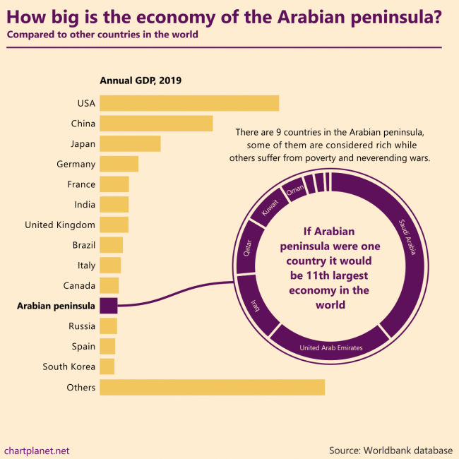
There are 9 countries in the Arabian peninsula, some of them are considered rich while others suffer from poverty and never ending wars. If the Arabian peninsula were one country it would be the 11th largest economy in the world.
What: GDP in constant 2010 USD
When: 2019
Where: All the countries in the world. “Others” were calculated by subtracting the shown countries from the total world GDP estimated by Worldbank. Countries of the Arabian peninsula are Saudi Arabia, United Arab Emirates, Iraq, Qatar, Kuwait, Oman, Bahrain, Jordan, Yemen.
Source: Worldbank database

ASEAN is an economic union of Southeast Asian countries. From 1999 to 2019 it experienced considerable growth becoming the 5th largest economy in the world if we count the EU as one unit as well.
Indonesia is the biggest country in the union, but all of them contribute to growth, most growing their GDP by more than 5% a year during 1999-2019 with the only exception being Brunei.
For comparison: the annual average growth in the EU was 1,6% a year and in China, it was 9,0% during the same period. The current composition of the EU was used for the calculations.
What: GDP in constant 2010 USD
When: 1999-2019
Where: All the countries in the world. “Others” were calculated by subtracting the shown countries from the total world GDP estimated by Worldbank.
Source: Worldbank database
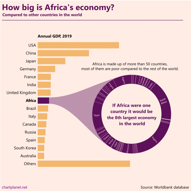
Africa is made up of more than 50 countries, most of them are poor compared to the rest of the world. If Africa were one country it would be the 8th largest economy in the world.
This chart is made without any numbers intentionally, they’d distract from the message. The ranking of the countries in the donut chart is “Algeria first”.
What: GDP in constant 2010 USD
When: 2019
Where: All the countries in the world. “Others” were calculated by subtracting the shown countries from the total world GDP estimated by Worldbank.
Source: Worldbank database
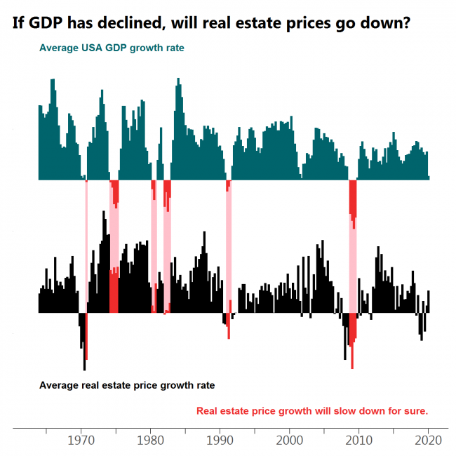
Every drop in GDP is followed by a decline in real estate prices or at least a significant slow down in growth with the most obvious case at the beginning of ’80s.
What: Moving average of quarterly USA GDP growth (GDP in billions of chained 2012 dollars, seasonally adjusted) and moving average of quarterly median sales price of houses sold in the United States.
When: 1964Q1 – 2020Q1
Where: USA only.
Source: FRED

Often when the market turns red there is at least a dip in GDP growth. However, there are cases when this does not happen.
What: Moving average of quarterly S&P500 index growth and moving average of quarterly USA GDP growth (GDP in billions of chained 2012 dollars, seasonally adjusted)
When: 1948Q1 – 2020Q1
Where: USA only, because S&P is populated by mostly American companies.
Source: Yahoo Finance for S&P500 and FRED for GDP.
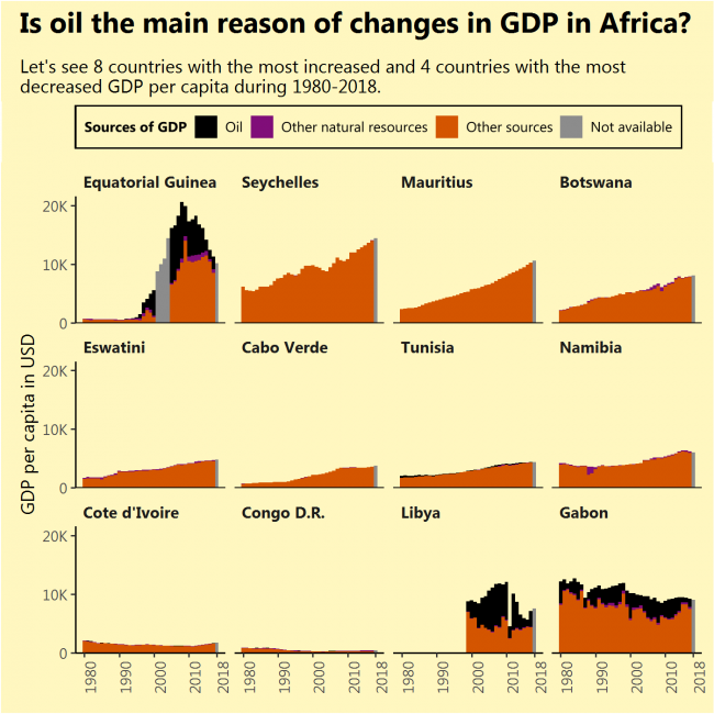
I was deceived!
I saw that Equatorial Guinea, the African country that increased its GDP per capita the most during 1980-2018 had done this due to newly found oil. I saw that Gabon, the African country that decreased its GDP per capita the most during the same period, had done this due to diminishing its oil reserves. So I thought, the same applies to the most of rapidly growing (or contracting) African economies, but that is not true (except for Libya).
The sources of growth might not be very sustainable just like oil, but finding them requires a deeper analysis of every separate country.
What: GDP per capita divided into oil rents, rents from other natural resources and GDP from other sources. Grey bars indicate full GDP value with the unknown division.
When: From 1980 till 2018. Not all countries had a full range of data. No country had its GDP divided for 2018.
Where: Countries of the African continent with the biggest GDP per capita growth during 1980-2018 (top 8) and biggest fall (bottom 4, except South Sudan, which had very short data range)
Source: WB
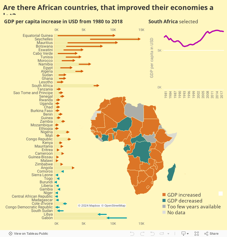
I will consider that improving economy simply means increasing GDP per capita.
And that happened in a handful of countries. What are the reasons for this increase? That is a question for the next image, but I expect to find oil. Also, what happened to Gabon?
What: GDP per capita.
When: From 1980 till 2018. Not all countries had a full range of data.
Where: Countries of the African continent
Source: WB
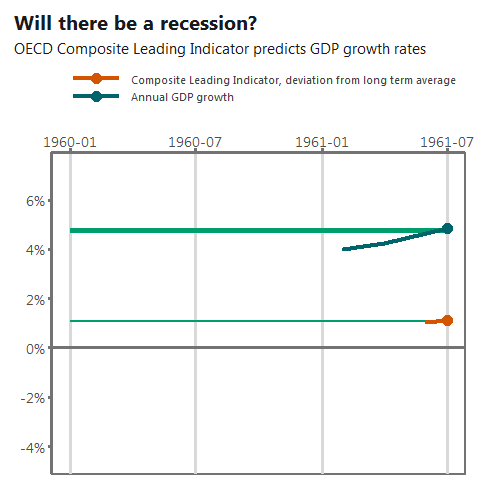
Sure. OECD Composite Leading Indicator (CLI) indicates it. It is surprising how sudden a drop in March 2020 is. Obviously, the only reason for it is the virus.
Will the recession become a crisis of a wider scope? Sadly, CLI does not reach that far into the future.
What: Composite Leading Indicator of OECD countries, amplitude adjusted, percentage deviations from long term average. GDP growth rate of OECD countries comparing month to the same month of the previous year. Both indicators are seasonally adjusted.
When: February 1961 – March 2020.
Where: OECD total, ~40 countries.
Source: OECD
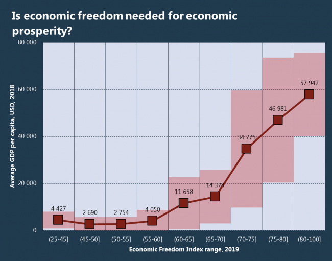
Pardon me for asking the obvious. But if less democratic countries manage to maintain high levels of HDI, maybe less economically free countries manage to reach high levels of GDP per capita? The answer is no, the relationship is clear and exponential – free economy is best. That might surprise, but even the United Arab Emirates are economically free, they rank the 9th in the world by economic freedom.
What: Average GDP per capita in USD in a given Economic Freedom Index range. The red area represents the standard deviation – with higher Index values, the GDP becomes more volatile.
When: I’d say the whole graph is 2018 because Economic Freedom Index represents previous years.
Where: 175 countries of the world.
Source: The Heritage Foundation and WB

I dare to say some very general upward trend is visible by a naked eye. The correlation coefficient is only 24%, but positive after all.
What: Investment or gross capital formation as a percent of GDP in current local currency, GDP per capita growth.
When: Investment in 2017, and GDP growth in 2018 (because there should be a lag before the investment kicks in and GDP starts to grow)
Where: Countries that have both statistics.
Source: IMF for Investment and WB for GDP

Behold these exotic countries! It seems that out of often mentioned countries only China is at the top of this list.
The graph makes sense – the less developed the country, the more investment it needs.
What: Investment or gross capital formation as a percent of GDP in current local currency. It is measured by the total value of the gross fixed capital formation and changes in inventories and acquisitions less disposals of valuables for a unit or sector.
When: 2018
Where: World
Source: IMF WEO report April 2019
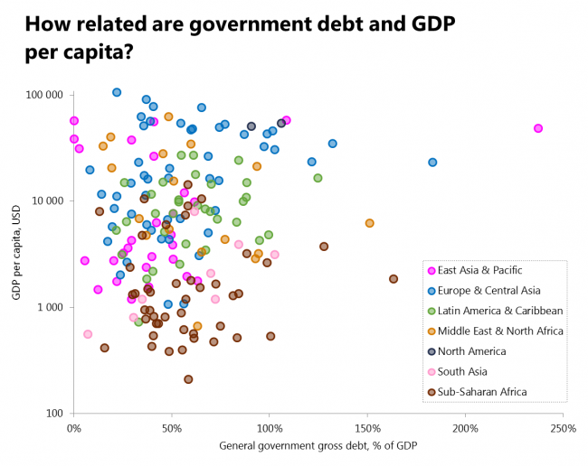
This graph is for you to observe the nonexistence of any relationship. The correlation between these two datasets is only 9%. Every region has values across a wide range of debt values, however, each regions’ GDP variation is specific to that region. Conclusion – debt does not mean a better life. I guess – ways of using it do.
What: General government gross debt as a percent of GDP and GDP per capita at constant prices of 2010 in USD.
When: 2018
Where: Countries that have both statistics.
Source: IMF and WB
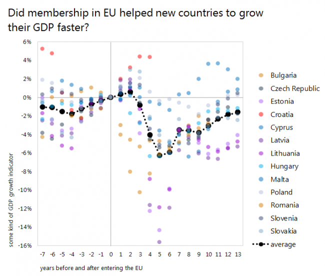
The graph tells me that further analysis would be purposeless. For most countries, which entered EU in 2004 the fifth year in the union was the time of global crisis. Would have they been better without EU? Well, this is a topic for a deeper analysis.
What: The graph shows 3-year moving averages of annual GDP per capita growth, with value at year 0 (entering the EU) subtracted from all the data series for visual purposes. The “average” is a simple average of all growths without the topmost and downmost values.
When: Years are different for each country depending on its date of joining the European Union.
Where: Countries joined the EU in 2004 and later.
Source: ES