Infografikas yra sukurtas projektui “Mitas”.
Sukurta su R ir Figma.

chart planet
visual communication of data
Dažniausiai valstybės biudžeto išlaidoms pavaizduoti naudojamas grafikas yra spalvotas 3d pyragas. Šis paveiksliukas paimtas iš oficialios finansų ministerijos medžiagos.

Pabandykime kitaip, o jei grafikas būtų:

Duomenys nuskaityti: 2023 m. gegužės 27 d.
Dažniausiai valstybės biudžeto išlaidoms pavaizduoti naudojamas grafikas yra spalvotas 3d pyragas. Šis paveiksliukas paimtas iš oficialios finansų ministerijos medžiagos.
Pabandykime kitaip, o jei grafikas būtų:

Spalvos paimtos iš oficialaus Finansų ministerijos bukleto, tačiau visgi pagrindinė mėlyna spalva buvo tokia ryški – kad panaudojau ne pagrindinę.
Viskas paruošta viename Ekselio faile ir atsinaujina įkopijavus naujus skaičius.
Duomenys nuskaityti: 2023 m. gegužės 27 d.
Šis grafikas parodo kiek lietuvių gyvena užsienio šalyse ir atvirkščiai – jis nerodo srauto, t.y. migracijos.
Stebina tai, kad Rusijoje ir Lenkijoje gyvena daugiau lietuvių nei Norvegijoje ar Airijoje.

Šaltinis: United Nations, Department of Economic and Social Affairs, Population Division (2019). International Migrant Stock 2019. (United Nations database, POP/DB/MIG/Stock/Rev.2019).

ASEAN is an economic union of Southeast Asian countries. From 1999 to 2019 it experienced considerable growth becoming the 5th largest economy in the world if we count the EU as one unit as well.
Indonesia is the biggest country in the union, but all of them contribute to growth, most growing their GDP by more than 5% a year during 1999-2019 with the only exception being Brunei.
For comparison: the annual average growth in the EU was 1,6% a year and in China, it was 9,0% during the same period. The current composition of the EU was used for the calculations.
What: GDP in constant 2010 USD
When: 1999-2019
Where: All the countries in the world. “Others” were calculated by subtracting the shown countries from the total world GDP estimated by Worldbank.
Source: Worldbank database
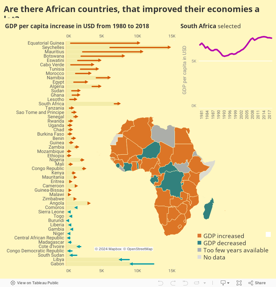
I will consider that improving economy simply means increasing GDP per capita.
And that happened in a handful of countries. What are the reasons for this increase? That is a question for the next image, but I expect to find oil. Also, what happened to Gabon?
What: GDP per capita.
When: From 1980 till 2018. Not all countries had a full range of data.
Where: Countries of the African continent
Source: WB
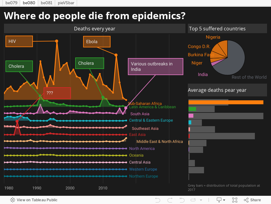
Mostly in Africa. It was quite difficult to find the exact diseases behind particular spikes of deaths, but some of them like Ebola got a lot of attention. Surprising enough, but it seems that in 2017 people suddenly stopped dying from diseases there.
Sadly I could not find what caused so many deaths in China in 1984. Just imagine the results I got when I searched for “china 1994 epidemics” – the overwhelming majority of articles about the current outbreak of coronavirus with some articles claiming that Chinese government is the one from Orwell’s novel.
What: Deaths due to epidemics
When: 1980-2017
Where: 194 countries and regions
Source: Institute for Health Metrics and Evaluation
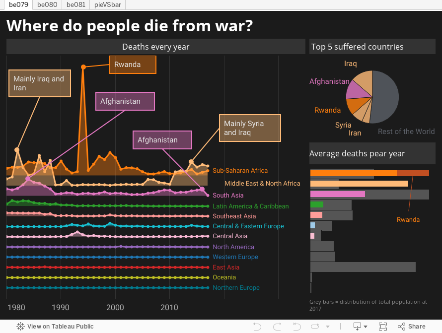
As expected, the most dangerous regions are Africa and the Middle East. However, a single event in Rwanda pushed Sub-Saharan Africa to the first place. Also, half of the deaths from 1980 till 2017 occurred in only five countries (we hear a lot about them in the news).
The rest of the world is more or less peaceful.
What: Deaths due to war and terrorism.
When: 1980-2017
Where: 194 countries and regions
Source: Institute for Health Metrics and Evaluation
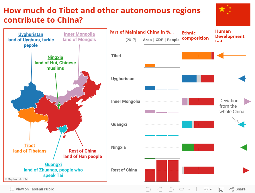
Apparently those large provinces where Tibetans and Uyghurs live are scarcely populated and less developed, so they contribute only a tiny fraction to the population and GDP in China. All other autonomous regions are inhabited mostly by Han Chinese who make more than half of the population there. Mongolia does not look like Mongolia when only 17% of inhabitants are Mongols.
A bit of sadness after seeing this.
What: Population, GDP in current USD, area in km2, ethnic composition and Human Development Index.
When: 2017
Where: Mainland China and its autonomous regions. Mainland China does not include Hong Kong, Macau and Taiwan.
Source: All data was found on Wikipedia. Let’s hope it’s correct.
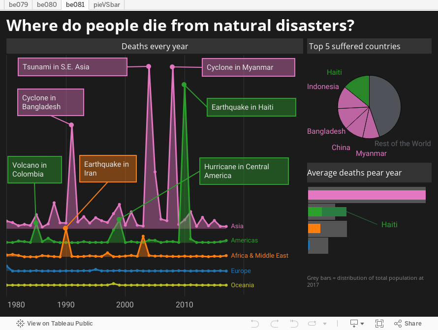
Natural disasters seem to be quite concentrated, more than half of all deaths during 1980-2017 have occurred in the same five countries and four of those five are in Asia. It is not possible to differentiate to smaller regions (like S.E. Asia, East Asia etc.) because a single tsunami or earthquake affects several regions at once.
The earthquake in Haiti seem to be the most deadly disaster for a single country, which makes up more than half of total deaths in Americas.
What: Deaths due to natural disasters
When: 1980-2017
Where: 194 countries and regions
Source: Institute for Health Metrics and Evaluation
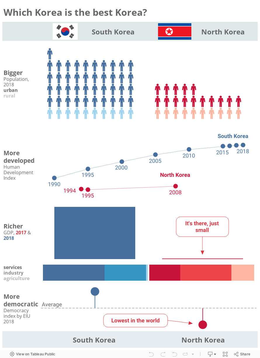
We knew what to expect here, but it’s interesting to see it. The only thing unexpected to me is that South Korea has significantly more people. I thought it’s only a bit more.
What: 4 different indicators indicated on the infographic. HDI for North Korea was adjusted because the methodology has changed since its HDI was last published.
When: Most indicators are for 2018, but the scarcity of data for North Korea forced me to use varying years for HDI and GDP.
Where: The 2 Koreas
Source: CIA, UNDP, UESCAP, W, WB, EIU and https://countryeconomy.com
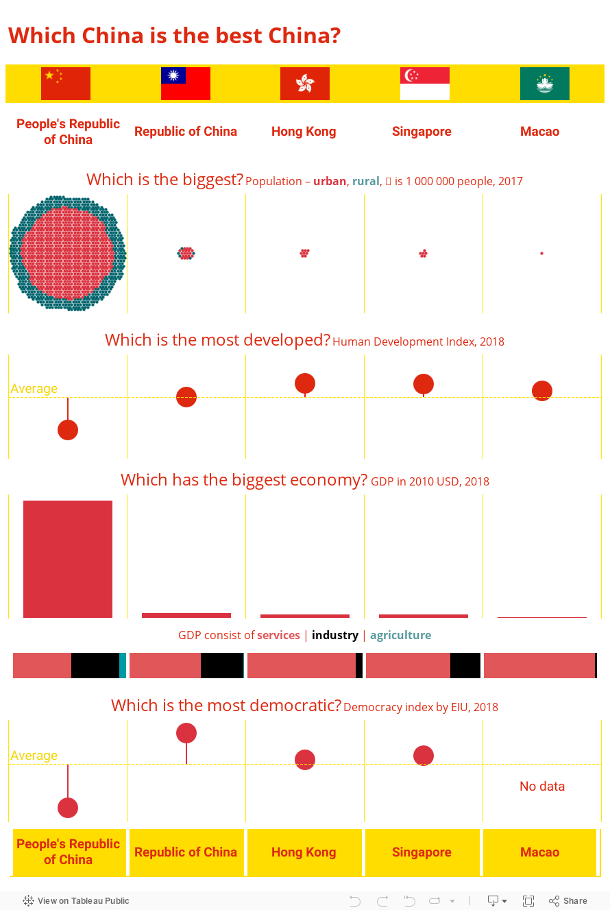
I am not sure if everyone is aware that there are 5 countries in this world where the majority of people could be considered Chinese. How different are those Chinas? The people’s Republic of China is the biggest one, however it is less developed compared to other Chinas, and infamously less democratic. Hong Kong, Singapore and Macao are 100% urban populations because those Chinas are basically one-city countries. The Republic of China better known as Taiwan seems like a normal usual country – not too big, not too small.
To understand better differences between these countries, I encourage the reader to dive deeper into cultural, historical and even linguistic differences between these countries.
By the way, Australia, Canada, UK and USA are also very different countries!
What: 4 different indicators indicated on the infographic
When: Time varies between 2017 and 2018 for different indicators and different Chinas
Where: The 5 Chinas
Source: CIA, UNDP, W, WB, IMF, EIU – most sources did not provide data for all 5 Chinas, so the data for one indicator might be gathered from various sources or even estimated by the author.