Dažniausiai valstybės biudžeto išlaidoms pavaizduoti naudojamas grafikas yra spalvotas 3d pyragas. Šis paveiksliukas paimtas iš oficialios finansų ministerijos medžiagos.
Pabandykime kitaip, o jei grafikas būtų:
Lengvai skaitomas – informacija apie vieną sritį būtų vienoje vietoje
Svarbiausias skaičius būtų procentas (juk tie milijonai – sunkiai suvokiami paprastam žmogui)
Vis dar patraukiantis dėmesį spalvomis ir geometrinėmis formomis
Turėtų palyginimą su pajamomis – nes pajamos ir asignavimai tai lyg dvi to paties medalio pusės
What: Annual inflation rate and 3-month interbank rate. When: Every month from January 1990 till January or February 2022 (latest data available). Where: All countries available in the OECD database (OECD countries + some other countries) which have data for 2022 (that’s why no China here) except Luxembourg. Source: OECD
What: The chart shows average daily gain in $ if $1000 were invested at a date on x-axis. Total gain was divided by the number of days between the day of investing and June 13, 2021. Gains were calculated on average 30-day prices. When: from March 28, 2013, till June 13, 2021 Source: investing.com and coingecko.com
In the Northern hemisphere the summer is warmer than the winter (i.e. normal), in the Southern hemisphere the winter is warmer than the summer (i.e. Australian), around the equator there is not much difference during the year.
What: The difference between monthly mean temperature and annual mean temperature. When: Some weather stations have data since the XVIII century. Where: All the weather stations in the world binned at each 10th latitude. Only stations with full-year datasets used in calculations. Source: Global Historical Climatology Network-Monthly (GHCN-M) temperature dataset https://www.ncdc.noaa.gov/ghcn-monthly
The question arises because we’re having Climate Change and not Global Warming. Only 6 weather stations in the world have a statistically significant negative temperature trend since 2000. Most of them are located around the equator, one is in Antarctica. There are 391 weather stations that have at least 5 full years of data since 2000 and which have a significant trend (p-value is less than 5%). In 385 of those stations, the temperature is rising.
When: 2000 January – 2020 December. Where: Weather stations that have at least 5 full years of data during the period in question and have a significant regression coefficient (p-value < 5%). Source: Global Historical Climatology Network-Monthly (GHCN-M) temperature dataset https://www.ncdc.noaa.gov/ghcn-monthly
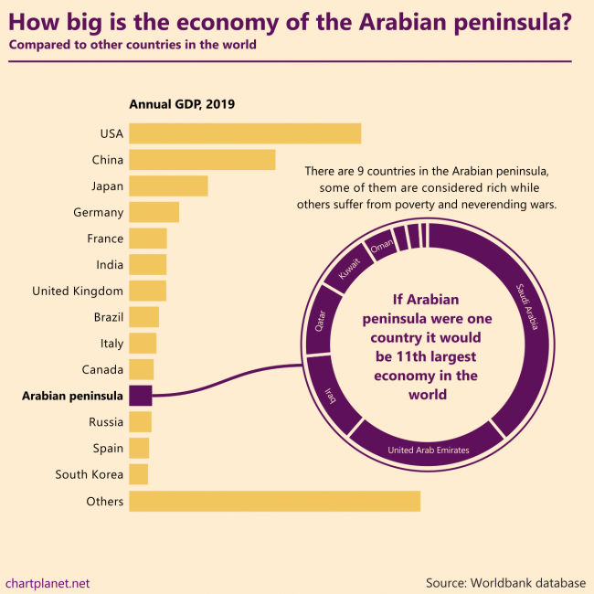
There are 9 countries in the Arabian peninsula, some of them are considered rich while others suffer from poverty and never ending wars. If the Arabian peninsula were one country it would be the 11th largest economy in the world.
What: GDP in constant 2010 USD When: 2019 Where: All the countries in the world. “Others” were calculated by subtracting the shown countries from the total world GDP estimated by Worldbank. Countries of the Arabian peninsula are Saudi Arabia, United Arab Emirates, Iraq, Qatar, Kuwait, Oman, Bahrain, Jordan, Yemen. Source: Worldbank database
ASEAN is an economic union of Southeast Asian countries. From 1999 to 2019 it experienced considerable growth becoming the 5th largest economy in the world if we count the EU as one unit as well. Indonesia is the biggest country in the union, but all of them contribute to growth, most growing their GDP by more than 5% a year during 1999-2019 with the only exception being Brunei.
For comparison: the annual average growth in the EU was 1,6% a year and in China, it was 9,0% during the same period. The current composition of the EU was used for the calculations.
What: GDP in constant 2010 USD When: 1999-2019 Where: All the countries in the world. “Others” were calculated by subtracting the shown countries from the total world GDP estimated by Worldbank. Source: Worldbank database
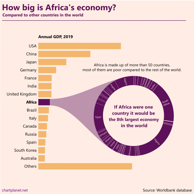
Africa is made up of more than 50 countries, most of them are poor compared to the rest of the world. If Africa were one country it would be the 8th largest economy in the world.
This chart is made without any numbers intentionally, they’d distract from the message. The ranking of the countries in the donut chart is “Algeria first”.
What: GDP in constant 2010 USD When: 2019 Where: All the countries in the world. “Others” were calculated by subtracting the shown countries from the total world GDP estimated by Worldbank. Source: Worldbank database
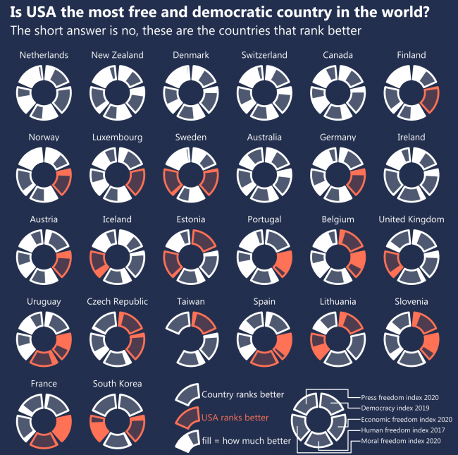
I checked five different indices of freedom and democracy provided by various researchers. My initial idea was to show the top 10 ranking countries of every index. However, the USA does not manage into the top 10 anywhere. So, I checked what countries rank better than the USA on those indices. Apparently its neighbour Canada, The Netherlands – one of the oldest democracies in the world, also New Zealand, Denmark and Switzerland rank better on all five indices. Countries like Estonia, Taiwan and Uruguay rank better on 3. Fund fact – the United Arab Emirates, one obviously not-so-free country ranks better than the USA on Economic Freedom Index.
So, If we talk about FREEDOM we talk about THE NETHERLANDS.
What: Difference in ranking compared to the USA on the following indices. Index, When, Source: Democracy Index, 2019, EIU Human Freedom Index, 2017, The Human Freedom Index 2018: A Global Measurement of Personal, Civil, and Economic Freedom Economic Freedom Index, 2020, The Heritage Foundation Moral Freedom Index, 2020, The Foundation for the Advancement of Liberty Press Freedom Index, 2020, Reporters Without Borders Where: 172 countries were ranked on at least 3 of these indices.
San Juan metro area accounts for more than 3 quarters of the population of Puerto Rico. Same with the Kuwait City metro area in Kuwait.
What: Population distribution between the largest city, the urban area without the largest city, and the rural population. Metro area is meant by the largest city in most cases. When: 2019 Where: Top ranking countries except one-city countries (like Singapore) from the whole world. Some countries with a total of 26 million inhabitants were excepted because they do not have needed statistics in the Worldbank database. Many of them are small, possibly one-city countries. Source: Worldbank for numbers, Wikipedia for names.
There are countries where they do, with notable examples being Kuwait, Puerto Rico, Djibouti, Mongolia and Uruguay.
Since rural populations are declining everywhere, relative weights of urban populations, as well as those in the largest cities, are increasing, so largest cities now are more dominating than they were in the ’60s.
The most concentrated region seems to be East Asia, but that is because they have Hong Kong and Macao with almost 100% of people living in the only city.
What: Median proportion of the population in the largest city, the urban area without the largest city, and the rural population. When: 1960 and 2019 Where: The whole world, with some exceptions having a total of 26 million inhabitants, the biggest being Botswana, Lesotho and Slovenia. Many of those exceptions are small, possibly one-city countries which do not have needed statistics in the Worldbank database. Source: Worldbank
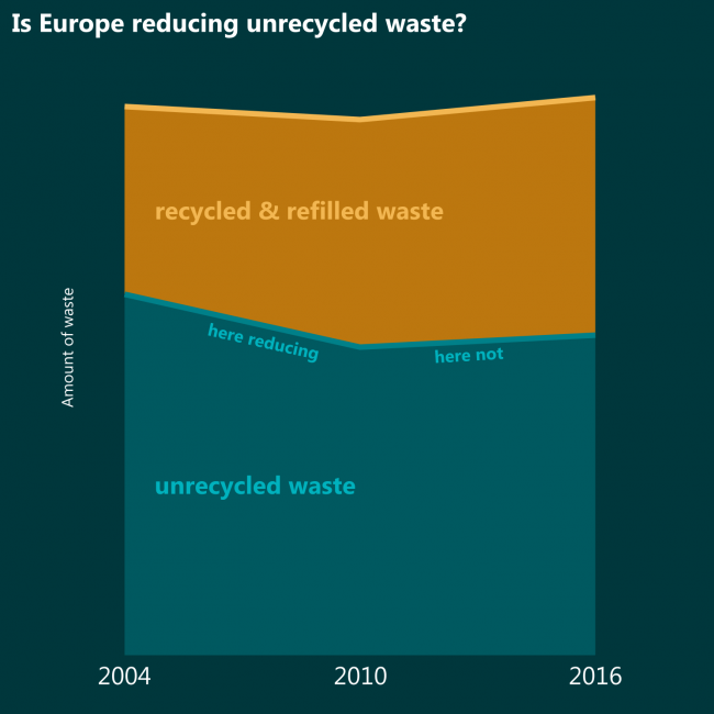
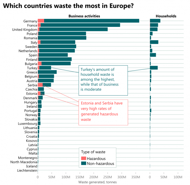
Whether the total amount of waste would decrease or increase, it would still be nice if amounts of UNRECYCLED waste decreased. If compared to 2004 it decreased, but if compared to 2010 it is increasing in spite of higher recycling rates.
What: Waste recycled or refilled in total waste generated. When: 2004, 2010 and 2016 Where: Europe Source: Eurostat
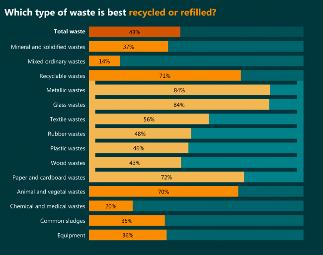
Metallic and glass waste. It’s probably quite easy to reuse metal and refill glass containers. The least recycled are mixed ordinary wastes of which almost half are generated by households (as seen in the previous chart).
May it be the motivation for sorting – if more mixed waste became recyclable waste, more would be … recycled.
What: Waste recycled or refilled in total waste generated. When: 2016 Where: Europe Source: Eurostat