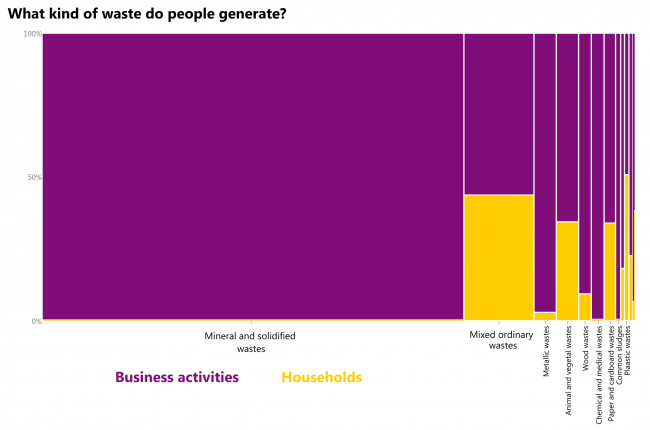
Mostly mineral and solidified wastes from business activities. Here goes waste from construction and demolition activities, combustion wastes, soils. Mixed ordinary wastes are the second – almost half of it is generated by households. The only type of waste where households produce more than half of the output is plastic.
What: Waste generated, tonnes. When: 2016 Where: European countries Source: Eurostat
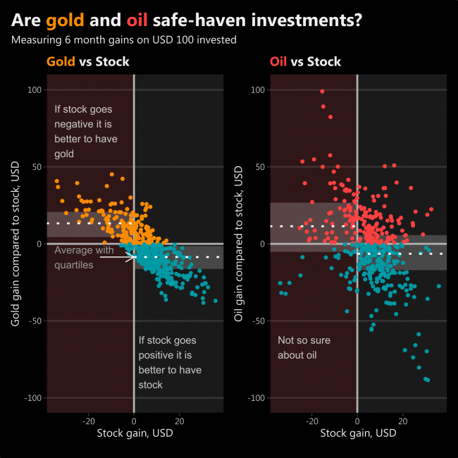
One dot represents one moment in time between February 1985 and April 2020. So, if you sense, that after 6 months the price of stocks will be lower than today, it might be a good idea to start buying gold. Based on historical data, it will probably end up gaining you positive returns. Whereas oil gains are not that consistent.
This tiny analysis of scatterplots shows that gold is a safe-haven investment and oil is not so.
What: “Gain” is the amount one’s investment would change if USD 100 were invested six months ago. Stock is made from Dow Jones Industrial Average and Nasdaq Composite indices. Oil is represented by Crude Oil. When: Monthly data between February 1985 and April 2020 Source: investing.com
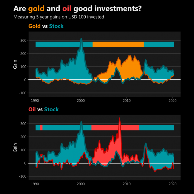
I never really understood investing in commodities. It seems that gold and oil gain more for long term investors when stock prices begin to go down and other investors seek alternative investments, thus raising the price of oil and gold.
After such interpretation, it seems that a recent increase in gold gain is probably caused by investors running from stock markets which are about to collapse, not anything related to gold itself. This might not be true.
However, oil gains have some significant fluctuations on their own.
What: “Gain” is the amount one’s investment would change if USD 100 were invested five years ago. Stock is made from Dow Jones Industrial Average and Nasdaq Composite indices. Oil is represented by Crude Oil. When: The chart begins in February 1990, but the data begins in February 1985. The most recent data is in April 2020. Source: investing.com