What: The chart shows average daily gain in $ if $1000 were invested at a date on x-axis. Total gain was divided by the number of days between the day of investing and June 13, 2021. Gains were calculated on average 30-day prices. When: from March 28, 2013, till June 13, 2021 Source: investing.com and coingecko.com
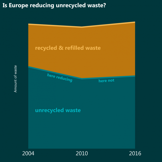
Whether the total amount of waste would decrease or increase, it would still be nice if amounts of UNRECYCLED waste decreased. If compared to 2004 it decreased, but if compared to 2010 it is increasing in spite of higher recycling rates.
What: Waste recycled or refilled in total waste generated. When: 2004, 2010 and 2016 Where: Europe Source: Eurostat
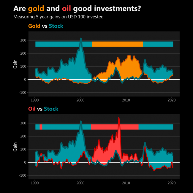
I never really understood investing in commodities. It seems that gold and oil gain more for long term investors when stock prices begin to go down and other investors seek alternative investments, thus raising the price of oil and gold.
After such interpretation, it seems that a recent increase in gold gain is probably caused by investors running from stock markets which are about to collapse, not anything related to gold itself. This might not be true.
However, oil gains have some significant fluctuations on their own.
What: “Gain” is the amount one’s investment would change if USD 100 were invested five years ago. Stock is made from Dow Jones Industrial Average and Nasdaq Composite indices. Oil is represented by Crude Oil. When: The chart begins in February 1990, but the data begins in February 1985. The most recent data is in April 2020. Source: investing.com
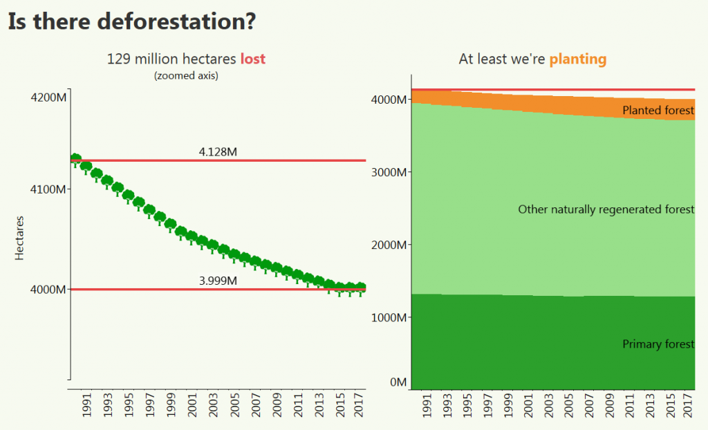
After zooming in the axis, the constant decrease is clear. I don’t know whether 129 million hectares is a big deal or not, but we were happier if the trend were the opposite. However people are also planting forest, and since they cut more and more, they plant more and more too. Now the rate of planting is less than the rate of cutting, but I believe one day the trend will be reversed.
What: Land used as forest and types of forest. Mind the axis on the left graph which does not start at zero. When: 1990-2017 Where: The world Source: FAO
(I don’t know where did I get this hypothesis from)
Let’s analyze the reserves. So, it’s losing just a bit, but Euro is losing too. And they’re not losing to any particular currency, seems the world is diversifying.
What: Shares of Allocated Reserves When: 2000-2018Q1 Where: World Source: IMF