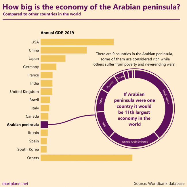
There are 9 countries in the Arabian peninsula, some of them are considered rich while others suffer from poverty and never ending wars. If the Arabian peninsula were one country it would be the 11th largest economy in the world.
What: GDP in constant 2010 USD When: 2019 Where: All the countries in the world. “Others” were calculated by subtracting the shown countries from the total world GDP estimated by Worldbank. Countries of the Arabian peninsula are Saudi Arabia, United Arab Emirates, Iraq, Qatar, Kuwait, Oman, Bahrain, Jordan, Yemen. Source: Worldbank database
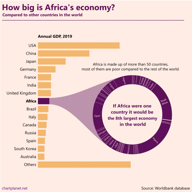
Africa is made up of more than 50 countries, most of them are poor compared to the rest of the world. If Africa were one country it would be the 8th largest economy in the world.
This chart is made without any numbers intentionally, they’d distract from the message. The ranking of the countries in the donut chart is “Algeria first”.
What: GDP in constant 2010 USD When: 2019 Where: All the countries in the world. “Others” were calculated by subtracting the shown countries from the total world GDP estimated by Worldbank. Source: Worldbank database
I tracked down the time when I start my working day, what percentage of weekly goals I do achieve and whether I do many other daily routine things (meditation, exercise, proper meal, not checking social media after 6 p.m. etc.) which I aggregated into “Level of discipline”.
During the time of self-observation I began to wake up and start working earlier, I started to achieve more goals, but this “discipline” thing did not improve. I guess that trying to do many “useful” things during the day is not as useful and productive as it may seem.
What: Weekly average time of starting to work, the proportion of weekly goals achieved, and “level of discipline” measured in points. Moving averages are calculated using 5-week intervals. There are omissions in the data, as one may see. When: 38 weeks during 2019-2020 Source: self-observation
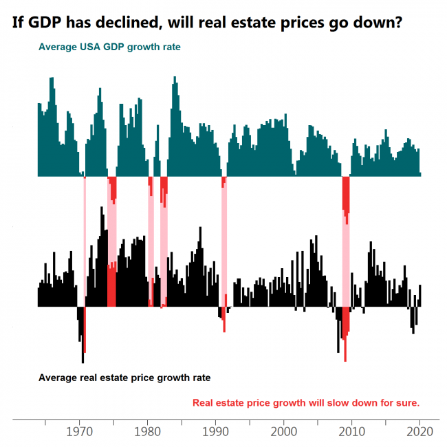
Every drop in GDP is followed by a decline in real estate prices or at least a significant slow down in growth with the most obvious case at the beginning of ’80s.
What: Moving average of quarterly USA GDP growth (GDP in billions of chained 2012 dollars, seasonally adjusted) and moving average of quarterly median sales price of houses sold in the United States. When: 1964Q1 – 2020Q1 Where: USA only. Source: FRED
Often when the market turns red there is at least a dip in GDP growth. However, there are cases when this does not happen.
What: Moving average of quarterly S&P500 index growth and moving average of quarterly USA GDP growth (GDP in billions of chained 2012 dollars, seasonally adjusted) When: 1948Q1 – 2020Q1 Where: USA only, because S&P is populated by mostly American companies. Source: Yahoo Finance for S&P500 and FRED for GDP.
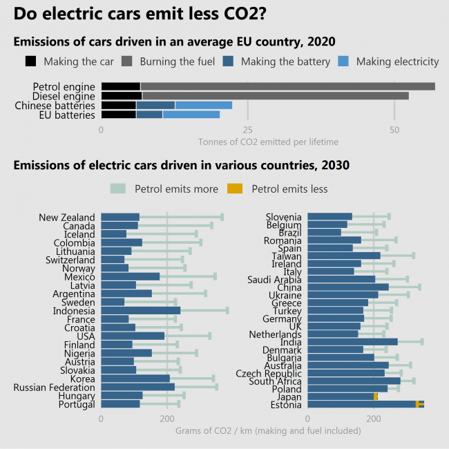
Many people still have doubts about whether the lower emissions of driving an electric car outweighs the additional impact on the environment caused by manufacturing the batteries.
Two studies (the latter is more trustworthy than the former) show that electric cars do help to reduce the CO2 emission. But how much – it depends. If the batteries are produced in a country where the industry is polluting more (China), reductions will be lower. If the car is driven in a country where electricity is produced by burning things (like Estonia or Poland) the reductions will be lower or even negative. A special case is Japan, where cars are so fuel-efficient, that electric cars even raise emissions.
So, YES, electric cars are more often better than not.
What: Top = Lifetime emissions of cars in tonnes of CO2. Bottom = Lifetime emissions of cars in grams of CO2 per 1 kilometer. When: Top = Estimate for 2020, Bottom = Estimate for 2030 with “current technological trajectory” scenario. Where: Top = EU countries, Bottom = selected countries of the world. Source: Top = European Federation for Transport and Environment, Bottom = Knobloch, F., Hanssen, S., Lam, A. et al. Net emission reductions from electric cars and heat pumps in 59 world regions over time. Nat Sustain (2020). https://doi.org/10.1038/s41893-020-0488-7
The good news is that we are really reducing poverty. Fewer and fewer people live for 1,90 dollars a day, fewer and fewer experience hunger, fewer and fewer experience struggle to get water.
The sad news is the realization that behind nice world trends there are still countries where one-third of the total population are poor, experience hunger and struggle to get water. And even worse – while over 40% of people in low-income countries don’t have access to BASIC drinking water service, 73% don’t have access to SAFE drinking water service.
But we’re reducing. There is still much to achieve and let’s hope for the best.
What: Very poor people = Poverty headcount ratio at $1.90 a day (2011 PPP) (% of population), Hungry people = Prevalence of undernourishment (% of population), People not having water = People not using at least basic drinking water services (% of population) When: Improvements by income class are shown between 2000 and 2017 with possible deviations a year or two for different category combinations. Where: Total world + the world divided into 4 income groups by the World Bank. Source: WB
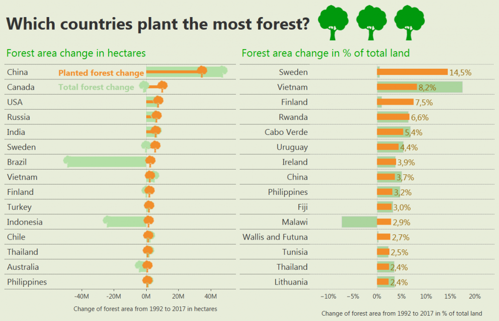
If we measure total hectares, then China is leading, followed by Canada, USA, Russia and India. Those countries are big, that’s why they manage to plant a lot. However this “planting” appeared to be a bad measure of how “forest loving” a country is because Brazil and Indonesia are significantly reducing their total forest area.
If we take the percentage of total land, then Sweden is leading, they planted 14,5% of their land area with trees. I even googled to see if this enormous number could be real, and seems it is, they even achieved Guinness world record in plating. However, this planting is made only to recover for what IKEA used because the total volume of forests increased only a bit in Sweden. It seems that Finland has quite a similar situation.
What: Planted forest and total forest area changes When: 1992 to 2017 Where: Top 15 by each measure. Some countries are not included, because for 1992 they did not have existing data, e.g. Czech and Slovak republics were still Czechoslovakia. It might be possible that one such country could appear in the top 15 by %. Source: FAO
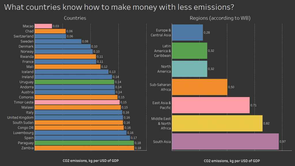
It’s a weird graph where poor African countries go together with rich European countries – Chad and Switzerland, Rwanda and France. It tells us, that some countries switched to less energy-consuming more intellect-consuming businesses, so they can reduce emissions, but others have not yet arrived at the stage where smoking chimneys power the growth. Will they manage jump over that stage? Will they manage skip factories and dive directly into developing apps or life-coaching blogs?
What: CO2 emissions (kg per 2010 US$ of GDP) – I don’t really get is it GDP in 2010 USD, or is it just 2010 GDP everywhere. But I hope it’s the former. When: 2014 Where: 25 countries of the world with the lowest value. Source: WB
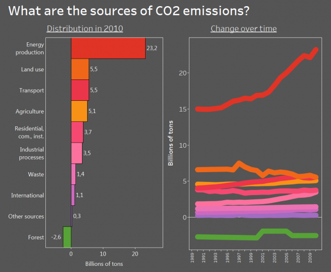
I know, the data is old, but back in 2010 energy production was the main source of CO2 and other greenhouse gas emissions. Transport had the potential to overtake the land use and I bet despite all those electromobiles everywhere it did.
And the beautiful thing is – the forest is a net absorber of greenhouse gas! I knew it all along, but it is nice to see it on the graph. And it’s depressing at the same time because its absorption is tiny compared to our emissions.
What: Emissions of various greenhouse gasses (CO2, CH4, PFCs and so on) expressed in the equivalent of CO2 emissions. May not the question mislead – initially I asked about CO2, but then I found stats for all greenhouse gases. “Land use” is emissions by cropland and grassland and is not included in agriculture. “Residential, com., inst.” is emissions by residential, commercial and institutional activities. I believe the weird shape for the forest is due to inconsistency in data rather than actual changes. When: From 1990 to 2010 Where: World aggregate Source: FAO
But of course it’s Northern and Western Europe! What surprises me in this graph, it’s that Central Asian countries are relatively safe, Tajikistan being among the safest!
And the least safe is Latin America – or maybe it’s just a low number of Venezuela dragging all of them down.
What: Law & Order Index, which was calculated after telephone and face to face interviews, asking questions like “Do you feel safe walking alone at night in the city or area where you live?” and similar. When: 2019 Where: 141 countries of the world Source: Gallup
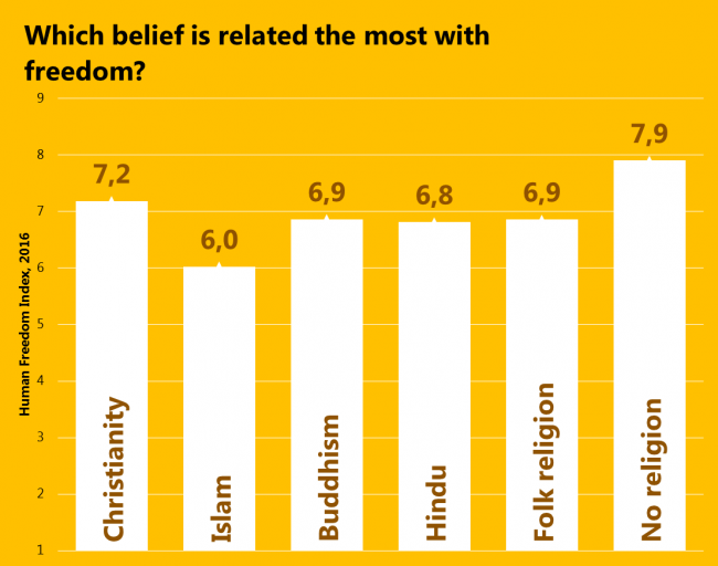
Since the freedom of religion has decreased since 2008, let’s see how beliefs themselves relate to freedom. Again, people living in the least religious countries are the freest, and those living in Islamic countries are the least free. There is a tiny nuance, that Christianity and “No religion” is the most common pair of significant beliefs in a country, so, they’re quite related. However, the second most common pair is Christianity and Islam.
What: Average Human Freedom Index by belief. It was calculated only for those countries where followers of a particular belief make more than 10% of the population and it was weighted by that percentage. Judaism and “Other beliefs” were excluded because they had only 1 country complying with such criteria. When: 2016 for Freedom 2020 for religion (it’s an estimate) because the latest actual data were of 2010. Where: 147 countries of the world. Source: Pew Research Center and The Human Freedom Index 2018: A Global Measurement of Personal, Civil, and Economic Freedom
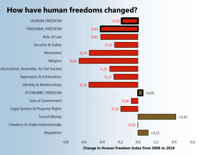
The Human Freedom Index consists of many subindexes covering various areas of people’s personal and economic life. After seeing that the average Human Freedom index of the world has decreased I decided to check what subindexes decreased the most and what increased. So, the winner is the “Sound Money” index which means, that money are safe from inflation and people can have foreign currency accounts. The loser is the “Religion” index, which mean that people have less freedom to establish and operate a religious organization.
What: Human Freedom Index – differences between subindex averages in 2016 and 2008. When: 2008 and 2016 Where: 162 countries Source: The Human Freedom Index 2018: A Global Measurement of Personal, Civil, and Economic Freedom
P.S. I must agree, those patterns on bars are terrible.
That’s rather disappointing. We talk a lot about same-sex marriage, which is allowed in more and more countries, but the overall situation is becoming worse.
Sadly the latest data is not very fresh, it’s 2016.
P.S. The word “freeer” is amazing, it has three consecutive letters “e”. Too bad it is not in the dictionary.
What: Human Freedom Index – the difference between regional averages in 2016 and 2008. When: 2008 and 2016 Where: 162 countries grouped into regions Source: The Human Freedom Index 2018: A Global Measurement of Personal, Civil, and Economic Freedom