↓
 

chart planet

data-human interaction

chart planet

data-human interaction

  • blog
    • dashboard design
    • data visualisation
    • Power BI asteroid
    • reviews
  • visuals
    • charts
    • interfaces
  • LT
    • grafikai
    • apie duomenų vizualizaciją
  • inspirations
  • talks
  • about

Tag Archives: Safety

Are we sure, that more development means more safety?

chart planet Posted on 2020-01-17 by Chart Planet2023-03-18
Are we sure, that more development means more safety?

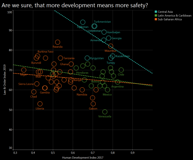
I was sure that I will get the obvious result again – more development will mean more safety. However, after cherrypicking some regions and drawing a trend line for each, I got the opposite result. Central Asia seems to follow exactly the opposite trend, and Latin America with Sub-Saharan Africa seems to be quite chaotic.

What: Law and Order (L&O) Index compared to Human Development Index (HDI)
When: 2019 for L&O and 2017 for HDI
Where: 63 countries from Central Asia, Sub-Saharan Africa, Latin America & Carribean, which have both indices.
Source: Gallup for L&O and UNDP for HDI

Posted in charts | Tagged Safety, Scatterplot, Tableau

Does limited freedom make people feel safer?

chart planet Posted on 2020-01-15 by Chart Planet2023-03-18
Does limited freedom make people feel safer?

After seeing Tajikistan and Azerbaijan among the safest countries I expected to see a U shaped distribution where both free countries and suppressed countries enjoy order and stability. However there is a clear line where freedom increases together with law and order, and many exceptions from the trend scattered around.

Also, many regional patterns are visible – blue Europe being at the top left corner, orange Africa and Middle East leaning towards bottom right, and green Latin America – towards bottom left.

What: Law & Order (L&O) Index compared to Human Freedom Index (HFI)
When: L&O is 2019 and HFI is 2016, both are most recent indices available at the moment of making the graph
Where: 135 countries of the world, that have both indices. For example, there is no Afghanistan on this graph because it does not have an HFI index calculated.
Source: Gallup for L&O and “The Human Freedom Index 2018: A Global Measurement of Personal, Civil, and Economic Freedom”

Posted in charts | Tagged Safety, Scatterplot, Tableau

What world regions are the safest?

chart planet Posted on 2020-01-13 by Chart Planet2023-03-18
What world regions are the safest?

But of course it’s Northern and Western Europe! What surprises me in this graph, it’s that Central Asian countries are relatively safe, Tajikistan being among the safest!

And the least safe is Latin America – or maybe it’s just a low number of Venezuela dragging all of them down.

What: Law & Order Index, which was calculated after telephone and face to face interviews, asking questions like “Do you feel safe walking alone at night in the city or area where you live?” and similar.
When: 2019
Where: 141 countries of the world
Source: Gallup

Posted in charts | Tagged Bar chart, Safety, Symbol map, Tableau

subscribe to blog posts

Please check your email to confirm subscription

linkedin fb bluesky instagram tableau sessionize rss
MJDC privacy policy
↑
Cookies are used on chart planet.