↓
 

chart planet

graphic insights about the world we live in

chart planet

graphic insights about the world we live in

  • charts
  • dataviz ideas
  • LT
    • LT grafikai
    • LT skaitymai
  • links
  • about

Tag Archives: Symbol map

Are there any places where the climate is recently getting colder?

chart planet Posted on 2021-04-14 by Chart Planet2021-11-20

The question arises because we’re having Climate Change and not Global Warming.
Only 6 weather stations in the world have a statistically significant negative temperature trend since 2000.
Most of them are located around the equator, one is in Antarctica.
There are 391 weather stations that have at least 5 full years of data since 2000 and which have a significant trend (p-value is less than 5%).
In 385 of those stations, the temperature is rising.

When: 2000 January – 2020 December.
Where: Weather stations that have at least 5 full years of data during the period in question and have a significant regression coefficient (p-value < 5%).
Source: Global Historical Climatology Network-Monthly (GHCN-M) temperature dataset https://www.ncdc.noaa.gov/ghcn-monthly

Posted in charts | Tagged Bar chart, Climate, Dot chart, R, SVG editing, Symbol map

What countries are the happiest and what the saddest?

chart planet Posted on 2020-02-03 by Chart Planet2021-05-30
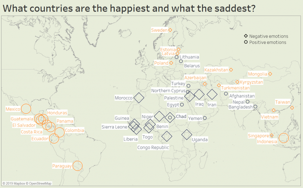
What countries are the happiest and what the saddest?

This time I am talking about daily positive or negative emotions, not the long-term reflection on life. This map shows top and bottom countries according to Positive Emotions index (circle) and Negative Emotions index (rectangle). Most of positive emotions (big circles) are in Latin America – they’re so happy and excited. Most of negative emotions (big squares) are in Africa – they’re so sad and depressed. Countries with low negative emotions (small squares) are spread across Eurasia – those people are chillin’. Countries with low positive emotions (small circles) are spread from Central Europe through the Middle East to South Asia. Those people are bored. Chad happens to be both high on negative emotions and low on positive, probably it’s the unhappiest place on the world.

What: Positive and Negative emotions indices based on more than 151,000 interviews with adults in more than 140 countries.
When: 2018
Where: 44 countries of the world.
Source: Gallup, The 2019 Global Emotions Report

Posted in charts | Tagged Happiness, Symbol map, Tableau

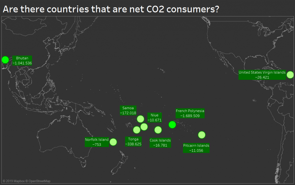
Are there countries that are net CO2 consumers?

chart planet Posted on 2020-01-22 by Chart Planet2021-05-30
Are there countries that are net CO2 consumers?

Since the forest is a net CO2 consumer, maybe there are whole countries covered in forests consuming CO2? Apparently, there are such countries, but they are tiny idyllic worlds mostly spread in the Pacific Ocean with happy exceptions of Bhutan (just beside the world’s largest polluter China) and US Virgin Islands (just beside the world’s second-largest polluter the USA).

What: Emissions of various greenhouse gasses (CO2, CH4, PFCs and so on) expressed in the equivalent of tons of CO2 emissions.
When: 2010
Where: The only nine countries with negative emissions at that time.
Source: FAO

Posted in charts | Tagged CO2 emissions, Symbol map, Tableau

What world regions are the safest?

chart planet Posted on 2020-01-13 by Chart Planet2021-05-30
What world regions are the safest?

But of course it’s Northern and Western Europe! What surprises me in this graph, it’s that Central Asian countries are relatively safe, Tajikistan being among the safest!

And the least safe is Latin America – or maybe it’s just a low number of Venezuela dragging all of them down.

What: Law & Order Index, which was calculated after telephone and face to face interviews, asking questions like “Do you feel safe walking alone at night in the city or area where you live?” and similar.
When: 2019
Where: 141 countries of the world
Source: Gallup

Posted in charts | Tagged Bar chart, Safety, Symbol map, Tableau
fb fb rss rss rss
©2022 - chart planet
↑