
Which data visualisation do you want to learn?
Data visualisation is not a uniform field, however after visiting some data visualisation conferences it may seem so. Seems that Data Journalism is THE data visualisation. Actually, different flavours of data visualisation are so distinct, that best-practices and rules of thumb that applies to one of them will be frowned upon if used for another one. Best works in one flavour would be ridiculed if displayed among another one, and additional skill sets needed for them are coming from very distinct fields.
In this article, I will offer a list of those data visualisation flavours, will explain what each of them is unique about. This way you will be sure which ones to pursue, which materials you need to check if you want to master that one specific flavour.
Keep in mind that flavours are not different forms of data visualisation. At the end of this article you will see that multiple flavours produce infographics and interfaces (also known as dashboards), but every time those infographics and interfaces have … well … a different flavour.
So, here is the list. Time to choose your favourite flavour.
Infographics and Data Storytelling
This flavour is often referred to as Data Journalism. We can consider Data Journalism as the flagship of all data visualisation, due to simple reason that most prominent names in dataviz (like Alberto Cairo) are working in this area.
Infographics and Data Storytelling is mostly used in news outlets, digital and printed, to explain various topics or tell stories about things or events, together with or instead of text articles. This kind of work can be found in other places as well, that is why “Infographics and Data Storytelling” is a more inclusive name than “Data Journalism”. It’s not always journalism.
The goal of practitioners of this flavour is usually to inform and educate people, just as usual journalists would do.
Visualisations themselves can take several forms in this flavour. Infographics are static combinations of charts, texts, images on a single topic. Data Storytelling here typically takes the format of Scrollytelling – where information is presented gradually by scrolling down, or it could be a more traditional form of article – just infused with charts and graphs. Frequently they end up with “Exploratory interfaces” as I would call them (or little dashboards) which allow users to explore information on their own or play with some scenarios.
Since those visualisations are custom-made bespoke creations and they’re provided in news outlets which make money by grabbing attention – they are often attention grabbing. They have outstanding flashy visuals, a spark of experimentation here or there, which might become an innovation, or a hated and debated piece.
Most data visualisation conferences are overwhelmingly filled with Data Journalism practitioners talking about their work, and rightfully so, because their work usually is the most innovative and boundaries pushing. Talks on “how I did this project” are frequent, just because there is always something nice to display, and the final result is typically public, does not contain any confidential data.
Data visualisation specialists working in this flavour often have to understand cutting-edge visualisation and web technologies, for not crashing a website with their cool viz and also know how to do journalism, storytelling and graphic design. It is not only about charts, it’s about every type of illustration you could think of. The great data visualisation book “The Functional Art” by Alberto Cairo does not focus on charts at all.
Regarding tools, they have to be highly customizable, since most visualisations are custom, created from scratch. D3.js library is popular for interactive visuals, and Adobe Illustrator, which is just a simple illustration software not dedicated to dataviz at all – this one is used for static visuals. But you can expect many more different tools – they use whatever is out there.
Usual collaborators are editorial teams which include, obviously – journalists, but then web designers, motion designers, video editors and all other kinds of people who could be involved in producing a piece of news. All the skills needed for a good Data Journalism piece are rarely in one person.
There are plenty of resources if you want to dive deeper into this flavour. For start, I would recommend books by Alberto Cairo, especially the already mentioned “The Functional Art” which captures the essence of the practice of Infographics.
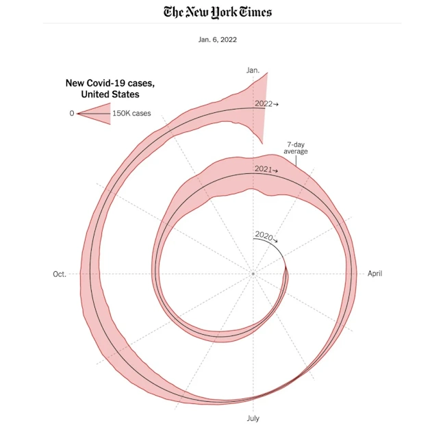
Below is an example coming from The New York Times with an illustration of Covid-19 cases. Back in the day, it was discussed and vivisected by everyone. Some consider it to be an outrageous failure. Some defend the innovation and memorability.
I started this website as Infographics and Storytelling journey trying to explain topics in economics and other social sciences by displaying custom-made one-off visualisations educating people (and myself) on various questions. Below is an example of an attempt to explain what is the place of ASEAN economic union in the world and how it is changing.

Scientific Visualisations
Scientific Visualisations are often similar to those of Infographics and Data Storytelling, but they take one step further towards accuracy and one farther from aesthetic appeal. They are created for scientific purposes – publications, analysis, research, argumentation, and explanation.
The goal of Scientific Visualisations is to explain a phenomenon, or make it intuitively visible, as accurately as possible. For example, rendering the image of a black hole based on the data that multiple sensors have collected. Or represent the vibrations in gravitational field before the merger of black holes as a sound. For the purpose of this article, I will consider sonification as a form of visualisation because in some areas a lot of data represent waves – and sound is a very natural way to show waves.
The forms visuals might take could be Infographics, even though they will be more precise, less attention grabbing, and straight to the point. Another form is an Exploratory Interface or a Dashboard – which would allow to tweak parameters to see possible outcomes of a process. However, the basic and most common form would probably be an Illustrated Article where text is accompanied by charts which are an integral part of the publication, not a decoration.
As you already guessed, the visual style is just bare-bones charts and graphs, without embellishments, because the focus is on data and on precision. If some error bars overlap – we’re having a discovery – we must be careful.
However, sometimes Scientific Visualisations take a lighter, more friendly tone when they are used for explaining concepts of science for general public or children. Then we are somewhere at the edge between Data Journalism and Science, but so are all those pop-science articles.
The skills needed for this flavour vary between mundane tools like Excel if you just want to do publication about economics, to very sophisticated custom coding and even custom hardware if you are doing some experiments at the edge of our knowledge. This might overlap with the obscure flavour I will discuss the last. Obviously, you need to understand the underlying science you’re visualising.
Colleagues for scientific visualizers might be other researchers, scientists, specialists, or engineers.
The only resource I currently know for this flavour is a book by Jan Christensen “Building Science Graphics“. You will see how much Infographics heavy this flavour is.
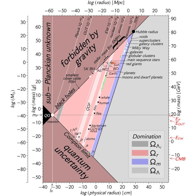
Below is an example by Charles H. Lineweaver and Vihan M. Patel visualising all the objects of our universe that ever existed, possible and impossible in a single chart. Even though it looks like an infographic with some interesting relatable stuff like flea, human and whale indicated, the underlying logic is based on robust science, and follows best and worst practices of Scientific Visualisations very well.
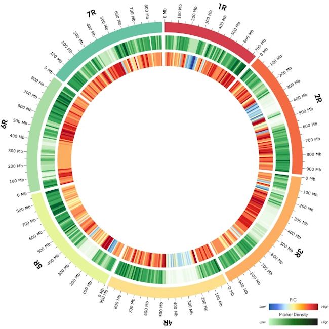
Another example looks like a Data Art project but actually shows distribution of 244,463 informative 600 K SNP array markers in 180 Nordic Seed hybrid rye breeding lines along the ‘Lo7’ reference genome in 10 mb bins. (Source: nature.com) Welcome to the world of beautiful genomic data visualisations!
I was involved a lot in simple scientific visuals because I studied economics, which is a chart heavy science. Many things that take a lot of effort to explain in words can be explained much more easily with charts. That was my first serious encounter with charts.
Business Intelligence and Analytics
Business Intelligence and Analytics (BI) is probably the most numerous flavour according to the surveys of Data Visualization society, because of how often specific BI tools are mentioned!
The goal of BI practitioners is to provide access to data for business end-users. This access can be provided in a form of a tidy data model, where the end-user can create their own visuals, an AI Agent – so the user can ask questions directly, or by providing Interfaces (Dashboards) which automatically highlight data points that need attention.
BI visuals are quite standard and there is not much space for artistic expression. Especially, if they are made with common tools – anyone at least with some experience will immediately say if a dashboard is made with Tableau or Power BI. Since Dashboards are quite similar to websites in terms of usability, they suffer from the digital sameness epidemic, where everything that follows the same best-practices looks the same. Therefore, you will rarely see a Dashboard presented in a data visualisation conference. Not much to see there! Another reason, why you rarely see them outside of work –they display confidential information, you cannot walk around showing off your work to everyone.
But hey, things are not that bleak here, there are plenty of opportunities for innovation and visual expression, albeit, not too artistic. Practitioners often invent new ways of automatically highlighting the data, navigating the report, the latest trend is trying to make a report in dark mode, which is quite challenging! Ultimately, creating a really accessible dashboard requires a lot of creativity.
Current innovation with AI hits Dashboards really hard because everyone talks about “chatting with your data” and “dashboards are dead”, however I believe this will be a mere transformation, and dashboards will die as Excel died. Hint – it didn’t.
Are Dashboards the only form of data visualisation that BI practitioners create? Well, all the PowerPoint presentations are a different flavour (I’ll explain later), and if you embed Power BI in PowerPoint it does not necessarily make it a Data Presentation, it might still be a Dashboard. The only other thing I could think of are Spreadsheets, but if we say that both Dashboards and Spreadsheets fall in a broader term of data exploration Interfaces – the ones which DJs (Data Journalists) also do – then yes, Interfaces are the only thing that BI people do on visual level. There are many other things they do to get data in the first place.
Obviously, BI practitioners have to understand the business itself, but more important are the intricacies of data engineering, while being fluent in SQL code is a must. I wouldn’t say that about Python, you can survive and thrive without Python, especially in the vibe-coding era of AI. BI analysts often work as a bridge between business and the IT world, so communication skills unexpectedly have a major role. Finally, it is not commonly addressed, but User Experience design is crucial for making a great Dashboard. Wouldn’t say that about Storytelling, you can survive and thrive without it.
Most common BI tools are Tableau, Power BI, Qlik Sense. Occasionally, Dashboards are created using geographical visualisation tools like ArcGIS or even libraries like the D3.js.
The best friends of BI practitioners are data engineers, then there are a bunch of IT people caring about all the platforms, and finally business people, in other words – managers and casual employees.
Since this flavour is hidden from the general data visualisation public, it received little attention and little resources are available to learn. I would recommend a book Dashboards that Deliver by Steve Wexler, Andy Cotgreave, Amanda Makulec and Jeffrey Shaffer.
Below is a Dashboard page example from Big Book of Dashboards, another book written by Wexler et al. Very obviously, this was made with Tableau.
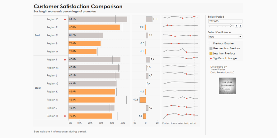
I know the most about this flavour because I work as a BI consultant. So, expect most articles in this website to focus on Business Intelligence and Dashboards, specifically made with Power BI.
Data Presentations
Here comes all those presentations prepared in corporate world that get to be presented just once. They might or might not have charts, but usually, they do, especially if we consider tables with visual aids as a form of visualisation. This is separate from BI because the flavour of visuals is really different, and people doing Dashboards and doing Data Presentations rarely overlap.
The goal of Data Presentations is to inform people about a certain situation or help them to decide, where persuasion might also be a form of help. Bear with me – not all presentations are made to persuade or inspire action! Sometimes they are just a form of status review, and often there is no action that should be taken. Such Data Presentations operate at the edge of BI – they might as well be considered a manually crafted Dashboard.
We can consider a Presentation a data representation form on its own, but the charts inside are usually quite elementary, except for frequent use of pie chart. However, visual embellishments are thriving – think about 3D, gradients, rounded corners, fancy icons and logos. Most visual stuff actually comes not in the form of charts, but more in diagrams, visual junk, generic soulless and sterile business illustrations and repeated oversized corporate brand imagery.
The number one skill needed for making a great Data Presentation is public speaking, this is where the data literally does not speak for itself. Of course, slides might be provided as handouts, or a report (which can be categorized as an Illustrated Article), then no speaking is required. But what is always important is the profound understanding of the topic, you cannot just show numbers without having no clue what they mean (as BI analysts often do). At least some understanding of graphic design basics is always beneficial. And this flavour benefits from data storytelling tremendously.
The most often used tools for this flavour are definitely Excel and PowerPoint, however some users embrace other technologies like Prezi. Other common options is to speed up chart making with add-ons like ThinkCell and Grunt.
To make a presentation an analyst usually has to collaborate a lot with other analysts often from different parts of the business, managers and other specialists to gather necessary information and to fill the gaps in their knowledge. Not much of IT is involved here, all happens via emails and manually copying and pasting numbers. Often, analysts have to fend off attempts of IT to interfere: “hey, we are going to make a custom tool for you so you don’t have to use Excel”. You have just suggested making a tool better than Excel. Are you kidding me?
The great resources for this task are books about data storytelling – the one by Cole Knaflic and the one by Kat Greenbrook. They focus on creating Data Presentations for business, and data visualisation is a necessary topic, however just a fraction of the book. Because it is not the key skill here.
Below is an example of a slide makeover – the goal is not to just show data, but help viewers to make a decision. Full article of the process and more such examples available in Storytelling with Data website.
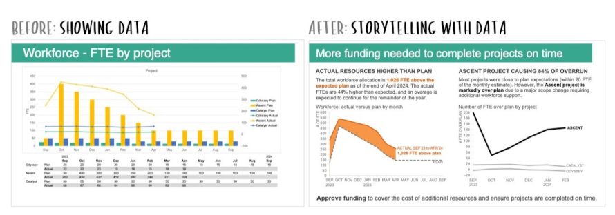
I have worked for years as a finance analyst, and have made plenty of Data Presentations and Reports with exploding 3D pie-charts, which I did on purpose – to over-inflate our market share. During this time, I learned a plenty of data visualisation techniques for obscuring the truth. That’s a skill in demand!
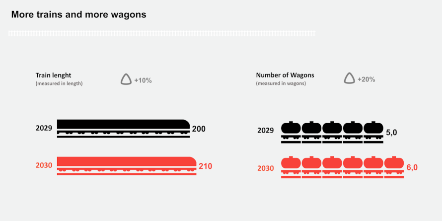
Below is an example of a slide I have done for a railway company. Such silly example is possible only in the serious world of business Data Presentations. This is a remake because the actual data is confidential.
Data Art
Data art is anything that uses data for creating a purely aesthetical piece. It might be very artistic data visualisation, displaying actual data, it might be generative art which uses generated random numbers to create shapes and images, or it might be a data inspired piece of art. My definition is quite broad, some people do not consider generative art as data art.
The goal of data art is like the goal of art. It is rather philosophical question where everyone can have opinion and all of them are fine. What do you think is the goal of art? Having fun for the creator? Expressing a message? Connecting with the audience?
The piece of Data Art can take any form the usual art can take. Data painting (an Infographic?). Data sonification. Data sculpture. Aren’t presentations by Hans Rosling an example of Data Theatre? Bar chart races done well can become true Data Movies!
The flavour of Data Art visualisations is definitely artistic. The primary goal is often not conveying cold-hard facts, but to convey warm-emotional facts, to make the reader feel and be inspired by the representation of data. Or just have an aesthetically pleasing outcome. So, as you might imagine, all the “data visualisation best practices” are thrown out of the window for the sake of creative expression.
The skills needed for Data Art depends on whether it is visual art – then visual skills are needed – understanding colours, visual rhythm. If it is sonic art or artistic data sonification – then sound engineering skills are needed. Both usually require some kind of coding. Common tool for data art is ggplot2 package for R programming language because of its flexibility and being part of statistical language where you can also calculate your random numbers. Other common options are D3.js library for JavaScript, and finally, Tableau that can be flexed enough to become a tool for art as well.
Art can be and often is an individual pursuit, especially if it is digital. However, it can also take physical form as of Data Sculpture, in such case the artist will collaborate with other artists or a team of a gallery where the piece is exhibited.
Also, there is a concept of “accidental art”, when something goes wrong with the code you have written, and the result is not the visualisation intended, but rather something that looks very creative and visually cool.
The resources for Data Art are those which spark creativity, and the book which sparks a lot of creativity is “Questions in Dataviz” by Neil Richards. That one raises questions about various aspects of data visualisation in a form of “Why don’t we just try it and see what happens?” It helps to unlearn some rigid stuff you have learned, and allow yourself to explore the field of visual possibilities. Which is necessary for data art.
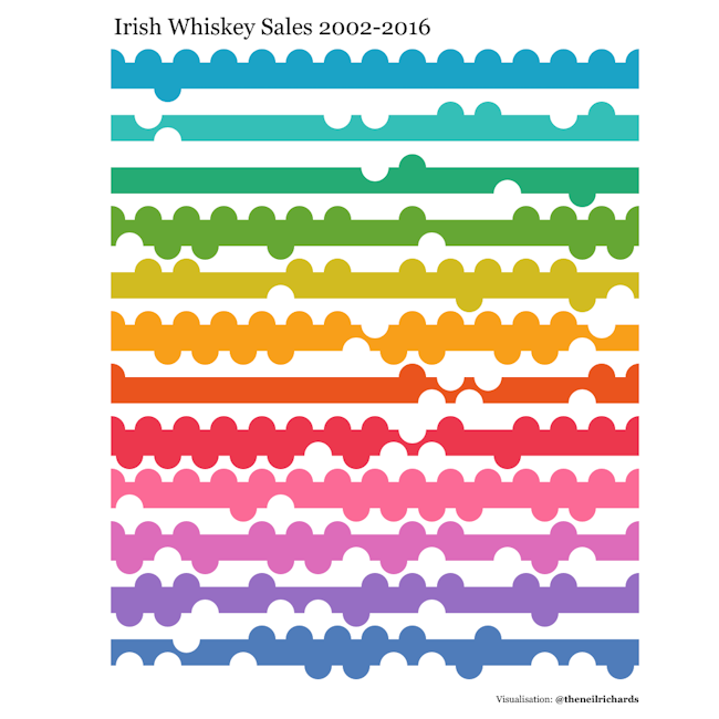
Below is an example from the book, considering “design driven visualisation” approach. The point is to first have a design concept in mind, then think about the way to encode data within the design concept, and finally – visualise the data. (See the interactive version here)
Another example below – a pure generative art by Tomas Lin Pedersen.

I have never been involved in data art project, the closest to it were several workshops at various conferences: one hosted by Mark-Jan Bludau, where we explored creative ways to visualize artist’s creative output, and another hosted by Alenka Guček and Martina Zunica from Journal Dataviz Challenge where we created artistic visualisations of mundane personal things.
Data Displays
Now it is time for ultimate obscurity. Usually, Data Art is discussed the last in similar articles or reviews because that one is considered to be far at the edge of observable universe. But after trying to make sense of the world of dataviz and drawing multiple Venn diagrams I have discovered something beyond: one more flavour, which is more ubiquitous and predates some other ones. This is the flavour of Data Displays. Think about car cockpit, hearth rate monitor or any physical device which shows data. Familiar, right? This flavour has significant physical and real-time undertones.
The goal of Data Displays is to display actual, mostly real-time information quickly and accurately for monitoring a process or checking a status. Unlike in BI Dashboards, there is often a focus on monitoring a single metric at a time.
The flavour of this one is even more strict than Scientific Visualisation, where accessibility is non-negotiable, and creativity is truly reduced. I was once discussing colours with someone working with medical devices, and they refused any variations on which colours could indicate negative things – because what if a doctor interprets that colour wrongly and delays a critical decision a fraction of a second? So, building on pre-existing habits of minds becomes essential. Compared to Business Intelligence, speed of reading the visualisation is even more important, but also there is an entirely different backend architecture feeding the data to the Display. It has to be real-time, connected to the stream of data. Otherwise, it just becomes an ugly static visual.
Data sonification becomes especially important because sonic clues are more powerful than visual ones. Sonic clues can wake you up. The heart rate monitor beeps, and if the temperature of a nuclear reactor reaches certain levels, there is an alarm.
Developing Data Displays might require way more knowledge of coding than any other flavour because these Displays might be just a frontend for complex things happening in the backed. In some cases, when visual display is integrated into a physical device, we might even need a knowledge of real physical engineering. Data visualisation knowledge also benefits creators of Data Displays, however the distilled essence is all what is needed.
What tools could be used to create Data Displays? They can be custom coded, if they are part of software, or mechanically engineered if they are part of hardware. They might benefit from the countless existing JavaScript libraries, which are often preferred over D3.js because of their simplicity and straightforward implementation. There are possibilities to do something like this with the infrastructure of Microsoft Fabric Real-Time intelligence, which is a separate stuff from Microsof Power BI, the BI tool. I believe other vendors have their own solutions for dealing with real-time data.
The team working on such products will consist of highly skilled coders and/or engineers. Expect to have more technical talk than anywhere else.
Regarding the resources – any data visualisation book focusing on basics would cover what is needed for this flavour. “Show me the Numbers” by Stephen Few would be something I would recommend, due to its technical nature it would appeal to this audience very well.
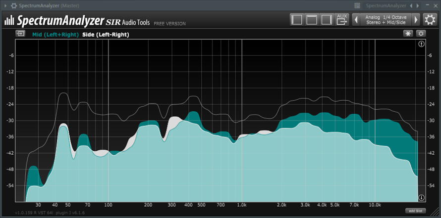
Below is an example of Data Display – a sound engineering plugin SpectrumAnalyzer by SIR Audio Tools which is configured to show difference of audio signal between Mid and Side. The area charts fluctuate in real time as the sound is plays.
Another example – mechanical Data Display created by Shimano – this one displays the current bicycle gear.

I have never worked on such a project, and I consider this a really high-end data visualisation inaccessible to play with for common mortals.
Where is Data Science?
Some might consider that Data Science is also a flavour of data visualisation. However, Data Science can use multiple flavours of data visualisation: to present findings to decision makers there will be a Data Presentation, to illustrate how your model works you might need to create a Scientific Visualisation, or maybe result are displayed in the form of interactive BI Interface where people can tweak parameters themselves. There is nothing that unites these forms besides the topic.
Welcome to Chart Planet!
Now you see how wide and varied the field of data visualisation is. I hope this helps you to figure out where you want to belong, make a choice, and most importantly, not get discouraged that you are not doing fancy Data Journalism stuff – there are other flavours where you can express yourself!
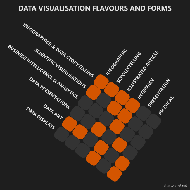
As you may have seen, some forms of data visualisation can have multiple flavours, for example Infographic can be useful in Data Journalism and Scientific Visualisations, while exploration Interfaces can be used across most of them. Also, some flavours can have multiple forms. While BI mostly focuses on creating Interfaces, Data Art can do most of them.
The visual below highlights the most common intersections. You wouldn’t see physical Business Intelligence dashboards as a common solution, but if you physically check stock levels at the warehouse – those piles of boxes work as a bar chart, aren’t they? Another example – a piggy bank on electronic scales where displayed weight gives an impression on how much cash you have! It’s possible, but rather impractical.
And the website you’re landed in – Chart Planet – cannot and is not covering all of them. Most articles in this website will be about Business Intelligence especially with Power BI, however most of the visual experiments are some kind of Infographics & Data Storytelling.