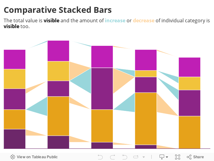
Chart idea: Comparative Stacked Bars
The Stacked Bar chart is one of my favourites, I even made the same stacked bar chart with 9 online tools – but it has one major weakness, it’s difficult to compare changes of its segments over time. I tried finding a way to improve it and here let me introduce the Comparative Stacked Bars:
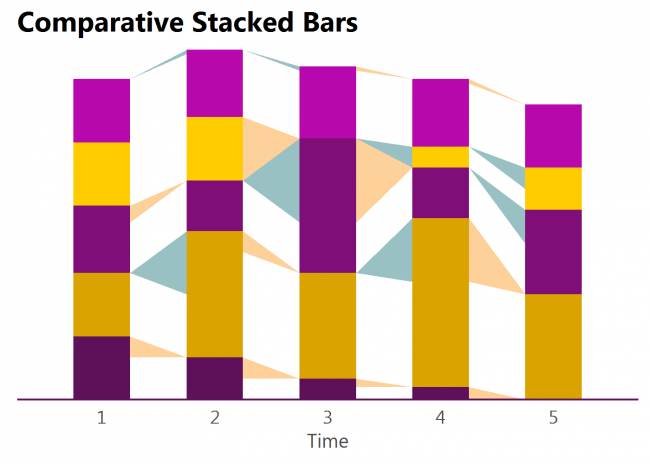
Triangles show the absolute increase or decrease of each segment. They are colour-coded to make it even easier to read.
It’s limitations:
- Too many is too many – if there are too many categories the triangles will make the chart look messy and difficult to read. But even more difficult it would be without triangles.
- Too small is too small – if the change is too small the triangle might become invisible. But without them, the changes would get invisible much sooner – just observe the top segment in the above chart.
The example above was made in R, and the example below was made in Tableau. Unfortunately I have no not-overly-complicated solution for Excel. If anyone knows how to implement it properly, please let me know!