↓
 

chart planet

insights design storytelling

chart planet

insights   design   storytelling

  • charts
    • charts EN
    • charts LT
    • applications
  • blog
  • blog LT
  • links
  • about

Post navigation

<< 1 2 3 4 5 … 8 9 >>

How free are different world regions?

chart planet Posted on 2020-12-09 by Chart Planet2023-03-18

The western world loves freedom a lot, with Northern Europe being at the top, whereas regions with predominantly Muslim populations have many restrictions and end up at the end of the (circular) list with low averages.

What: Freedom indices recalculated to fit the range from 0 to 1, where 1 means the best index and 0 means the worst (in 3 out of 5 cases – it’s North Korea). Simple averages were calculated for the regions.
Index, When, Source:
Democracy Index, 2019, EIU
Human Freedom Index, 2017, The Human Freedom Index 2018: A Global Measurement of Personal, Civil, and Economic Freedom
Economic Freedom Index, 2020, The Heritage Foundation
Moral Freedom Index, 2020, The Foundation for the Advancement of Liberty
Press Freedom Index, 2020, Reporters Without Borders
Where: 172 countries were ranked on at least 3 of these indices.

P.S. Radial representation is to make this chart more entertaining for its creator.

Posted in charts EN | Tagged Freedom, Interactive, Lollipop chart, R, Radial scatterplot

Is freedom consistent between fields?

chart planet Posted on 2020-12-07 by Chart Planet2023-03-18

Different freedom indices measure different fields of freedom – press, economy or general human freedom. Are they consistent within a country?

As we see from the 2nd segment of this chart – no, freedoms are not consistent. Economic freedom index is quite often much higher than indices of other freedoms, especially in those countries at the low end. I did my best to adjust the indices so their ranges are uniform, but their averages are still quite different – most countries love economic freedom, while many of them do not care much about democracy or moral freedom.

What: Freedom indices recalculated to fit the range from 0 to 1, where 1 means the best index and 0 means the worst (in 3 out of 5 cases – it’s North Korea). Country average is a simple average of all 5 indices.
Index, When, Source:
Democracy Index, 2019, EIU
Human Freedom Index, 2017, The Human Freedom Index 2018: A Global Measurement of Personal, Civil, and Economic Freedom
Economic Freedom Index, 2020, The Heritage Foundation
Moral Freedom Index, 2020, The Foundation for the Advancement of Liberty
Press Freedom Index, 2020, Reporters Without Borders
Where: 172 countries were ranked on at least 3 of these indices.

P.S. This chart reminds me a forest of mushrooms.

Posted in charts EN | Tagged Freedom, Interactive, Lollipop chart, Tableau

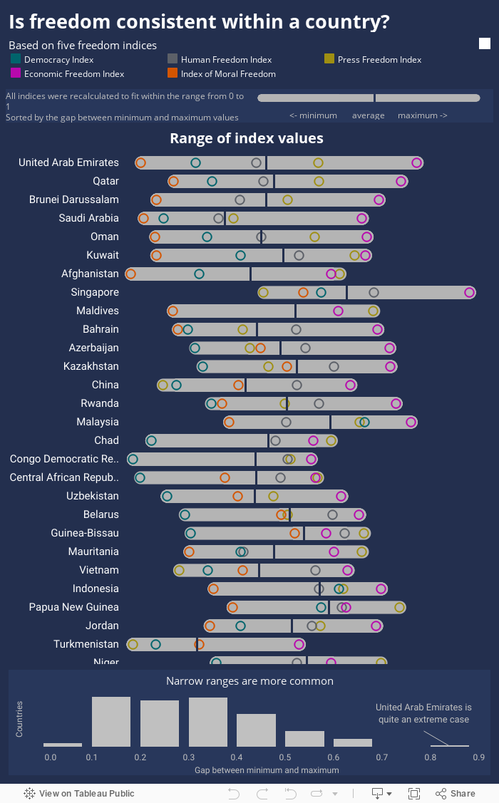
Is freedom consistent within a country?

chart planet Posted on 2020-12-02 by Chart Planet2023-03-18

I’ve found five freedom indices measuring various fields of freedom. The question is whether all those measures are consistent within countries, or do they vary a lot?

The answer is in the chart below the chart below – more often they’re consistent than not. Exceptions are in some Muslim countries which do not like moral freedom or democracy – those ratings are low, but they want high economic freedom – so this one particular rating is often high.

What: Freedom indices recalculated to fit the range from 0 to 1, where 1 means best index and 0 means the worst (in 3 out of 5 cases – it’s North Korea)
Index, When, Source:
Democracy Index, 2019, EIU
Human Freedom Index, 2017, The Human Freedom Index 2018: A Global Measurement of Personal, Civil, and Economic Freedom
Economic Freedom Index, 2020, The Heritage Foundation
Moral Freedom Index, 2020, The Foundation for the Advancement of Liberty
Press Freedom Index, 2020, Reporters Without Borders
Where: 172 countries were ranked on at least 3 of these indices.

Posted in charts EN | Tagged Dot chart, Freedom, Interactive, Tableau

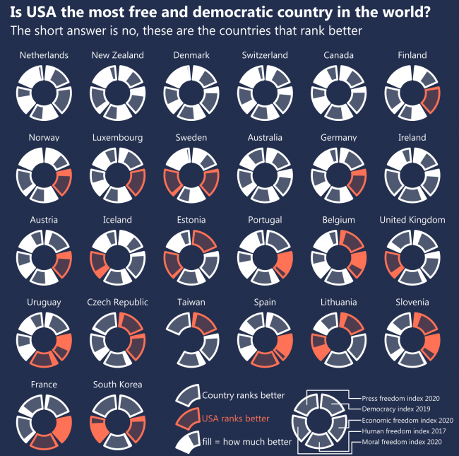
Is the USA the most free and democratic country in the world?

chart planet Posted on 2020-11-30 by Chart Planet2023-03-18
Is the USA the most free and democratic country in the world?

I checked five different indices of freedom and democracy provided by various researchers. My initial idea was to show the top 10 ranking countries of every index. However, the USA does not manage into the top 10 anywhere. So, I checked what countries rank better than the USA on those indices. Apparently its neighbour Canada, The Netherlands – one of the oldest democracies in the world, also New Zealand, Denmark and Switzerland rank better on all five indices. Countries like Estonia, Taiwan and Uruguay rank better on 3. Fund fact – the United Arab Emirates, one obviously not-so-free country ranks better than the USA on Economic Freedom Index.

So, If we talk about FREEDOM we talk about THE NETHERLANDS.

What: Difference in ranking compared to the USA on the following indices.
Index, When, Source:
Democracy Index, 2019, EIU
Human Freedom Index, 2017, The Human Freedom Index 2018: A Global Measurement of Personal, Civil, and Economic Freedom
Economic Freedom Index, 2020, The Heritage Foundation
Moral Freedom Index, 2020, The Foundation for the Advancement of Liberty
Press Freedom Index, 2020, Reporters Without Borders
Where: 172 countries were ranked on at least 3 of these indices.

Posted in charts EN | Tagged Country specific, Democracy, Post-design, R, Radial bar chart

What are the most dominating cities in their countries?

chart planet Posted on 2020-10-14 by Chart Planet2023-03-18
What are the most dominating cities in their countries?

San Juan metro area accounts for more than 3 quarters of the population of Puerto Rico. Same with the Kuwait City metro area in Kuwait.

What: Population distribution between the largest city, the urban area without the largest city, and the rural population. Metro area is meant by the largest city in most cases.
When: 2019
Where: Top ranking countries except one-city countries (like Singapore) from the whole world. Some countries with a total of 26 million inhabitants were excepted because they do not have needed statistics in the Worldbank database. Many of them are small, possibly one-city countries.
Source: Worldbank for numbers, Wikipedia for names.

Posted in charts EN | Tagged Demographics, JMP, Post-design, Stacked bar chart

Are the largest cities dominating their countries?

chart planet Posted on 2020-10-12 by Chart Planet2023-03-18
Are the largest cities dominating their countries?

There are countries where they do, with notable examples being Kuwait, Puerto Rico, Djibouti, Mongolia and Uruguay.

Since rural populations are declining everywhere, relative weights of urban populations, as well as those in the largest cities, are increasing, so largest cities now are more dominating than they were in the ’60s.

The most concentrated region seems to be East Asia, but that is because they have Hong Kong and Macao with almost 100% of people living in the only city.

What: Median proportion of the population in the largest city, the urban area without the largest city, and the rural population.
When: 1960 and 2019
Where: The whole world, with some exceptions having a total of 26 million inhabitants, the biggest being Botswana, Lesotho and Slovenia. Many of those exceptions are small, possibly one-city countries which do not have needed statistics in the Worldbank database.
Source: Worldbank

Posted in charts EN | Tagged Demographics, JMP, Line chart, Post-design

Is Europe reducing unrecycled waste?

chart planet Posted on 2020-09-30 by Chart Planet2023-03-18
Is Europe reducing unrecycled waste?

Whether the total amount of waste would decrease or increase, it would still be nice if amounts of UNRECYCLED waste decreased. If compared to 2004 it decreased, but if compared to 2010 it is increasing in spite of higher recycling rates.

What: Waste recycled or refilled in total waste generated.
When: 2004, 2010 and 2016
Where: Europe
Source: Eurostat

Posted in charts EN | Tagged Area chart, JMP, Post-design, Waste

Which type of waste is best recycled or refilled?

chart planet Posted on 2020-09-28 by Chart Planet2023-03-18
Which type of waste is best recycled or refilled?

Metallic and glass waste. It’s probably quite easy to reuse metal and refill glass containers.
The least recycled are mixed ordinary wastes of which almost half are generated by households (as seen in the previous chart).

May it be the motivation for sorting – if more mixed waste became recyclable waste, more would be … recycled.

What: Waste recycled or refilled in total waste generated.
When: 2016
Where: Europe
Source: Eurostat

Posted in charts EN | Tagged JMP, Post-design, Stacked bar chart, Waste

Which countries waste the most in Europe?

chart planet Posted on 2020-09-23 by Chart Planet2023-03-18
Which countries waste the most in Europe?

The industry giants do: Germany, France and the UK.

Somehow Bulgaria, Serbia and Estonia manage to produce lots of hazardous waste.

What: Waste generated, tonnes
When: 2016
Where: European countries (Turkey is here because it’s in the dataset)
Source: Eurostat.

Posted in charts EN | Tagged JMP, Post-design, Stacked bar chart, Waste

What kind of waste do people generate?

chart planet Posted on 2020-09-21 by Chart Planet2023-03-18
What kind of waste do people generate?

Mostly mineral and solidified wastes from business activities. Here goes waste from construction and demolition activities, combustion wastes, soils.
Mixed ordinary wastes are the second – almost half of it is generated by households.
The only type of waste where households produce more than half of the output is plastic.

What: Waste generated, tonnes.
When: 2016
Where: European countries
Source: Eurostat

Posted in charts EN | Tagged JMP, Marimekko chart, Post-design, Waste

Do richer countries produce more waste?

chart planet Posted on 2020-09-16 by Chart Planet2023-03-18

If the waste generated per GDP euro is compared to GDP per capita, then no trend is visible. Seems that required additional waste for additional euro per capita is more or less fixed (at least in Europe) except for 4 countries.

Math goes like this: to increase GDP per capita in 1 €, the total amount of waste should increase by w/(GDP per capita), where w is the current total amount of waste. Then the additional amount of waste is equal to (waste per GDP euro) * population.

What: Waste generated, tonnes per GDP euro & GDP, chain-linked volumes (2010), euro per capita
When: 2016
Where: European countries.
Source: Eurostat

Posted in charts EN | Tagged Contour plot, JMP, Waste

Do richer countries produce more waste?

chart planet Posted on 2020-09-14 by Chart Planet2023-03-18

If waste generated is compared to GDP (both per capita), then some positive trend is visible, but still there are too many outliers to draw conclusions. Amounts of waste each country generates depend on specific features of that country.

What: Waste generated, kilograms per capita & GDP, chain-linked volumes (2010), euro per capita
When: 2016
Where: European countries
Source: Eurostat

Posted in charts EN | Tagged Contour plot, JMP, Waste

Does self-observation help to improve?

chart planet Posted on 2020-08-05 by Chart Planet2023-03-18
Does self-observation help to improve?

This is my last data selfie for now.

I tracked down the time when I start my working day, what percentage of weekly goals I do achieve and whether I do many other daily routine things (meditation, exercise, proper meal, not checking social media after 6 p.m. etc.) which I aggregated into “Level of discipline”.

During the time of self-observation I began to wake up and start working earlier, I started to achieve more goals, but this “discipline” thing did not improve. I guess that trying to do many “useful” things during the day is not as useful and productive as it may seem.

What: Weekly average time of starting to work, the proportion of weekly goals achieved, and “level of discipline” measured in points. Moving averages are calculated using 5-week intervals. There are omissions in the data, as one may see.
When: 38 weeks during 2019-2020
Source: self-observation

Posted in charts EN | Tagged Bar chart, Data selfie, Line chart, Lollipop chart, R

Is discipline helping to be more productive?

chart planet Posted on 2020-08-03 by Chart Planet2023-03-18
Is discipline helping to be more productive?

This is another data selfie based on my own observation of myself.

I tracked down how disciplined am I based on how well I stick to my daily routine and also how much of weekly goals I do achieve. There is a visible positive correlation, but two facts leave me unconvinced that discipline is really useful: 1. When I am the least disciplined, my results are not really bad, at some weeks I even managed to achieve 100% 2. When I am the most disciplined, at some weeks I had results that are among the worst.

I guess that when I concentrate too much on those “daily routine” and “discipline” things I might be more motivated, but then I have less time for actual work on my goals. After those weeks of tracking my results, I dropped the effort to stick to the daily routine completely. And I believe I am as productive as I can be.

What: The proportion of weekly goals achieved and “level of discipline” measured in points. Discipline points are binned into arbitrary intervals, and the white gradient shows median at its brightest point.
When: 38 weeks during 2019-2020
Source: self-observation

My real goal here was to draw really “creative” chart even if it is hard to read.

Posted in charts EN | Tagged Boxplot, Data selfie, R

Is waking up earlier better?

chart planet Posted on 2020-07-29 by Chart Planet2023-03-18
Is waking up earlier better?

In this world of selfies I make data selfies. I documented my daily routine and weekly goals for 38 weeks and how I have some data to make conclusions on.

According to my own observations of myself the earlier I wake up and start working, the more weekly goals I achieve. Starting the work at 10 a.m. yields better results than at 9 a.m., but there were only 3 weeks when I woke up so late on average and even those were affected by a single day when I slept until noon after some kind of all-night activity.

When I wake up early my body and mind are ready to work at once – I’m definitely not an owl.

What: Weekly average time of starting to work, and the proportion of weekly goals achieved. Time is binned into intervals by 1 hour, and the proportion is averaged.
When: 38 weeks during 2019 and 2020
Source: self-observation

My real goal here was to draw really “creative” chart even if it is hard to read.

Posted in charts EN | Tagged Data selfie, R, Radial bar chart

Post navigation

<< 1 2 3 4 5 … 8 9 >>

subscribe to blog posts

Please check your email to confirm subscription

fb fb rss rss rss
©2023 - chart planet
↑