
Is it easy to replicate the default settings of one charting software in another charting software?
The question is it easy to replicate the default settings of one charting software in another charting software bothered me for some time. Are the default settings more universal or less universal? Do different vendors have different attitudes towards what should be the default setting?
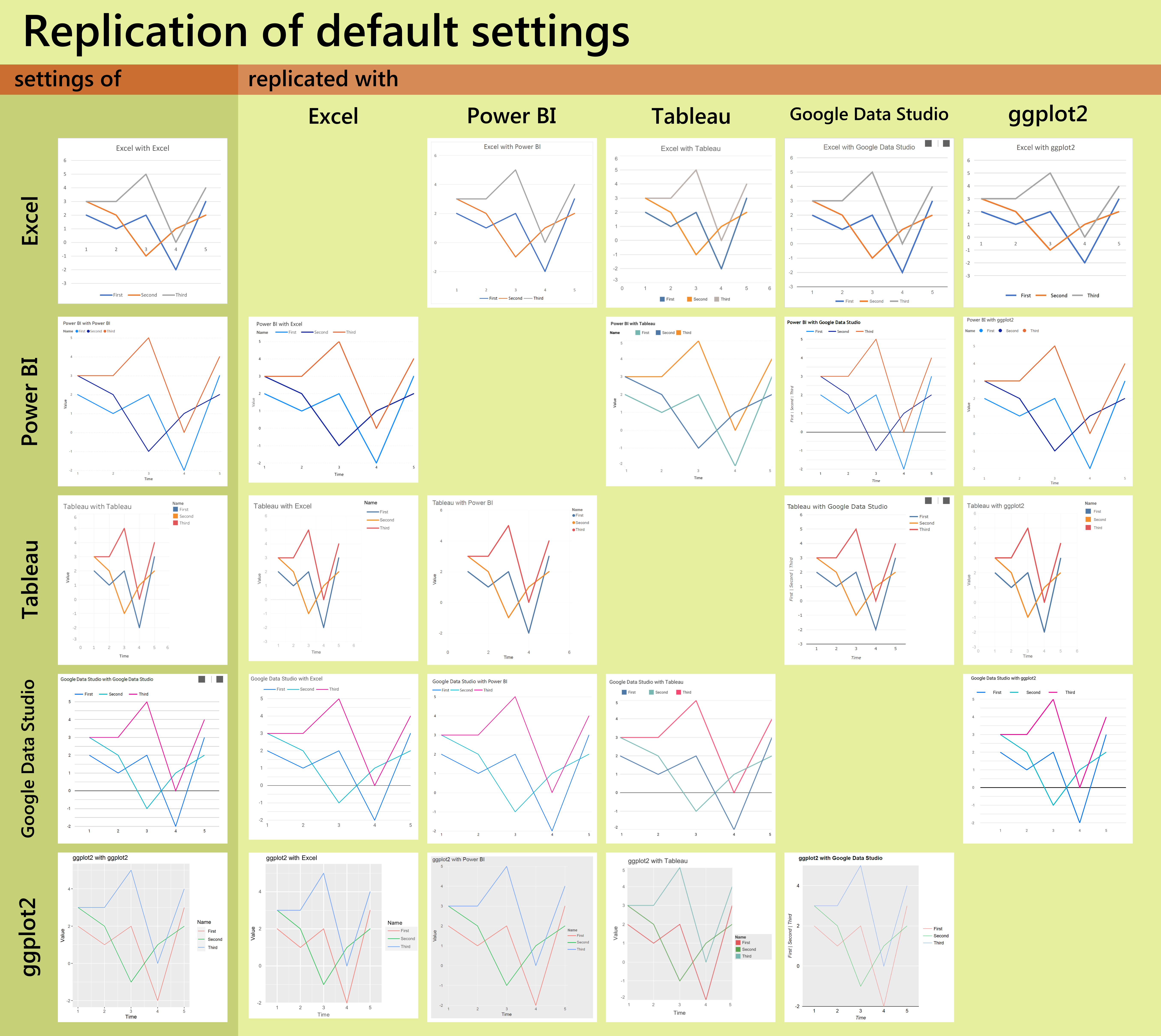
I chose to work with a line chart because different software interprets differently how to arrange multiple series in a bar chart – some tools stack them, some not. By adjusting this arrangement I would lose the defaultness, while without any corrections the charts would be less comparable. I made all charts squared, so they fit better in the grid.
This comparison does not include online tools like Datawrapper because a significant part of their settings are the interactions – tooltips, highlights, etc and here only static images are compared. I would like to include JMP, but my trial period has already expired. Python and Javascript libraries are not included, because I don’t know how to use them.
Insights about the defaults:
- All have horizontal gridlines, ggplot2 and Tableau have even vertical ones.
- Only Google Data Studio and Tableau have highlighted the zero line, although Tableau highlight is barely noticeable.
- Blue and red or orange are within the first three choices in every palette.
- ggplot2 looks exceptional with its grey panel.
- The default settings of Tableau make the least sense because they are configured for more charts with more legends. One chart with one legend looks a bit squeezed.
- Grey squares at the top right of Google Data Studio charts are how the control buttons are rendered as an image.
Insights about the comparisons:
- Of course, ggplot2 manages to replicate even the most complex cases. The biggest challenge was using Google font from Google Data Studio because the library”showtext” which seemingly allows achieving this does not work well with ggplot2.
- Settings of ggplot2 itself were the most difficult to replicate.
- Tableau was the only software that could not replicate the exact colours of lines, because a colour must be chosen from a predefined palette there.
- It was quite annoying that Power BI and Google Data Studio could only export to PDF, however they are not meant to make pretty pictures after all.
- Somehow square charts from Excel lost the squareness after saved as images.
- Google Data Studio insisted on a black line indicating zero and refused to show vertical gridlines. Maybe I just don’t know this tool well enough or maybe these are the limits.
- Adjusting the limits of the x-axis was always a challenge, the y-axis is often allowed for way more freedom.
- Adjusting legends was always the most difficult part. Legend is what distinguishes one tool from another.
I believe this exercise is of little use, but it was fun to do it!