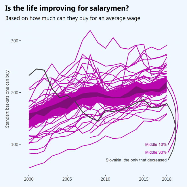
Based on how many average baskets of goods one can buy for an average salary while living alone and without children – yes, absolutely. There were wiggles after the crisis, but the overall trend is upwards – people can buy more and more stuff because salaries are increasing faster than prices.
The only sad exception in the period analyzed is Slovakia.
What: Annual net earnings divided by price level index which result in the number of standard baskets of goods one can buy.
The average wage is “annual net earnings of a full-time single worker without children earning an average wage” measured in Purchase Power Standards.
Price level index is made to be 100 in 2020 for the EU as a whole for a standardized basket of goods. It is tailored for cross-country comparison.
Data for OECD countries was estimated using “Price level ratio of PPP conversion factor (GDP) to market exchange rate” (provided by WB, very accurate estimates), and “Average annual wage in 2018 constant prices at 2018 USD PPPs” (provided by OECD, not very accurate estimates)
When: 2000 – 2018
Where: 39 countries from the EU and OECD.
Source: EUROSTAT, OECD, WB