
↓
 

chart planet

data-human interaction

chart planet

data-human interaction

  • blog
    • dashboard design
    • data visualisation
    • Power BI asteroid
    • reviews
  • visuals
    • charts
    • interfaces
  • LT
    • grafikai
    • apie duomenų vizualizaciją
  • inspirations
  • talks
  • about

Category Archives: charts

static or interactive charts or infographics

Post navigation

<< 1 2 … 6 7 8 9

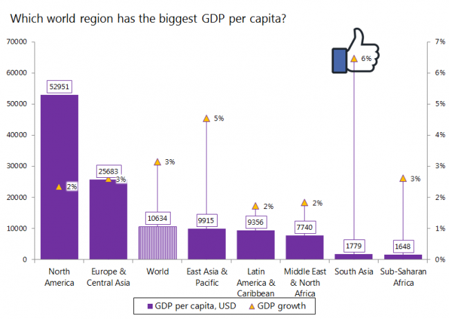
Which world region has the biggest GDP per capita?

chart planet Posted on 2018-10-31 by Chart Planet2023-03-18
Which world region has the biggest GDP per capita?

Of course it’s North America. But here what’s interesting – seems like South Asia is as poor as Africa (which is unexpected to me), but it’s growing much faster, 6% a year, whereas Sub-Saharan Africa – only 3%.

What: GDP per capita and GDP per capita growth.
When: 2017
Where: World regions according to WB
Source: WB
Posted in charts | Tagged Bar chart, Excel, GDP

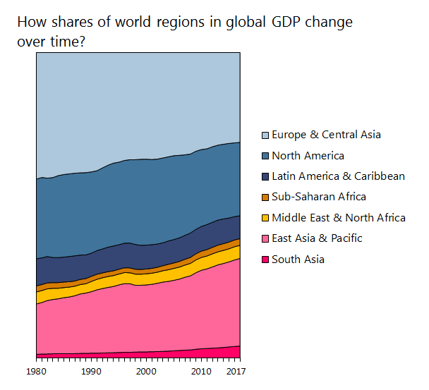
How shares of world regions in global GDP change over time?

chart planet Posted on 2018-10-29 by Chart Planet2023-03-18
How shares of world regions in global GDP change over time?

Seems like Asia’s economic power is growing and Europe’s is shrinking.

What: Shares in global GDP
When: 1980-2017
Where: World regions according to WB
Source: WB

Posted in charts | Tagged Area chart, Excel, GDP

Post navigation

<< 1 2 … 6 7 8 9

subscribe to blog posts

Please check your email to confirm subscription

linkedin fb bluesky instagram tableau sessionize rss
MJDC privacy policy
↑
Cookies are used on chart planet.