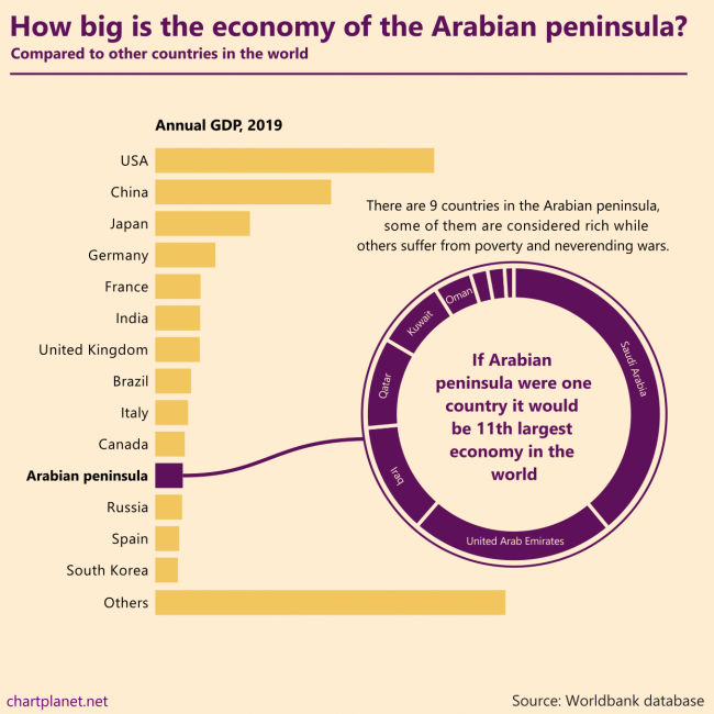
There are 9 countries in the Arabian peninsula, some of them are considered rich while others suffer from poverty and never ending wars. If the Arabian peninsula were one country it would be the 11th largest economy in the world.
What: GDP in constant 2010 USD When: 2019 Where: All the countries in the world. “Others” were calculated by subtracting the shown countries from the total world GDP estimated by Worldbank. Countries of the Arabian peninsula are Saudi Arabia, United Arab Emirates, Iraq, Qatar, Kuwait, Oman, Bahrain, Jordan, Yemen. Source: Worldbank database
ASEAN is an economic union of Southeast Asian countries. From 1999 to 2019 it experienced considerable growth becoming the 5th largest economy in the world if we count the EU as one unit as well. Indonesia is the biggest country in the union, but all of them contribute to growth, most growing their GDP by more than 5% a year during 1999-2019 with the only exception being Brunei.
For comparison: the annual average growth in the EU was 1,6% a year and in China, it was 9,0% during the same period. The current composition of the EU was used for the calculations.
What: GDP in constant 2010 USD When: 1999-2019 Where: All the countries in the world. “Others” were calculated by subtracting the shown countries from the total world GDP estimated by Worldbank. Source: Worldbank database
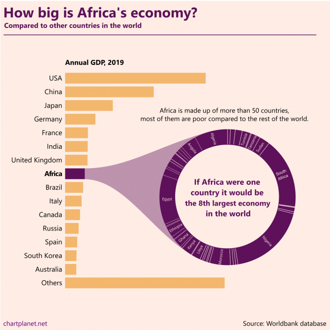
Africa is made up of more than 50 countries, most of them are poor compared to the rest of the world. If Africa were one country it would be the 8th largest economy in the world.
This chart is made without any numbers intentionally, they’d distract from the message. The ranking of the countries in the donut chart is “Algeria first”.
What: GDP in constant 2010 USD When: 2019 Where: All the countries in the world. “Others” were calculated by subtracting the shown countries from the total world GDP estimated by Worldbank. Source: Worldbank database
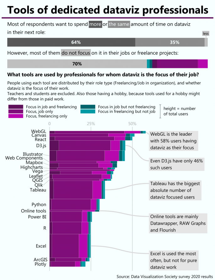
There are variety of tools to do dataviz and for someone who is just starting it is quite difficult to select which one to learn. One possible criteria might be whether this tool is used by professions focused on dataviz. R is focused on statistical analysis, Excel on spreadsheets, and python might be used for everything. So what is the tool which dedicated dataviz professionals use? The conclusion is that there is no such tool, because dataviz is more like a skill useful in many cases (financial reporting, UX design, journalism, etc.) rather than a profession by itself.
If you’re working in the financial department of a company or just dealing with financial data, you may be familiar with the Previous-Budget-Actual bar chart. It’s frequently used, occupying critical presentation and dashboard space, but sadly it lacks data density, contributing only three observations.
Managers rarely have time to thoroughly explore financial presentations, that is why you need to make as much information available as quickly as possible — an easily readable data-dense visualization serves this purpose well. In my pursuit to make denser bar charts, I found five techniques that I will share here:
Probably of the most often visualized datasets in the world are profit-loss statements of corporations month after month presented to executives in powerpoints. Millions of them are made and quickly thrown away faster than new Covid-19 case charts. It’s quite strange how few resources are there discussing visualizations of financial data.
Majority of those who do care about finance seem to favour waterfall charts (like this analyst) and for a good reason, because they provide insight a simple table does not have. Some utilize sankey or flow diagrams because they show flows of money in quite an intuitive way (cool example – a squared sankey in Tableau). Also, there are dashboards completely ignoring the specific structure of financial data – good (because it’s bad) example is this dashboard made by “somebody with good Tableau but limited finance knowledge” as said in one comment.
I consider myself as somebody with good financial knowledge so I tried finding a better way to visualize profit loss statement solving some limitations of waterfall and sankey charts:
waterfalls look much better when visualizing increases and decreases, but the distribution of revenues or expenses look weird done in this way.
sankeys simply cannot visualize negative results in an intuitive way
financial activity result is often presented as one line in profit-loss statements and might be positive or negative, so in a usual sankey diagram it would not have a fixed position independent of its value
And here is the result. Sankey is used for basic distribution of revenue or expenses and could be used for showing the further breakdown. The waterfall comes in after Operating profit is calculated and net results of financial and other activities are simply added and subtracted (in this specific case they’re tiny). Profit tax is again visualized as sankey, because usually, it has the same sign as profit. Also, mind the colours, black is used to show positive flows (revenue), blue (which is also provided in the brandbook of Amazon) is used for negative flows (expenses).
This approach allows for visualizing negative results as well. Where else could we look for companies with negative profits except the aviation industry! Here is the profit-loss statement of Lufthansa, a German air carrier. The visualization is a bit awkward at first, but once we get into the waterfall everything becomes simple and intuitive. Also, notice that profit tax is negative – it improves the result.
Of course this way to visualize profit-loss is far from perfect:
One issue is related to labels – when a rectangle is too small, the number does not fit inside. It is easy to solve, however – if labels are necessary they can be shown beside the names of categories.
Another issue is a comparison between time periods – this type of chart can show only one period. However some cross-company insights still could be made – just compare profit margins of Amazon with those of Aramco – the Saudi Arabian Oil Company:
I hope these charts will inspire further discussion about financial data visualization and more great ideas.
The western world loves freedom a lot, with Northern Europe being at the top, whereas regions with predominantly Muslim populations have many restrictions and end up at the end of the (circular) list with low averages.
What: Freedom indices recalculated to fit the range from 0 to 1, where 1 means the best index and 0 means the worst (in 3 out of 5 cases – it’s North Korea). Simple averages were calculated for the regions. Index, When, Source: Democracy Index, 2019, EIU Human Freedom Index, 2017, The Human Freedom Index 2018: A Global Measurement of Personal, Civil, and Economic Freedom Economic Freedom Index, 2020, The Heritage Foundation Moral Freedom Index, 2020, The Foundation for the Advancement of Liberty Press Freedom Index, 2020, Reporters Without Borders Where: 172 countries were ranked on at least 3 of these indices.
P.S. Radial representation is to make this chart more entertaining for its creator.
Different freedom indices measure different fields of freedom – press, economy or general human freedom. Are they consistent within a country?
As we see from the 2nd segment of this chart – no, freedoms are not consistent. Economic freedom index is quite often much higher than indices of other freedoms, especially in those countries at the low end. I did my best to adjust the indices so their ranges are uniform, but their averages are still quite different – most countries love economic freedom, while many of them do not care much about democracy or moral freedom.
What: Freedom indices recalculated to fit the range from 0 to 1, where 1 means the best index and 0 means the worst (in 3 out of 5 cases – it’s North Korea). Country average is a simple average of all 5 indices. Index, When, Source: Democracy Index, 2019, EIU Human Freedom Index, 2017, The Human Freedom Index 2018: A Global Measurement of Personal, Civil, and Economic Freedom Economic Freedom Index, 2020, The Heritage Foundation Moral Freedom Index, 2020, The Foundation for the Advancement of Liberty Press Freedom Index, 2020, Reporters Without Borders Where: 172 countries were ranked on at least 3 of these indices.
I’ve found five freedom indices measuring various fields of freedom. The question is whether all those measures are consistent within countries, or do they vary a lot?
The answer is in the chart below the chart below – more often they’re consistent than not. Exceptions are in some Muslim countries which do not like moral freedom or democracy – those ratings are low, but they want high economic freedom – so this one particular rating is often high.
What: Freedom indices recalculated to fit the range from 0 to 1, where 1 means best index and 0 means the worst (in 3 out of 5 cases – it’s North Korea) Index, When, Source: Democracy Index, 2019, EIU Human Freedom Index, 2017, The Human Freedom Index 2018: A Global Measurement of Personal, Civil, and Economic Freedom Economic Freedom Index, 2020, The Heritage Foundation Moral Freedom Index, 2020, The Foundation for the Advancement of Liberty Press Freedom Index, 2020, Reporters Without Borders Where: 172 countries were ranked on at least 3 of these indices.
I checked five different indices of freedom and democracy provided by various researchers. My initial idea was to show the top 10 ranking countries of every index. However, the USA does not manage into the top 10 anywhere. So, I checked what countries rank better than the USA on those indices. Apparently its neighbour Canada, The Netherlands – one of the oldest democracies in the world, also New Zealand, Denmark and Switzerland rank better on all five indices. Countries like Estonia, Taiwan and Uruguay rank better on 3. Fund fact – the United Arab Emirates, one obviously not-so-free country ranks better than the USA on Economic Freedom Index.
So, If we talk about FREEDOM we talk about THE NETHERLANDS.
What: Difference in ranking compared to the USA on the following indices. Index, When, Source: Democracy Index, 2019, EIU Human Freedom Index, 2017, The Human Freedom Index 2018: A Global Measurement of Personal, Civil, and Economic Freedom Economic Freedom Index, 2020, The Heritage Foundation Moral Freedom Index, 2020, The Foundation for the Advancement of Liberty Press Freedom Index, 2020, Reporters Without Borders Where: 172 countries were ranked on at least 3 of these indices.
Radial charts are far from best practices, so if a tool has them, we can consider it to be flexible enough. May this article serve you as a helpful reference.
The Stacked Bar chart is one of my favourites, I even made the same stacked bar chart with 9 online tools – but it has one major weakness, it’s difficult to compare changes of its segments over time. I tried finding a way to improve it and here let me introduce the Comparative Stacked Bars:
Triangles show the absolute increase or decrease of each segment. They are colour-coded to make it even easier to read.
It’s limitations:
Too many is too many – if there are too many categories the triangles will make the chart look messy and difficult to read. But even more difficult it would be without triangles.
Too small is too small – if the change is too small the triangle might become invisible. But without them, the changes would get invisible much sooner – just observe the top segment in the above chart.
The example above was made in R, and the example below was made in Tableau. Unfortunately I have no not-overly-complicated solution for Excel. If anyone knows how to implement it properly, please let me know!
The pie chart faces a tremendous amount of criticism for attempts to show part to the whole relations. Of course – it is easily the single most misused chart! However more and more data visualizations practitioners are writing articles to defend it with Robert Kosara being the most thorough and methodical in my opinion.
Here I will offer an alternative which is something like a mix of square pie chart, marimekko and packed bars. Let me introduce the Cake Chart:
It’s features:
Always a regular square, total area = 100%.
Each segment is a bar for easy comparison, but its area represents the percentage.
The height of the chart is distributed evenly among bars.
Only the selected number of largest categories are shown separately.
All other categories are aggregated into the irregular steppy gray area.
If there are 5 categories shown separately, then the largest cannot be larger than 100% / 5 = 20%. For X categories to be shown – the maximum value cannot be larger than 100% / X.
Weaknesses:
Aggregated other categories are difficult to compare to bars.
There are limitations how long the longest bar can be without destroying the squariness of the square.
Square is not as intuitive to be 100% as circle.
Strengths:
Bars are super easy to compare.
It’s still a regular shape.
It’s quite obvious how to make it – make the panel square, make its background grey. However, making the Others category selectable in Tableau is a challenge and here is the result:
San Juan metro area accounts for more than 3 quarters of the population of Puerto Rico. Same with the Kuwait City metro area in Kuwait.
What: Population distribution between the largest city, the urban area without the largest city, and the rural population. Metro area is meant by the largest city in most cases. When: 2019 Where: Top ranking countries except one-city countries (like Singapore) from the whole world. Some countries with a total of 26 million inhabitants were excepted because they do not have needed statistics in the Worldbank database. Many of them are small, possibly one-city countries. Source: Worldbank for numbers, Wikipedia for names.