↓
 

chart planet

data-human interaction

chart planet

data-human interaction

  • charts
    • charts EN
    • charts LT
    • applications
  • blog
  • blog LT
  • links
  • talks
  • about

Author Archives: Chart Planet

Post navigation

<< 1 2 3 4 5 6 … 10 11 >>

Are there any places where the climate is recently getting colder?

chart planet Posted on 2021-04-14 by Chart Planet2023-03-18

The question arises because we’re having Climate Change and not Global Warming.
Only 6 weather stations in the world have a statistically significant negative temperature trend since 2000.
Most of them are located around the equator, one is in Antarctica.
There are 391 weather stations that have at least 5 full years of data since 2000 and which have a significant trend (p-value is less than 5%).
In 385 of those stations, the temperature is rising.

When: 2000 January – 2020 December.
Where: Weather stations that have at least 5 full years of data during the period in question and have a significant regression coefficient (p-value < 5%).
Source: Global Historical Climatology Network-Monthly (GHCN-M) temperature dataset https://www.ncdc.noaa.gov/ghcn-monthly

Posted in charts EN | Tagged Climate, Dot chart, Post-design, R, Symbol map

How the world’s economic powers are shifting?

chart planet Posted on 2021-03-31 by Chart Planet2023-03-18

What: share of the total world’s GDP
When: 1990-2019
Where: top 14 world countries by GDP each year
Source: Worldbank database

Posted in charts EN | Tagged GDP, Post-design, Power BI, Ribbon chart

How big is the economy of the Arabian peninsula?

chart planet Posted on 2021-03-29 by Chart Planet2023-03-18

There are 9 countries in the Arabian peninsula, some of them are considered rich while others suffer from poverty and never ending wars. If the Arabian peninsula were one country it would be the 11th largest economy in the world.

What: GDP in constant 2010 USD
When: 2019
Where: All the countries in the world. “Others” were calculated by subtracting the shown countries from the total world GDP estimated by Worldbank. Countries of the Arabian peninsula are Saudi Arabia, United Arab Emirates, Iraq, Qatar, Kuwait, Oman, Bahrain, Jordan, Yemen.
Source: Worldbank database

Posted in charts EN | Tagged Bar chart, GDP, Post-design, Power BI

How big is the ASEAN economy?

chart planet Posted on 2021-03-24 by Chart Planet2023-03-18

ASEAN is an economic union of Southeast Asian countries. From 1999 to 2019 it experienced considerable growth becoming the 5th largest economy in the world if we count the EU as one unit as well.
Indonesia is the biggest country in the union, but all of them contribute to growth, most growing their GDP by more than 5% a year during 1999-2019 with the only exception being Brunei.

For comparison: the annual average growth in the EU was 1,6% a year and in China, it was 9,0% during the same period. The current composition of the EU was used for the calculations.

What: GDP in constant 2010 USD
When: 1999-2019
Where: All the countries in the world. “Others” were calculated by subtracting the shown countries from the total world GDP estimated by Worldbank.
Source: Worldbank database

Posted in charts EN | Tagged GDP, Infographic, Post-design, Power BI

How big is Africa’s economy?

chart planet Posted on 2021-03-22 by Chart Planet2023-03-18

Africa is made up of more than 50 countries, most of them are poor compared to the rest of the world. If Africa were one country it would be the 8th largest economy in the world.

This chart is made without any numbers intentionally, they’d distract from the message. The ranking of the countries in the donut chart is “Algeria first”.

What: GDP in constant 2010 USD
When: 2019
Where: All the countries in the world. “Others” were calculated by subtracting the shown countries from the total world GDP estimated by Worldbank.
Source: Worldbank database

Posted in charts EN | Tagged Bar chart, GDP, Post-design, Power BI

Tools of dedicated dataviz professionals

chart planet Posted on 2021-03-06 by Chart Planet2023-03-21

There are variety of tools to do dataviz and for someone who is just starting it is quite difficult to select which one to learn. One possible criteria might be whether this tool is used by professions focused on dataviz. R is focused on statistical analysis, Excel on spreadsheets, and python might be used for everything. So what is the tool which dedicated dataviz professionals use? The conclusion is that there is no such tool, because dataviz is more like a skill useful in many cases (financial reporting, UX design, journalism, etc.) rather than a profession by itself.

dvs 2020

This is my submission to the Data Visualization Census Survey 2020 Challenge by Data Visualization Society a bit updated from the original based on comments by the jury. Visit their site to see the winners!

>> My original entry <<

Posted in charts EN | Tagged Challenge, Dataviz tools, Marimekko chart, R

Let’s Bring Some Data Density to Financial Presentations

chart planet Posted on 2021-03-06 by Chart Planet2024-02-06
previous budget actual

Managers rarely have time to thoroughly explore financial presentations, that is why you need to make as much information available as quickly as possible — an easily readable data-dense visualization serves this purpose well. In my pursuit to make denser bar charts, I found five techniques that I will share here.

CONTINUE >>>
Posted in blog | Tagged External post, Financial analysis, Nightingale

Resume in Tableau

chart planet Posted on 2021-01-24 by Chart Planet2023-03-17

This is one idea how to make resume as a data visualization.

CONTINUE >>>
Posted in blog | Tagged Chart ideas, Tableau (blog)

Visualizing profit loss statement

chart planet Posted on 2020-12-30 by Chart Planet2023-03-18

I tried finding a better way to visualize profit loss statement solving some limitations of waterfall and sankey charts.

CONTINUE >>>
Posted in blog | Tagged Chart ideas, Financial analysis

How free are different world regions?

chart planet Posted on 2020-12-09 by Chart Planet2023-03-18

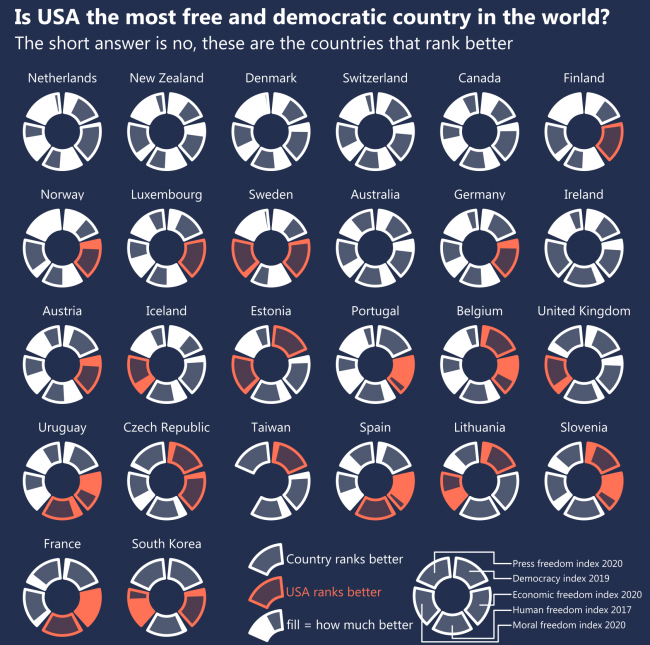
The western world loves freedom a lot, with Northern Europe being at the top, whereas regions with predominantly Muslim populations have many restrictions and end up at the end of the (circular) list with low averages.

What: Freedom indices recalculated to fit the range from 0 to 1, where 1 means the best index and 0 means the worst (in 3 out of 5 cases – it’s North Korea). Simple averages were calculated for the regions.
Index, When, Source:
Democracy Index, 2019, EIU
Human Freedom Index, 2017, The Human Freedom Index 2018: A Global Measurement of Personal, Civil, and Economic Freedom
Economic Freedom Index, 2020, The Heritage Foundation
Moral Freedom Index, 2020, The Foundation for the Advancement of Liberty
Press Freedom Index, 2020, Reporters Without Borders
Where: 172 countries were ranked on at least 3 of these indices.

P.S. Radial representation is to make this chart more entertaining for its creator.

Posted in charts EN | Tagged Freedom, Interactive, Lollipop chart, R, Radial scatterplot

Is freedom consistent between fields?

chart planet Posted on 2020-12-07 by Chart Planet2023-03-18

Different freedom indices measure different fields of freedom – press, economy or general human freedom. Are they consistent within a country?

As we see from the 2nd segment of this chart – no, freedoms are not consistent. Economic freedom index is quite often much higher than indices of other freedoms, especially in those countries at the low end. I did my best to adjust the indices so their ranges are uniform, but their averages are still quite different – most countries love economic freedom, while many of them do not care much about democracy or moral freedom.

What: Freedom indices recalculated to fit the range from 0 to 1, where 1 means the best index and 0 means the worst (in 3 out of 5 cases – it’s North Korea). Country average is a simple average of all 5 indices.
Index, When, Source:
Democracy Index, 2019, EIU
Human Freedom Index, 2017, The Human Freedom Index 2018: A Global Measurement of Personal, Civil, and Economic Freedom
Economic Freedom Index, 2020, The Heritage Foundation
Moral Freedom Index, 2020, The Foundation for the Advancement of Liberty
Press Freedom Index, 2020, Reporters Without Borders
Where: 172 countries were ranked on at least 3 of these indices.

P.S. This chart reminds me a forest of mushrooms.

Posted in charts EN | Tagged Freedom, Interactive, Lollipop chart, Tableau

Is freedom consistent within a country?

chart planet Posted on 2020-12-02 by Chart Planet2023-03-18

I’ve found five freedom indices measuring various fields of freedom. The question is whether all those measures are consistent within countries, or do they vary a lot?

The answer is in the chart below the chart below – more often they’re consistent than not. Exceptions are in some Muslim countries which do not like moral freedom or democracy – those ratings are low, but they want high economic freedom – so this one particular rating is often high.

What: Freedom indices recalculated to fit the range from 0 to 1, where 1 means best index and 0 means the worst (in 3 out of 5 cases – it’s North Korea)
Index, When, Source:
Democracy Index, 2019, EIU
Human Freedom Index, 2017, The Human Freedom Index 2018: A Global Measurement of Personal, Civil, and Economic Freedom
Economic Freedom Index, 2020, The Heritage Foundation
Moral Freedom Index, 2020, The Foundation for the Advancement of Liberty
Press Freedom Index, 2020, Reporters Without Borders
Where: 172 countries were ranked on at least 3 of these indices.

Posted in charts EN | Tagged Dot chart, Freedom, Interactive, Tableau

Is the USA the most free and democratic country in the world?

chart planet Posted on 2020-11-30 by Chart Planet2023-03-18
Is the USA the most free and democratic country in the world?

I checked five different indices of freedom and democracy provided by various researchers. My initial idea was to show the top 10 ranking countries of every index. However, the USA does not manage into the top 10 anywhere. So, I checked what countries rank better than the USA on those indices. Apparently its neighbour Canada, The Netherlands – one of the oldest democracies in the world, also New Zealand, Denmark and Switzerland rank better on all five indices. Countries like Estonia, Taiwan and Uruguay rank better on 3. Fund fact – the United Arab Emirates, one obviously not-so-free country ranks better than the USA on Economic Freedom Index.

So, If we talk about FREEDOM we talk about THE NETHERLANDS.

What: Difference in ranking compared to the USA on the following indices.
Index, When, Source:
Democracy Index, 2019, EIU
Human Freedom Index, 2017, The Human Freedom Index 2018: A Global Measurement of Personal, Civil, and Economic Freedom
Economic Freedom Index, 2020, The Heritage Foundation
Moral Freedom Index, 2020, The Foundation for the Advancement of Liberty
Press Freedom Index, 2020, Reporters Without Borders
Where: 172 countries were ranked on at least 3 of these indices.

Posted in charts EN | Tagged Country specific, Democracy, Post-design, R, Radial bar chart

Radial charts with 6 online tools

chart planet Posted on 2020-11-04 by Chart Planet2023-03-17

Radial charts are far from best practices, so if a tool has them, we can consider it to be flexible enough. May this article serve you as a helpful reference.

CONTINUE >>>
Posted in blog | Tagged Same chart many tools

Chart idea: Comparative Stacked Bars

chart planet Posted on 2020-10-29 by Chart Planet2023-03-18

Stacked Bars have one major weakness, it’s difficult to compare changes of its segments over time. I tried finding a way to improve it.

CONTINUE >>>
Posted in blog | Tagged Chart ideas

Post navigation

<< 1 2 3 4 5 6 … 10 11 >>

subscribe to blog posts

Please check your email to confirm subscription

fb fb rss rss rss
MJDC privacy policy
↑
Cookies are used on chart planet.OKprivacy policy