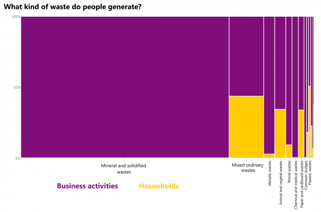
Mostly mineral and solidified wastes from business activities. Here goes waste from construction and demolition activities, combustion wastes, soils. Mixed ordinary wastes are the second – almost half of it is generated by households. The only type of waste where households produce more than half of the output is plastic.
What: Waste generated, tonnes. When: 2016 Where: European countries Source: Eurostat
If the waste generated per GDP euro is compared to GDP per capita, then no trend is visible. Seems that required additional waste for additional euro per capita is more or less fixed (at least in Europe) except for 4 countries.
Math goes like this: to increase GDP per capita in 1 €, the total amount of waste should increase by w/(GDP per capita), where w is the current total amount of waste. Then the additional amount of waste is equal to (waste per GDP euro) * population.
What: Waste generated, tonnes per GDP euro & GDP, chain-linked volumes (2010), euro per capita When: 2016 Where: European countries. Source: Eurostat
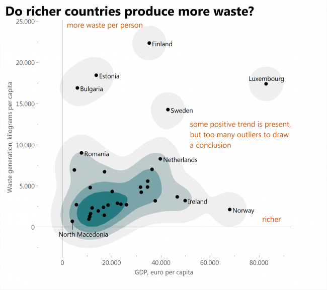
If waste generated is compared to GDP (both per capita), then some positive trend is visible, but still there are too many outliers to draw conclusions. Amounts of waste each country generates depend on specific features of that country.
What: Waste generated, kilograms per capita & GDP, chain-linked volumes (2010), euro per capita When: 2016 Where: European countries Source: Eurostat
How does one draw the dynamics of a changing curve? This article will be dedicated to experiments of drawing the evolution of the whole yield curve over time.
I tracked down the time when I start my working day, what percentage of weekly goals I do achieve and whether I do many other daily routine things (meditation, exercise, proper meal, not checking social media after 6 p.m. etc.) which I aggregated into “Level of discipline”.
During the time of self-observation I began to wake up and start working earlier, I started to achieve more goals, but this “discipline” thing did not improve. I guess that trying to do many “useful” things during the day is not as useful and productive as it may seem.
What: Weekly average time of starting to work, the proportion of weekly goals achieved, and “level of discipline” measured in points. Moving averages are calculated using 5-week intervals. There are omissions in the data, as one may see. When: 38 weeks during 2019-2020 Source: self-observation
This is another data selfie based on my own observation of myself.
I tracked down how disciplined am I based on how well I stick to my daily routine and also how much of weekly goals I do achieve. There is a visible positive correlation, but two facts leave me unconvinced that discipline is really useful: 1. When I am the least disciplined, my results are not really bad, at some weeks I even managed to achieve 100% 2. When I am the most disciplined, at some weeks I had results that are among the worst.
I guess that when I concentrate too much on those “daily routine” and “discipline” things I might be more motivated, but then I have less time for actual work on my goals. After those weeks of tracking my results, I dropped the effort to stick to the daily routine completely. And I believe I am as productive as I can be.
What: The proportion of weekly goals achieved and “level of discipline” measured in points. Discipline points are binned into arbitrary intervals, and the white gradient shows median at its brightest point. When: 38 weeks during 2019-2020 Source: self-observation
My real goal here was to draw really “creative” chart even if it is hard to read.
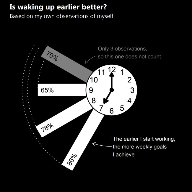
In this world of selfies I make data selfies. I documented my daily routine and weekly goals for 38 weeks and how I have some data to make conclusions on.
According to my own observations of myself the earlier I wake up and start working, the more weekly goals I achieve. Starting the work at 10 a.m. yields better results than at 9 a.m., but there were only 3 weeks when I woke up so late on average and even those were affected by a single day when I slept until noon after some kind of all-night activity.
When I wake up early my body and mind are ready to work at once – I’m definitely not an owl.
What: Weekly average time of starting to work, and the proportion of weekly goals achieved. Time is binned into intervals by 1 hour, and the proportion is averaged. When: 38 weeks during 2019 and 2020 Source: self-observation
My real goal here was to draw really “creative” chart even if it is hard to read.
They’re doing well on the internet. China’s Tencent and Alibaba are among the top 10 for 4 years already.
What: Non-USA companies that are in the top 10 public traded companies by market capitalization every year. Saudi Aramco is not included, because only a small fraction of its shares are traded publicly. When: 1997-2020Q2 Where: I hope it’s the whole world except the USA. Source: https://en.wikipedia.org/wiki/List_of_public_corporations_by_market_capitalization
What: Top 10 public traded companies by market capitalization every year. Saudi Aramco is not included, because only a small fraction of its shares are traded publicly. When: 1997-2020Q2 Where: I hope it’s the whole world. Source: https://en.wikipedia.org/wiki/List_of_public_corporations_by_market_capitalization
Imagine the situation – we want a beautiful and interactive chart on our website but have no knowledge of D3 or other fancy stuff, so, to pick a solution I am quickly trying them all and making a recommendation based on this experience.
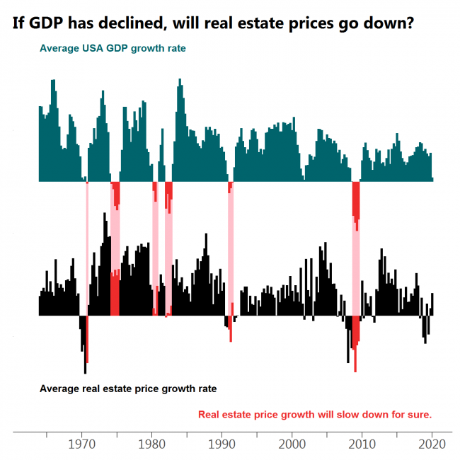
Every drop in GDP is followed by a decline in real estate prices or at least a significant slow down in growth with the most obvious case at the beginning of ’80s.
What: Moving average of quarterly USA GDP growth (GDP in billions of chained 2012 dollars, seasonally adjusted) and moving average of quarterly median sales price of houses sold in the United States. When: 1964Q1 – 2020Q1 Where: USA only. Source: FRED
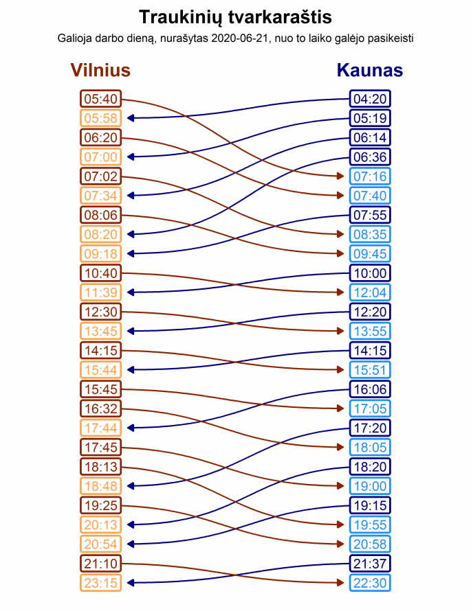
Įsivaizduok – nori nuvažiuoti iš Vilniaus į Kauną kelioms valandoms ir tada grįžti. Sužiūrėti traukinių tvarkaraščius tokiai kelionei nėra sudėtinga, bet visgi reikia daryti dvi paieškas ir nepasiklysti tarp išvykimo-atvykimo laikų.
Argi nebūtų patogu, jei kelionės į abi puses būtų išdėliotos vienoje schemoje?
Įdomus faktas – 6:36 iš Kauno išvykstantis traukinys pakeliui sutinka 4 priešinga kryptimi važiuojančius traukinius.
Often when the market turns red there is at least a dip in GDP growth. However, there are cases when this does not happen.
What: Moving average of quarterly S&P500 index growth and moving average of quarterly USA GDP growth (GDP in billions of chained 2012 dollars, seasonally adjusted) When: 1948Q1 – 2020Q1 Where: USA only, because S&P is populated by mostly American companies. Source: Yahoo Finance for S&P500 and FRED for GDP.
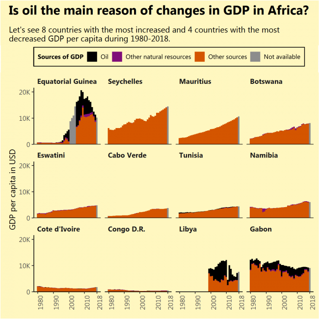
I saw that Equatorial Guinea, the African country that increased its GDP per capita the most during 1980-2018 had done this due to newly found oil. I saw that Gabon, the African country that decreased its GDP per capita the most during the same period, had done this due to diminishing its oil reserves. So I thought, the same applies to the most of rapidly growing (or contracting) African economies, but that is not true (except for Libya).
The sources of growth might not be very sustainable just like oil, but finding them requires a deeper analysis of every separate country.
What: GDP per capita divided into oil rents, rents from other natural resources and GDP from other sources. Grey bars indicate full GDP value with the unknown division. When: From 1980 till 2018. Not all countries had a full range of data. No country had its GDP divided for 2018. Where: Countries of the African continent with the biggest GDP per capita growth during 1980-2018 (top 8) and biggest fall (bottom 4, except South Sudan, which had very short data range) Source: WB
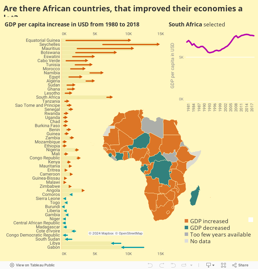
I will consider that improving economy simply means increasing GDP per capita.
And that happened in a handful of countries. What are the reasons for this increase? That is a question for the next image, but I expect to find oil. Also, what happened to Gabon?
What: GDP per capita. When: From 1980 till 2018. Not all countries had a full range of data. Where: Countries of the African continent Source: WB