
This post is an opinion. The mix of traditional and simplified characters is intentional.
Made with R and Inkscape.

chart planet
visual communication of data
This post is an opinion. The mix of traditional and simplified characters is intentional.
Made with R and Inkscape.
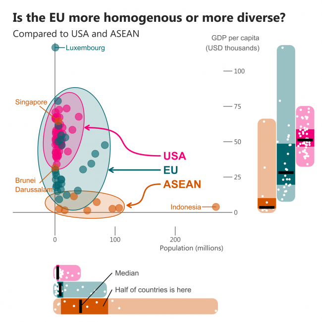
I believe you’ve heard about “Europe of two speeds”. But to understand whether those two speeds are really different we need to compare it to something. I picked two options – one is ASEAN, an organisation in Southeast Asia that promotes integration in economic, political and other fields. Another one is the USA and its states.
I’m comparing two core measures – GDP per capita and population.
Boxplots at the bottom and the right side of the chart show us that the USA is a highly homogenous entity compared to the other two.
If we look at population only, there seems to be a lot of variety in ASEAN, however, there are only 10 countries with one clear outlier – Indonesia. This country is not encircled in the scatterplot, and the encircling ellipses of the EU and ASEAN have quite similar widths. EU just has way more small countries.
Checking the GDP per capita gives a clear view of the diversity of the EU. If the two richest ASEAN countries are excluded, it becomes very homogenous – all the other countries are on the poor side.
Conclusion: EU is diverse even compared to Asian standards.
What: Population and GDP per capita in current USD (for ASEAN and EU) and GDP per capita in chained 2012 USD (for the USA). I believe this inconsistency is of minor influence since the diversity inside the group is what matters – comparisons of states and countries should not be made.
When: 2018, except Population of the USA which is an estimate for 2019
Where: Countries of EU and ASEAN as well as states of the USA.
Source: WB + BEA and USCB for USA states