↓
 

chart planet

data-human interaction

chart planet

data-human interaction

  • blog
    • dashboard design
    • data visualisation
    • Power BI asteroid
    • reviews
  • visuals
    • charts
    • interfaces
  • LT
    • grafikai
    • apie duomenų vizualizaciją
  • inspirations
  • talks
  • about

Tag Archives: Tableau

Post navigation

<< 1 2 3

Do more GDP per capita require more CO2 emissions?

chart planet Posted on 2020-01-29 by Chart Planet2023-03-18
Do more GDP per capita require more CO2 emissions?

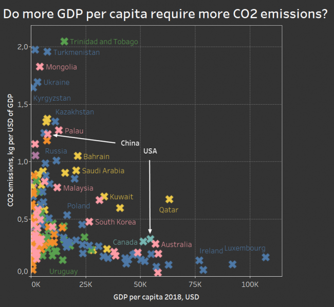
As expected – no, there is a nice easily visible downward trend. It’s not the inefficiency of the USA making it one of the biggest polluters, it’s just the amount of production, while China has plenty of space to improve. There are many outliers above the general trend, and they’re mostly Middle East countries with oil plus one pink Brunei, also with oil and Estonia (probably with oil shale?) just beside Saudi Arabia.

What: CO2 emissions (kg per 2010 US$ of GDP) and GDP per capita. Colours mean regions by WB.
When: 2014 for emissions, and 2018 for GDP. I did not match the time this time 🙁
Where: 187 countries of the world
Source: WB
Posted in charts | Tagged CO2 emissions, Scatterplot, Tableau

What countries know how to make money with less emissions?

chart planet Posted on 2020-01-27 by Chart Planet2023-03-18
What countries know how to make money with less emissions?

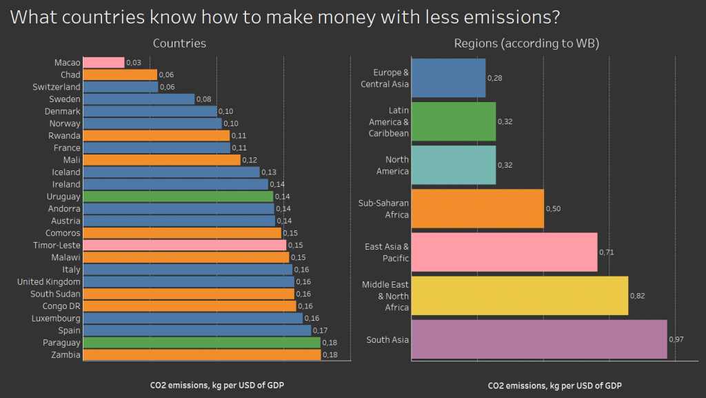
It’s a weird graph where poor African countries go together with rich European countries – Chad and Switzerland, Rwanda and France. It tells us, that some countries switched to less energy-consuming more intellect-consuming businesses, so they can reduce emissions, but others have not yet arrived at the stage where smoking chimneys power the growth. Will they manage jump over that stage? Will they manage skip factories and dive directly into developing apps or life-coaching blogs?

What: CO2 emissions (kg per 2010 US$ of GDP) – I don’t really get is it GDP in 2010 USD, or is it just 2010 GDP everywhere. But I hope it’s the former.
When: 2014
Where: 25 countries of the world with the lowest value.
Source: WB

Posted in charts | Tagged Bar chart, CO2 emissions, Tableau

Are there countries that are net CO2 consumers?

chart planet Posted on 2020-01-22 by Chart Planet2023-03-18
Are there countries that are net CO2 consumers?

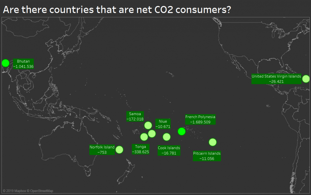
Since the forest is a net CO2 consumer, maybe there are whole countries covered in forests consuming CO2? Apparently, there are such countries, but they are tiny idyllic worlds mostly spread in the Pacific Ocean with happy exceptions of Bhutan (just beside the world’s largest polluter China) and US Virgin Islands (just beside the world’s second-largest polluter the USA).

What: Emissions of various greenhouse gasses (CO2, CH4, PFCs and so on) expressed in the equivalent of tons of CO2 emissions.
When: 2010
Where: The only nine countries with negative emissions at that time.
Source: FAO

Posted in charts | Tagged CO2 emissions, Symbol map, Tableau

What are the sources of CO2 emissions?

chart planet Posted on 2020-01-20 by Chart Planet2023-03-18
What are the sources of CO2 emissions?

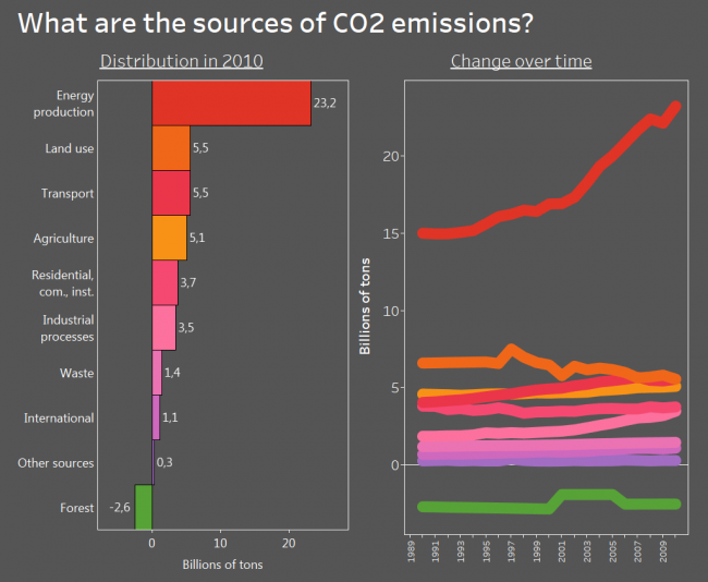
I know, the data is old, but back in 2010 energy production was the main source of CO2 and other greenhouse gas emissions. Transport had the potential to overtake the land use and I bet despite all those electromobiles everywhere it did.

And the beautiful thing is – the forest is a net absorber of greenhouse gas! I knew it all along, but it is nice to see it on the graph. And it’s depressing at the same time because its absorption is tiny compared to our emissions.

What: Emissions of various greenhouse gasses (CO2, CH4, PFCs and so on) expressed in the equivalent of CO2 emissions. May not the question mislead – initially I asked about CO2, but then I found stats for all greenhouse gases. “Land use” is emissions by cropland and grassland and is not included in agriculture. “Residential, com., inst.” is emissions by residential, commercial and institutional activities. I believe the weird shape for the forest is due to inconsistency in data rather than actual changes.
When: From 1990 to 2010
Where: World aggregate
Source: FAO

Posted in charts | Tagged Bar chart, CO2 emissions, Line chart, Tableau

Are we sure, that more development means more safety?

chart planet Posted on 2020-01-17 by Chart Planet2023-03-18
Are we sure, that more development means more safety?

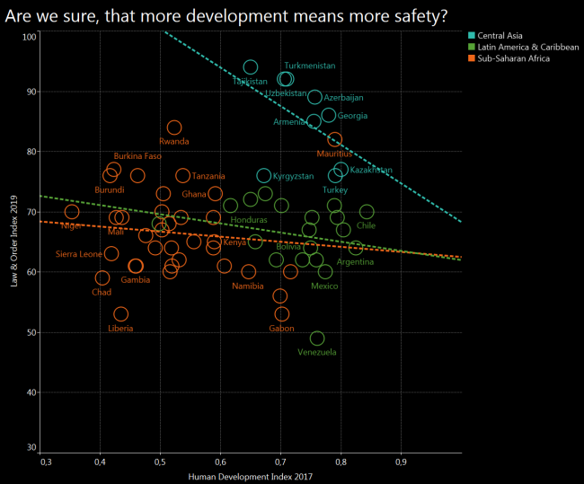
I was sure that I will get the obvious result again – more development will mean more safety. However, after cherrypicking some regions and drawing a trend line for each, I got the opposite result. Central Asia seems to follow exactly the opposite trend, and Latin America with Sub-Saharan Africa seems to be quite chaotic.

What: Law and Order (L&O) Index compared to Human Development Index (HDI)
When: 2019 for L&O and 2017 for HDI
Where: 63 countries from Central Asia, Sub-Saharan Africa, Latin America & Carribean, which have both indices.
Source: Gallup for L&O and UNDP for HDI

Posted in charts | Tagged Safety, Scatterplot, Tableau

Does limited freedom make people feel safer?

chart planet Posted on 2020-01-15 by Chart Planet2023-03-18
Does limited freedom make people feel safer?

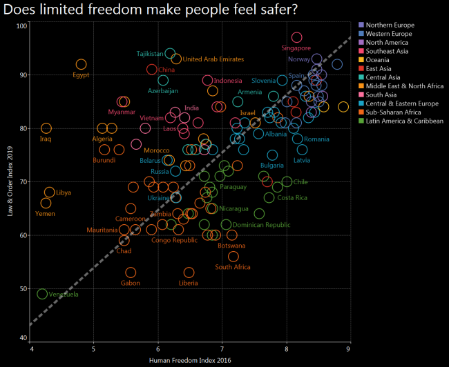
After seeing Tajikistan and Azerbaijan among the safest countries I expected to see a U shaped distribution where both free countries and suppressed countries enjoy order and stability. However there is a clear line where freedom increases together with law and order, and many exceptions from the trend scattered around.

Also, many regional patterns are visible – blue Europe being at the top left corner, orange Africa and Middle East leaning towards bottom right, and green Latin America – towards bottom left.

What: Law & Order (L&O) Index compared to Human Freedom Index (HFI)
When: L&O is 2019 and HFI is 2016, both are most recent indices available at the moment of making the graph
Where: 135 countries of the world, that have both indices. For example, there is no Afghanistan on this graph because it does not have an HFI index calculated.
Source: Gallup for L&O and “The Human Freedom Index 2018: A Global Measurement of Personal, Civil, and Economic Freedom”

Posted in charts | Tagged Safety, Scatterplot, Tableau

Ar kyla kainos Lietuvoje?

chart planet Posted on 2020-01-14 by Chart Planet2023-03-16
Ar kyla kainos Lietuvoje?
Posted in grafikai | Tagged Data story, Tableau

What world regions are the safest?

chart planet Posted on 2020-01-13 by Chart Planet2023-03-18
What world regions are the safest?

But of course it’s Northern and Western Europe! What surprises me in this graph, it’s that Central Asian countries are relatively safe, Tajikistan being among the safest!

And the least safe is Latin America – or maybe it’s just a low number of Venezuela dragging all of them down.

What: Law & Order Index, which was calculated after telephone and face to face interviews, asking questions like “Do you feel safe walking alone at night in the city or area where you live?” and similar.
When: 2019
Where: 141 countries of the world
Source: Gallup

Posted in charts | Tagged Bar chart, Safety, Symbol map, Tableau

Metro Vilniuje?

chart planet Posted on 2019-12-16 by Chart Planet2023-03-16
Metro Vilniuje?

Posted in grafikai | Tagged Data story, Tableau

Ar daug Lietuvoje miško?

chart planet Posted on 2019-11-30 by Chart Planet2023-03-16
Ar daug Lietuvoje miško?

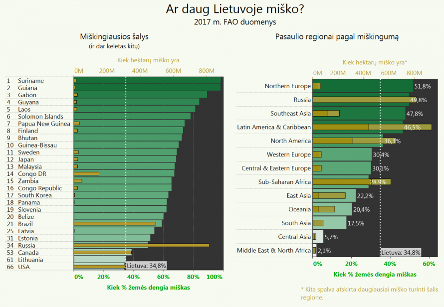
Visados galvojau, kad Lietuva yra miškų šalis – gal čia ir nėra didžiausias miškų masyvas pasaulyje, visgi esame maži, tačiau procentais miškų pas mus daug!

Pasirodo esame viso labo 61 vietoje pasaulyje su 34,8% mišku padengto žemės ploto. Nors mūsų miškingumo vidurkis šiek tiek didesnis nei Vakarų Europos, bet pasauliniu mastu tai su tokiais skaičiais nieko nenustebinsi. Net latvių ir estų nenustebinsi.

Šaltinis: FAO (Maisto ir Žemės ūkio Organizacija)

Posted in grafikai | Tagged Bar chart, Tableau

Lietuva tarp nuobodžiausių pasaulio šalių.

chart planet Posted on 2019-11-24 by Chart Planet2020-10-24
Lietuva tarp nuobodžiausių pasaulio šalių.

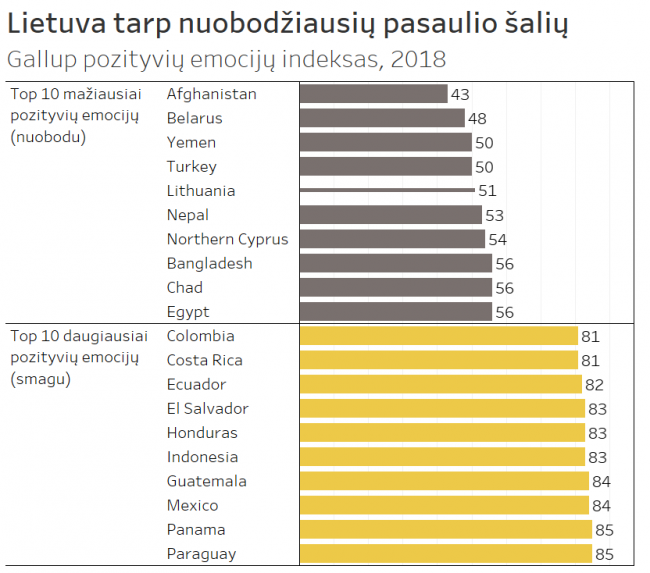
Ar paskutiniu metu šypsojaisi, juokeisi?
Ar jautiesi pailsėjusi?
Ar pagarbiai su tavimi elgėsi?
Ar išmokai ką nors naujo?
Ar kuo nors džiaugeisi?

Tai klausimai, kurie buvo užduoti žmonėms tyrimo metu, o lietuviai dažnai atsakydavo: ne.

Tebūna tai paskatinimas daugiau šypsotis, džiaugtis, elgtis su kitais pagarbiai, mokytis ir ilsėtis. Pinigų turime tikrai daugiau nei bet kuri kita šalis iš dešimtuko.

Šaltinis: Gallup apklausa

Posted in grafikai | Tagged Bar chart, Tableau

Post navigation

<< 1 2 3

subscribe to blog posts

Please check your email to confirm subscription

linkedin fb bluesky instagram sessionize rss
MJDC privacy policy
↑
Cookies are used on chart planet.