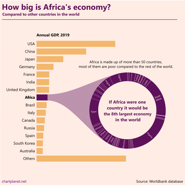
Africa is made up of more than 50 countries, most of them are poor compared to the rest of the world. If Africa were one country it would be the 8th largest economy in the world.
This chart is made without any numbers intentionally, they’d distract from the message. The ranking of the countries in the donut chart is “Algeria first”.
What: GDP in constant 2010 USD When: 2019 Where: All the countries in the world. “Others” were calculated by subtracting the shown countries from the total world GDP estimated by Worldbank. Source: Worldbank database
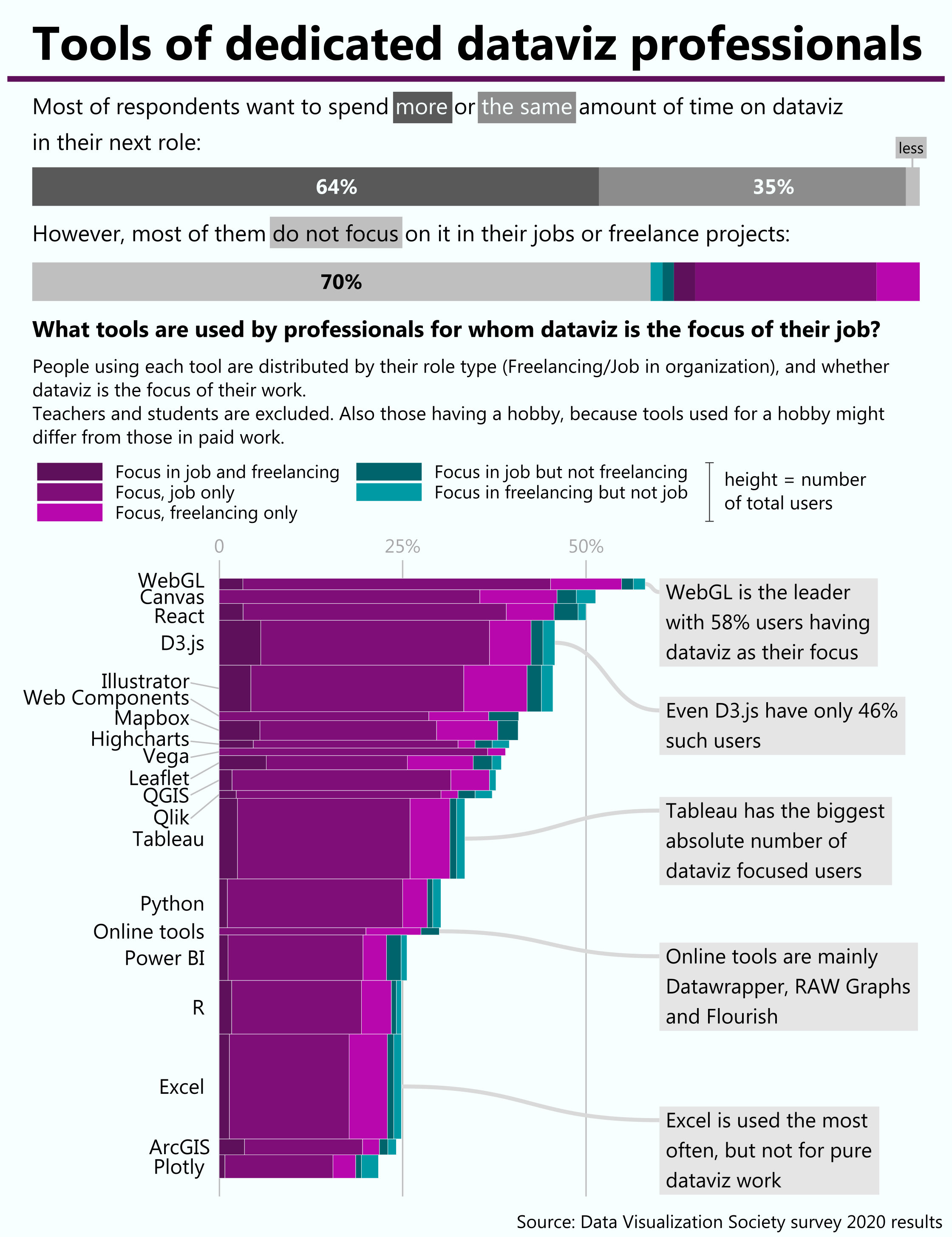
There are variety of tools to do dataviz and for someone who is just starting it is quite difficult to select which one to learn. One possible criteria might be whether this tool is used by professions focused on dataviz. R is focused on statistical analysis, Excel on spreadsheets, and python might be used for everything. So what is the tool which dedicated dataviz professionals use? The conclusion is that there is no such tool, because dataviz is more like a skill useful in many cases (financial reporting, UX design, journalism, etc.) rather than a profession by itself.
The western world loves freedom a lot, with Northern Europe being at the top, whereas regions with predominantly Muslim populations have many restrictions and end up at the end of the (circular) list with low averages.
What: Freedom indices recalculated to fit the range from 0 to 1, where 1 means the best index and 0 means the worst (in 3 out of 5 cases – it’s North Korea). Simple averages were calculated for the regions. Index, When, Source: Democracy Index, 2019, EIU Human Freedom Index, 2017, The Human Freedom Index 2018: A Global Measurement of Personal, Civil, and Economic Freedom Economic Freedom Index, 2020, The Heritage Foundation Moral Freedom Index, 2020, The Foundation for the Advancement of Liberty Press Freedom Index, 2020, Reporters Without Borders Where: 172 countries were ranked on at least 3 of these indices.
P.S. Radial representation is to make this chart more entertaining for its creator.
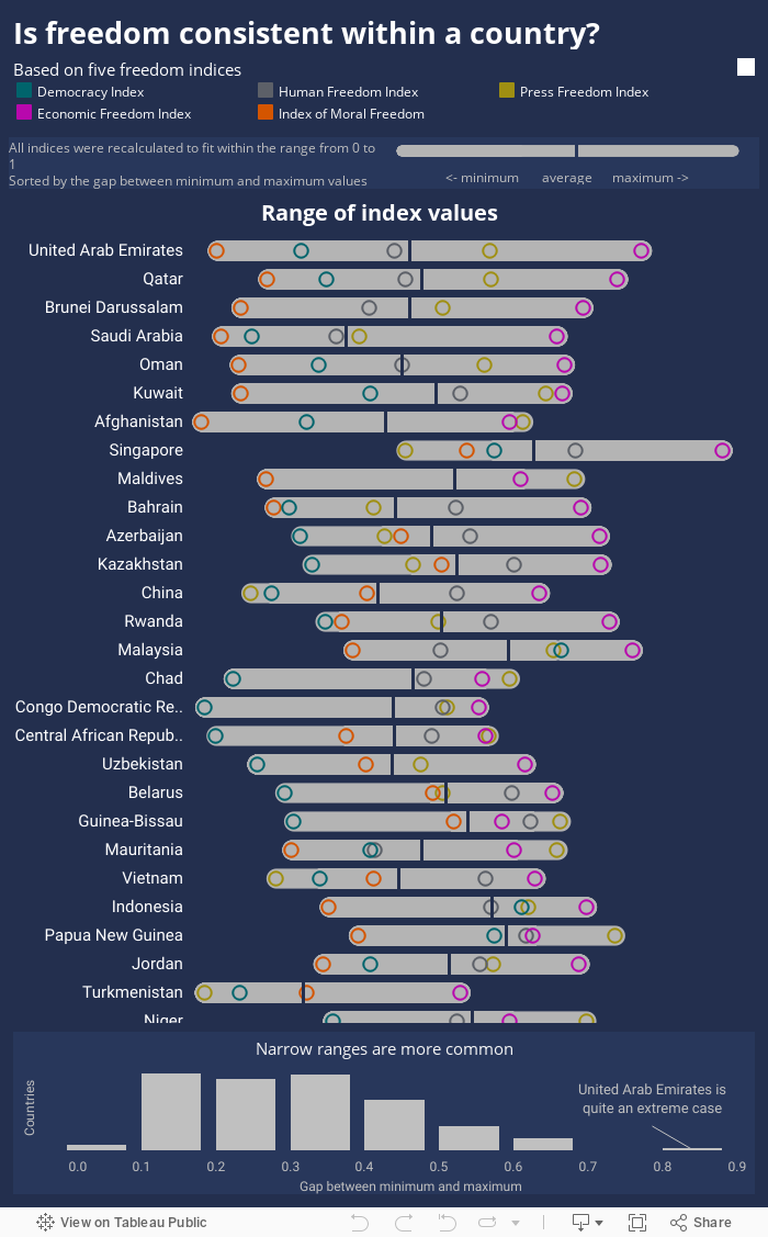
Different freedom indices measure different fields of freedom – press, economy or general human freedom. Are they consistent within a country?
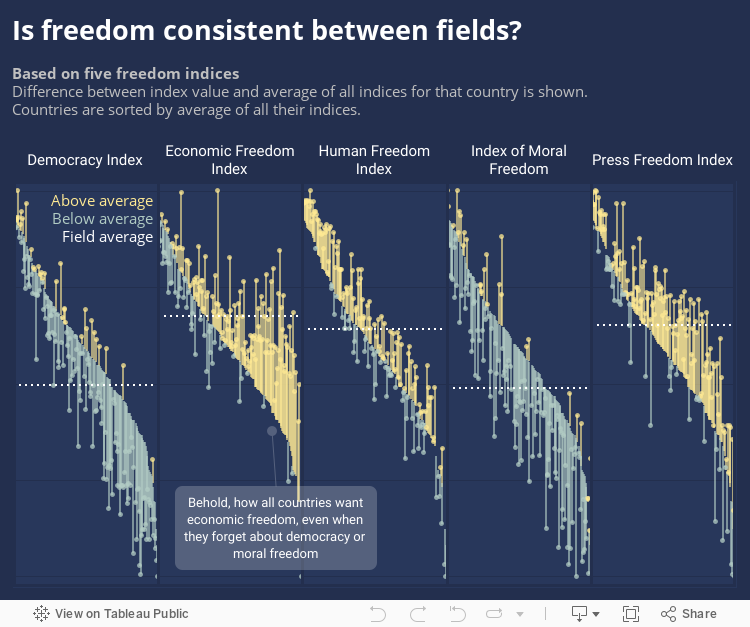
As we see from the 2nd segment of this chart – no, freedoms are not consistent. Economic freedom index is quite often much higher than indices of other freedoms, especially in those countries at the low end. I did my best to adjust the indices so their ranges are uniform, but their averages are still quite different – most countries love economic freedom, while many of them do not care much about democracy or moral freedom.
What: Freedom indices recalculated to fit the range from 0 to 1, where 1 means the best index and 0 means the worst (in 3 out of 5 cases – it’s North Korea). Country average is a simple average of all 5 indices. Index, When, Source: Democracy Index, 2019, EIU Human Freedom Index, 2017, The Human Freedom Index 2018: A Global Measurement of Personal, Civil, and Economic Freedom Economic Freedom Index, 2020, The Heritage Foundation Moral Freedom Index, 2020, The Foundation for the Advancement of Liberty Press Freedom Index, 2020, Reporters Without Borders Where: 172 countries were ranked on at least 3 of these indices.
I’ve found five freedom indices measuring various fields of freedom. The question is whether all those measures are consistent within countries, or do they vary a lot?
The answer is in the chart below the chart below – more often they’re consistent than not. Exceptions are in some Muslim countries which do not like moral freedom or democracy – those ratings are low, but they want high economic freedom – so this one particular rating is often high.
What: Freedom indices recalculated to fit the range from 0 to 1, where 1 means best index and 0 means the worst (in 3 out of 5 cases – it’s North Korea) Index, When, Source: Democracy Index, 2019, EIU Human Freedom Index, 2017, The Human Freedom Index 2018: A Global Measurement of Personal, Civil, and Economic Freedom Economic Freedom Index, 2020, The Heritage Foundation Moral Freedom Index, 2020, The Foundation for the Advancement of Liberty Press Freedom Index, 2020, Reporters Without Borders Where: 172 countries were ranked on at least 3 of these indices.
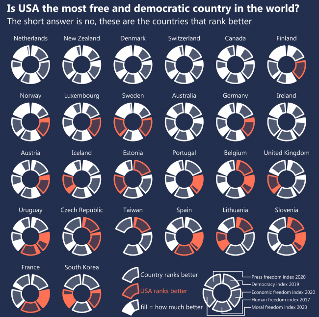
I checked five different indices of freedom and democracy provided by various researchers. My initial idea was to show the top 10 ranking countries of every index. However, the USA does not manage into the top 10 anywhere. So, I checked what countries rank better than the USA on those indices. Apparently its neighbour Canada, The Netherlands – one of the oldest democracies in the world, also New Zealand, Denmark and Switzerland rank better on all five indices. Countries like Estonia, Taiwan and Uruguay rank better on 3. Fund fact – the United Arab Emirates, one obviously not-so-free country ranks better than the USA on Economic Freedom Index.
So, If we talk about FREEDOM we talk about THE NETHERLANDS.
What: Difference in ranking compared to the USA on the following indices. Index, When, Source: Democracy Index, 2019, EIU Human Freedom Index, 2017, The Human Freedom Index 2018: A Global Measurement of Personal, Civil, and Economic Freedom Economic Freedom Index, 2020, The Heritage Foundation Moral Freedom Index, 2020, The Foundation for the Advancement of Liberty Press Freedom Index, 2020, Reporters Without Borders Where: 172 countries were ranked on at least 3 of these indices.
San Juan metro area accounts for more than 3 quarters of the population of Puerto Rico. Same with the Kuwait City metro area in Kuwait.
What: Population distribution between the largest city, the urban area without the largest city, and the rural population. Metro area is meant by the largest city in most cases. When: 2019 Where: Top ranking countries except one-city countries (like Singapore) from the whole world. Some countries with a total of 26 million inhabitants were excepted because they do not have needed statistics in the Worldbank database. Many of them are small, possibly one-city countries. Source: Worldbank for numbers, Wikipedia for names.
There are countries where they do, with notable examples being Kuwait, Puerto Rico, Djibouti, Mongolia and Uruguay.
Since rural populations are declining everywhere, relative weights of urban populations, as well as those in the largest cities, are increasing, so largest cities now are more dominating than they were in the ’60s.
The most concentrated region seems to be East Asia, but that is because they have Hong Kong and Macao with almost 100% of people living in the only city.
What: Median proportion of the population in the largest city, the urban area without the largest city, and the rural population. When: 1960 and 2019 Where: The whole world, with some exceptions having a total of 26 million inhabitants, the biggest being Botswana, Lesotho and Slovenia. Many of those exceptions are small, possibly one-city countries which do not have needed statistics in the Worldbank database. Source: Worldbank
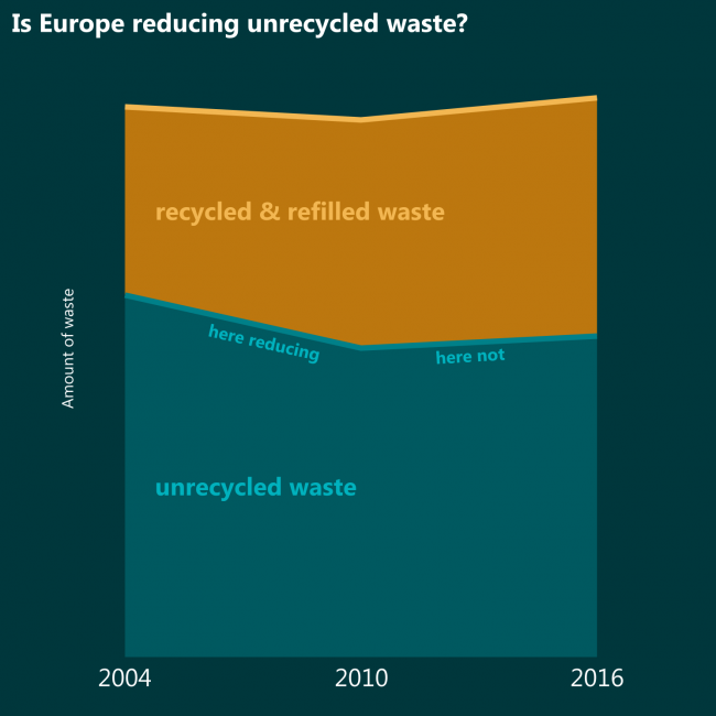
Whether the total amount of waste would decrease or increase, it would still be nice if amounts of UNRECYCLED waste decreased. If compared to 2004 it decreased, but if compared to 2010 it is increasing in spite of higher recycling rates.
What: Waste recycled or refilled in total waste generated. When: 2004, 2010 and 2016 Where: Europe Source: Eurostat
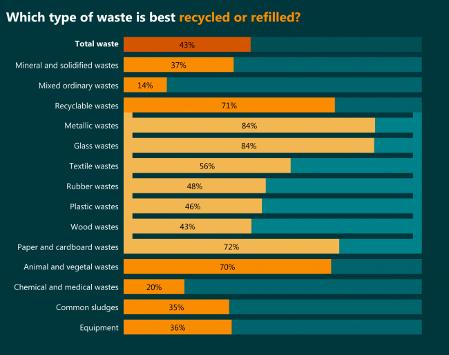
Metallic and glass waste. It’s probably quite easy to reuse metal and refill glass containers. The least recycled are mixed ordinary wastes of which almost half are generated by households (as seen in the previous chart).
May it be the motivation for sorting – if more mixed waste became recyclable waste, more would be … recycled.
What: Waste recycled or refilled in total waste generated. When: 2016 Where: Europe Source: Eurostat
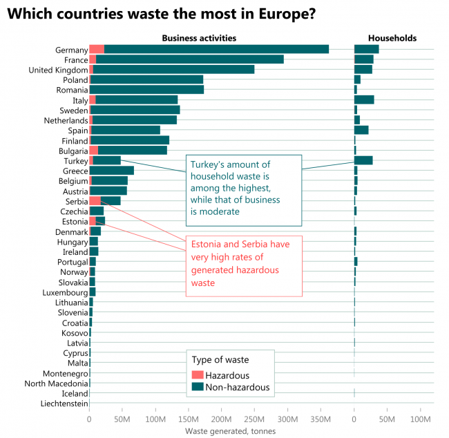
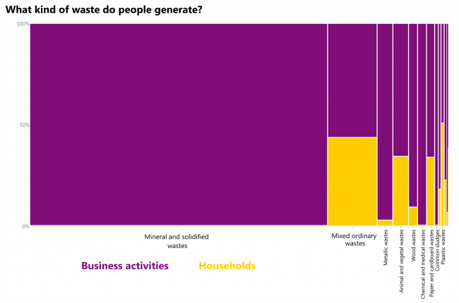
Mostly mineral and solidified wastes from business activities. Here goes waste from construction and demolition activities, combustion wastes, soils. Mixed ordinary wastes are the second – almost half of it is generated by households. The only type of waste where households produce more than half of the output is plastic.
What: Waste generated, tonnes. When: 2016 Where: European countries Source: Eurostat
If the waste generated per GDP euro is compared to GDP per capita, then no trend is visible. Seems that required additional waste for additional euro per capita is more or less fixed (at least in Europe) except for 4 countries.
Math goes like this: to increase GDP per capita in 1 €, the total amount of waste should increase by w/(GDP per capita), where w is the current total amount of waste. Then the additional amount of waste is equal to (waste per GDP euro) * population.
What: Waste generated, tonnes per GDP euro & GDP, chain-linked volumes (2010), euro per capita When: 2016 Where: European countries. Source: Eurostat
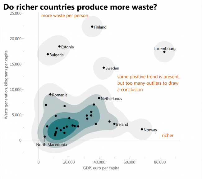
If waste generated is compared to GDP (both per capita), then some positive trend is visible, but still there are too many outliers to draw conclusions. Amounts of waste each country generates depend on specific features of that country.
What: Waste generated, kilograms per capita & GDP, chain-linked volumes (2010), euro per capita When: 2016 Where: European countries Source: Eurostat