↓
 

chart planet

data-human interaction

chart planet

data-human interaction

  • blog
    • dashboard design
    • data visualisation
    • Power BI asteroid
    • reviews
  • visuals
    • charts
    • interfaces
  • LT
    • grafikai
    • apie duomenų vizualizaciją
  • inspirations
  • talks
  • about

Category Archives: visuals

graphic insights about the world we live in

Post navigation

<< 1 2 3 4 5 6 7 8 9 >>

Which region feeds the world?

chart planet Posted on 2020-03-09 by Chart Planet2023-03-18
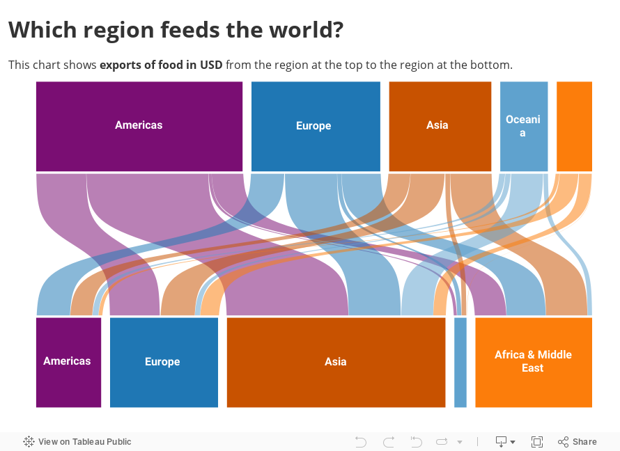
Which region feeds the world?

These are the trade flows between regions of the world measured in dollars. Strange enough – Africa does not provide much food for other regions. I have heard rumours, that Africans starve because they export all the food for rich Europeans! Maybe that’s not true, or maybe there is something specific about the trade flows measured. But according to this data, the Americas feed the world, and Asia is the one being fed.

What: Export of food items, measured in USD. Trade flows inside the region are eliminated.
When: 2017
Where: 243 countries and territories divided into 6 regions, of which Antarctica was not displayed.
Source: FAO

Posted in charts | Tagged Food, Interactive, Sankey, Tableau

Does the USA dominate the world?

chart planet Posted on 2020-03-04 by Chart Planet2023-03-18
Does the USA dominate the world?

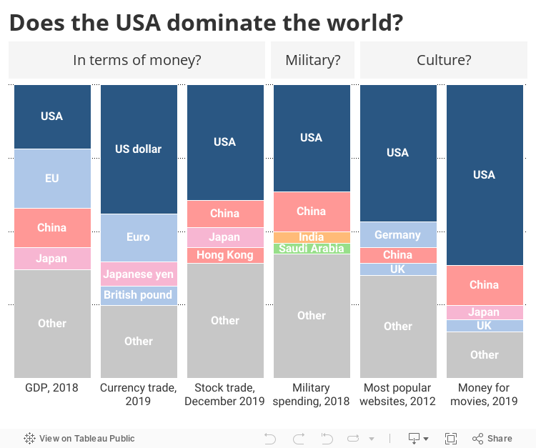
Well, there are some areas where the USA dominates the world. For example, they collect the majority of the money we spend on movies because they have Hollywood. They had almost half of one million most popular websites on the internet. Also, USD is the most traded world currency which takes almost half of the total traded value. Having in mind that one act of currency exchange requires two currencies we can safely assume, that almost all trades involved USD from one side or another.

Surprisingly (at least for me) it does not have the largest army, it is not the biggest CO2 producer, not the biggest car producer.
Do you know any other indicators where the USA dominates the world?

What, When, Source:
GDP in constant 2010 USD, 2018, WB
Daily average of OTC foreign exchange turnover, 2019, BIS
Market capitalization of stock exchanges by country, December 2019, WFE
Military expenditure in constant 2017 USD, 2018, Stockholm International Peace Research Institute
945 472 of one million Alexa’s top-ranked websites by country, 2012, pingdom.com
Total worldwide box office by country of movie production, 2019, the-numbers.com – very unreliable data, as written in the source itself – beta version.

Posted in charts | Tagged Country specific, Interactive, Stacked bar chart, Tableau

How much do Tibet and other autonomous regions contribute to China?

chart planet Posted on 2020-03-02 by Chart Planet2023-03-18
How much do Tibet and other autonomous regions contribute to China?

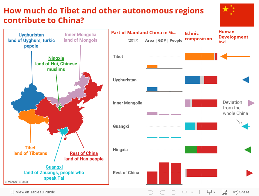
Apparently those large provinces where Tibetans and Uyghurs live are scarcely populated and less developed, so they contribute only a tiny fraction to the population and GDP in China. All other autonomous regions are inhabited mostly by Han Chinese who make more than half of the population there. Mongolia does not look like Mongolia when only 17% of inhabitants are Mongols.

A bit of sadness after seeing this.

What: Population, GDP in current USD, area in km2, ethnic composition and Human Development Index.
When: 2017
Where: Mainland China and its autonomous regions. Mainland China does not include Hong Kong, Macau and Taiwan.
Source: All data was found on Wikipedia. Let’s hope it’s correct.

Posted in charts | Tagged Country specific, Infographic, Interactive, Tableau

Where do people die from natural disasters?

chart planet Posted on 2020-03-02 by Chart Planet2023-03-18
Where do people die from natural disasters?

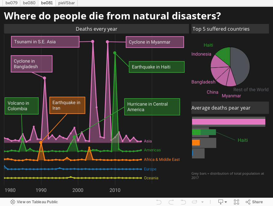
Natural disasters seem to be quite concentrated, more than half of all deaths during 1980-2017 have occurred in the same five countries and four of those five are in Asia. It is not possible to differentiate to smaller regions (like S.E. Asia, East Asia etc.) because a single tsunami or earthquake affects several regions at once.

The earthquake in Haiti seem to be the most deadly disaster for a single country, which makes up more than half of total deaths in Americas.

What: Deaths due to natural disasters
When: 1980-2017
Where: 194 countries and regions
Source: Institute for Health Metrics and Evaluation

Posted in charts | Tagged Death, Infographic, Interactive, Tableau

Which Korea is the best Korea?

chart planet Posted on 2020-02-26 by Chart Planet2023-03-18
Which Korea is the best Korea?

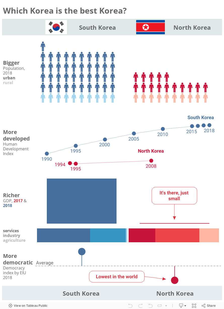
We knew what to expect here, but it’s interesting to see it. The only thing unexpected to me is that South Korea has significantly more people. I thought it’s only a bit more.

What: 4 different indicators indicated on the infographic. HDI for North Korea was adjusted because the methodology has changed since its HDI was last published.
When: Most indicators are for 2018, but the scarcity of data for North Korea forced me to use varying years for HDI and GDP.
Where: The 2 Koreas
Source: CIA, UNDP, UESCAP, W, WB, EIU and https://countryeconomy.com

Posted in charts | Tagged Country specific, Infographic, Interactive, Tableau

Which China is the best China?

chart planet Posted on 2020-02-24 by Chart Planet2023-03-18
Which China is the best China?

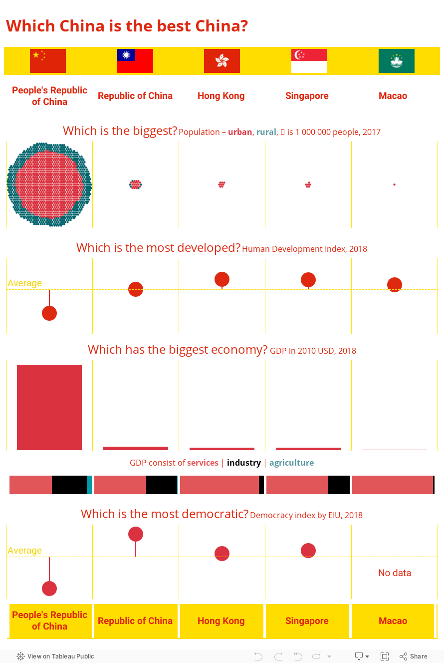
I am not sure if everyone is aware that there are 5 countries in this world where the majority of people could be considered Chinese. How different are those Chinas? The people’s Republic of China is the biggest one, however it is less developed compared to other Chinas, and infamously less democratic. Hong Kong, Singapore and Macao are 100% urban populations because those Chinas are basically one-city countries. The Republic of China better known as Taiwan seems like a normal usual country – not too big, not too small.

To understand better differences between these countries, I encourage the reader to dive deeper into cultural, historical and even linguistic differences between these countries.

By the way, Australia, Canada, UK and USA are also very different countries!

What: 4 different indicators indicated on the infographic
When: Time varies between 2017 and 2018 for different indicators and different Chinas
Where: The 5 Chinas
Source: CIA, UNDP, W, WB, IMF, EIU – most sources did not provide data for all 5 Chinas, so the data for one indicator might be gathered from various sources or even estimated by the author.

Posted in charts | Tagged Country specific, Infographic, Interactive, Tableau

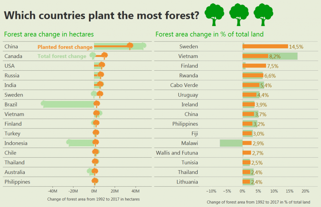
Which countries plant the most forest?

chart planet Posted on 2020-02-21 by Chart Planet2023-03-18
Which countries plant the most forest?

If we measure total hectares, then China is leading, followed by Canada, USA, Russia and India. Those countries are big, that’s why they manage to plant a lot. However this “planting” appeared to be a bad measure of how “forest loving” a country is because Brazil and Indonesia are significantly reducing their total forest area.

If we take the percentage of total land, then Sweden is leading, they planted 14,5% of their land area with trees. I even googled to see if this enormous number could be real, and seems it is, they even achieved Guinness world record in plating. However, this planting is made only to recover for what IKEA used because the total volume of forests increased only a bit in Sweden. It seems that Finland has quite a similar situation.

What: Planted forest and total forest area changes
When: 1992 to 2017
Where: Top 15 by each measure. Some countries are not included, because for 1992 they did not have existing data, e.g. Czech and Slovak republics were still Czechoslovakia. It might be possible that one such country could appear in the top 15 by %.
Source: FAO

Posted in charts | Tagged Bar chart, Nature, Tableau

Is there deforestation?

chart planet Posted on 2020-02-19 by Chart Planet2023-03-18
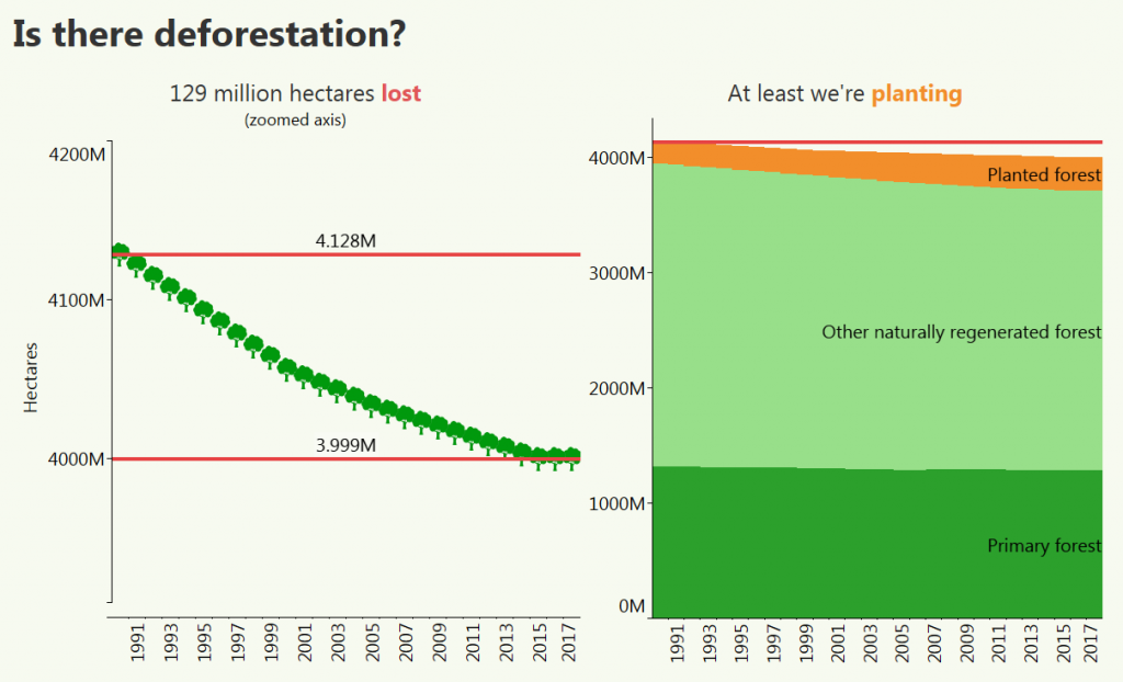
Is there deforestation?

After zooming in the axis, the constant decrease is clear. I don’t know whether 129 million hectares is a big deal or not, but we were happier if the trend were the opposite. However people are also planting forest, and since they cut more and more, they plant more and more too. Now the rate of planting is less than the rate of cutting, but I believe one day the trend will be reversed.

What: Land used as forest and types of forest. Mind the axis on the left graph which does not start at zero.
When: 1990-2017
Where: The world
Source: FAO

Posted in charts | Tagged Area chart, Line chart, Nature, Tableau

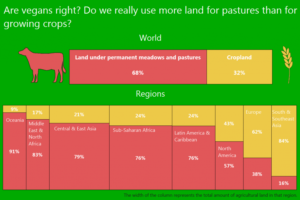
Are vegans right? Do we really use more land for pastures than for growing crops?

chart planet Posted on 2020-02-17 by Chart Planet2023-03-18
Are vegans right? Do we really use more land for pastures than for growing crops?

It’s true! And some crops are even grown for feeding the cattle, so, this division between land used to feed humans and land used to feed animals which are used to feed humans is even bigger than it seems from the first glimpse. But would we really save energy and resources if we all turn vegan?

What: Comparative shares of land area used as cropland and meadows & pastures.
When: 2017
Where: The world
Source: FAO

Posted in charts | Tagged Marimekko chart, Nature, Tableau

How much did humans change the face of the earth?

chart planet Posted on 2020-02-12 by Chart Planet2023-03-18
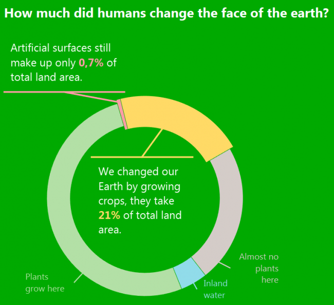
How much did humans change the face of the earth?

I was sure, that we have lots of buildings, but in reality, we have less than 0,7% of the land area covered with them. However, combining buildings and cropland, we changed almost 22% of the land area. Is that a lot? Subjective question!

The real percentage might be higher because I did not count grasslands used as pastures (which might have been forests before becoming grasslands), changing inland waters (shrinking Sea of Azov for example), growing deserts or barren land due to human activities. Let’s say, that those 22 percent is an obvious change even an alien would immediately identify with humans.

What: Land Cover according to European Spatial Agency Climate Change Initiative annual land cover maps, which were produced by the Université catholique de Louvain.
When: 2015
Where: Land area of the whole planet including inland water.
Source: FAO

Posted in charts | Tagged Donut chart, Nature, Tableau

Is Thailand “the country of smiles”?

chart planet Posted on 2020-02-10 by Chart Planet2023-03-18
Is Thailand "the country of smiles"?

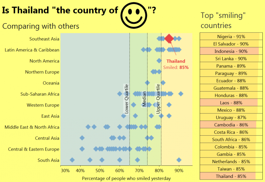
After debunking “America is the country of freedom” myth, I tried to debunk “Thailand is the country of smiles” myth. As it happens, Gallup, while doing research for their emotional indices asked people did they smile or laugh yesterday. And this data reveals that Thailand indeed could be called the country of smiles – its result is among the best in the world, however, its poorer brother Laos does better on this list.

But the whole Southeast Asia is indeed the region of smiles!

By the way, where is the secret of Nigeria? Is it Nollywood?

What: Percentage of people who replied that they smiled or laughed yesterday on an interview on emotions.
When: 2018
Where: 143 countries of the world
Source: Gallup

Posted in charts | Tagged Country specific, Happiness, Scatterplot, Tableau

Does reflective happiness correlate with positive emotions?

chart planet Posted on 2020-02-05 by Chart Planet2023-03-18
Does reflective happiness correlate with positive emotions?

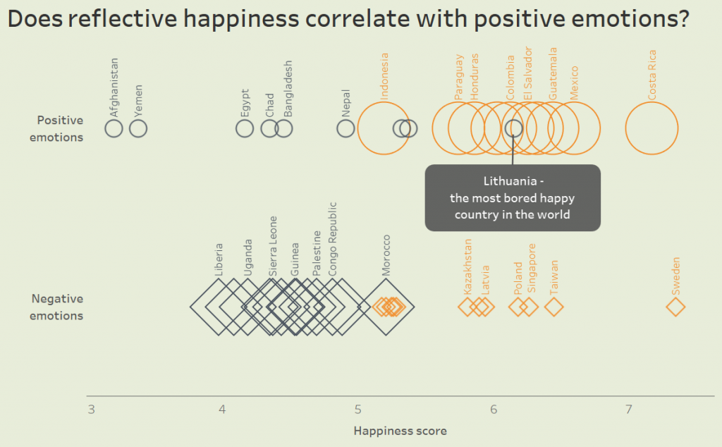
I have put countries into four categories:
– those which have the most positive emotions (big circle – excited)
– those which have the least positive emotions (small circle – bored)
– those which have the most negative emotions (big square – sad)
– those which have the least negative emotions (small square – chill)
Then I ranked them according to the World Happiness Report. I did not see any serious contradictions between these two data sets, except one country – Lithuania is quite high on happiness score, but very low on positive experiences, so it is the most bored happy country in the world.

What: Positive and Negative emotions indices based on interviews and Happiness index also based on interviews.
When: 2018
Where: 43 countries of the world
Source: Gallup for emotions and WHR for happiness

Posted in charts | Tagged Dot chart, Happiness, Tableau

What countries are the happiest and what the saddest?

chart planet Posted on 2020-02-03 by Chart Planet2023-03-18
What countries are the happiest and what the saddest?

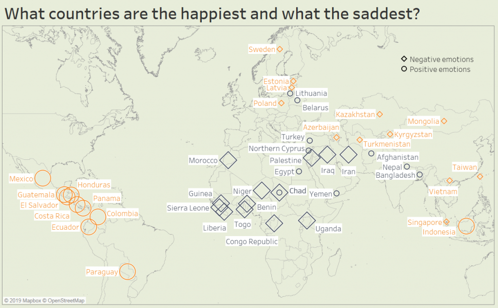
This time I am talking about daily positive or negative emotions, not the long-term reflection on life. This map shows top and bottom countries according to Positive Emotions index (circle) and Negative Emotions index (rectangle). Most of positive emotions (big circles) are in Latin America – they’re so happy and excited. Most of negative emotions (big squares) are in Africa – they’re so sad and depressed. Countries with low negative emotions (small squares) are spread across Eurasia – those people are chillin’. Countries with low positive emotions (small circles) are spread from Central Europe through the Middle East to South Asia. Those people are bored. Chad happens to be both high on negative emotions and low on positive, probably it’s the unhappiest place on the world.

What: Positive and Negative emotions indices based on more than 151,000 interviews with adults in more than 140 countries.
When: 2018
Where: 44 countries of the world.
Source: Gallup, The 2019 Global Emotions Report

Posted in charts | Tagged Happiness, Symbol map, Tableau

Are the world regions learning how to reduce CO2 emissions per dollar?

chart planet Posted on 2020-01-31 by Chart Planet2023-03-18
Are the world regions learning how to reduce CO2 emissions per dollar?

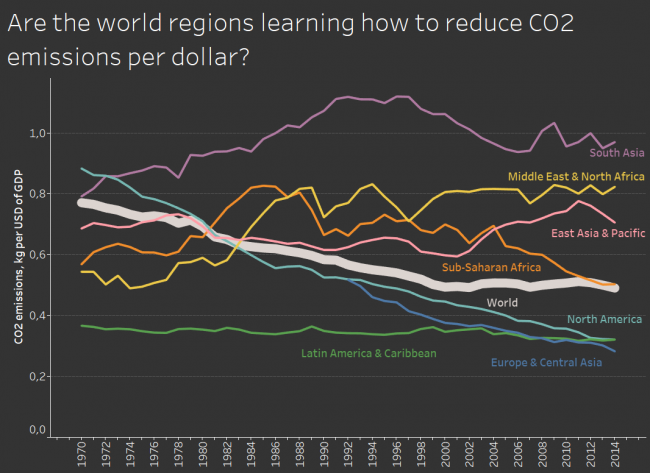
Seems like kind of yes, they do. Some regions rely on polluting industries like the Middle East, some struggle to find their direction like South Asia, but most regions do reduce. Good news for future us.

What: CO2 emissions (kg per 2010 US$ of GDP) and GDP per capita.
When: 1970-2014
Where: World regions according to WB
Source: WB

Posted in charts | Tagged CO2 emissions, Line chart, Tableau

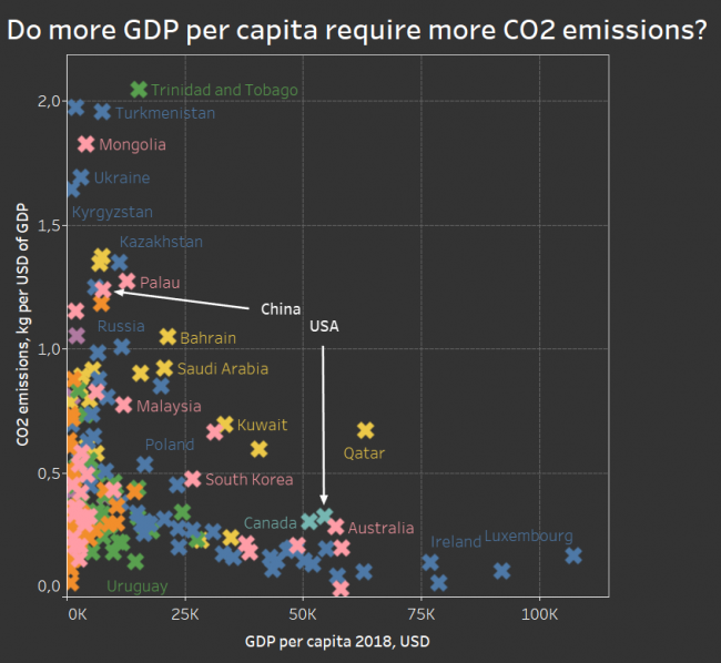
Do more GDP per capita require more CO2 emissions?

chart planet Posted on 2020-01-29 by Chart Planet2023-03-18
Do more GDP per capita require more CO2 emissions?

As expected – no, there is a nice easily visible downward trend. It’s not the inefficiency of the USA making it one of the biggest polluters, it’s just the amount of production, while China has plenty of space to improve. There are many outliers above the general trend, and they’re mostly Middle East countries with oil plus one pink Brunei, also with oil and Estonia (probably with oil shale?) just beside Saudi Arabia.

What: CO2 emissions (kg per 2010 US$ of GDP) and GDP per capita. Colours mean regions by WB.
When: 2014 for emissions, and 2018 for GDP. I did not match the time this time 🙁
Where: 187 countries of the world
Source: WB

Posted in charts | Tagged CO2 emissions, Scatterplot, Tableau

Post navigation

<< 1 2 3 4 5 6 7 8 9 >>

subscribe to blog posts

Please check your email to confirm subscription

linkedin fb bluesky instagram tableau sessionize rss
MJDC privacy policy
↑
Cookies are used on chart planet.