↓
 

chart planet

data-human interaction

chart planet

data-human interaction

  • blog
    • dashboard design
    • data visualisation
    • Power BI asteroid
    • reviews
  • visuals
    • charts
    • interfaces
  • LT
    • grafikai
    • apie duomenų vizualizaciją
  • inspirations
  • talks
  • about

Category Archives: visuals

graphic insights about the world we live in

Post navigation

<< 1 2 3 4 5 6 7 8 9 >>

What countries know how to make money with less emissions?

chart planet Posted on 2020-01-27 by Chart Planet2023-03-18
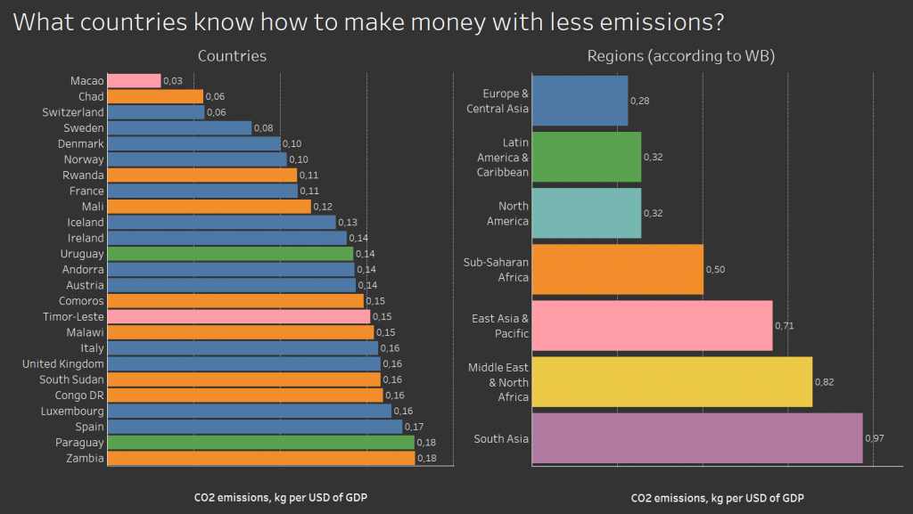
What countries know how to make money with less emissions?

It’s a weird graph where poor African countries go together with rich European countries – Chad and Switzerland, Rwanda and France. It tells us, that some countries switched to less energy-consuming more intellect-consuming businesses, so they can reduce emissions, but others have not yet arrived at the stage where smoking chimneys power the growth. Will they manage jump over that stage? Will they manage skip factories and dive directly into developing apps or life-coaching blogs?

What: CO2 emissions (kg per 2010 US$ of GDP) – I don’t really get is it GDP in 2010 USD, or is it just 2010 GDP everywhere. But I hope it’s the former.
When: 2014
Where: 25 countries of the world with the lowest value.
Source: WB
Posted in charts | Tagged Bar chart, CO2 emissions, Tableau

Are there countries that are net CO2 consumers?

chart planet Posted on 2020-01-22 by Chart Planet2023-03-18
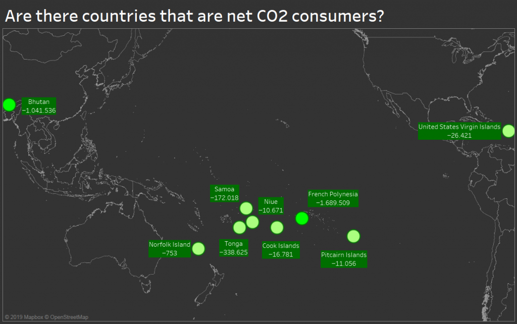
Are there countries that are net CO2 consumers?

Since the forest is a net CO2 consumer, maybe there are whole countries covered in forests consuming CO2? Apparently, there are such countries, but they are tiny idyllic worlds mostly spread in the Pacific Ocean with happy exceptions of Bhutan (just beside the world’s largest polluter China) and US Virgin Islands (just beside the world’s second-largest polluter the USA).

What: Emissions of various greenhouse gasses (CO2, CH4, PFCs and so on) expressed in the equivalent of tons of CO2 emissions.
When: 2010
Where: The only nine countries with negative emissions at that time.
Source: FAO

Posted in charts | Tagged CO2 emissions, Symbol map, Tableau

What are the sources of CO2 emissions?

chart planet Posted on 2020-01-20 by Chart Planet2023-03-18
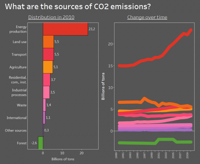
What are the sources of CO2 emissions?

I know, the data is old, but back in 2010 energy production was the main source of CO2 and other greenhouse gas emissions. Transport had the potential to overtake the land use and I bet despite all those electromobiles everywhere it did.

And the beautiful thing is – the forest is a net absorber of greenhouse gas! I knew it all along, but it is nice to see it on the graph. And it’s depressing at the same time because its absorption is tiny compared to our emissions.

What: Emissions of various greenhouse gasses (CO2, CH4, PFCs and so on) expressed in the equivalent of CO2 emissions. May not the question mislead – initially I asked about CO2, but then I found stats for all greenhouse gases. “Land use” is emissions by cropland and grassland and is not included in agriculture. “Residential, com., inst.” is emissions by residential, commercial and institutional activities. I believe the weird shape for the forest is due to inconsistency in data rather than actual changes.
When: From 1990 to 2010
Where: World aggregate
Source: FAO

Posted in charts | Tagged Bar chart, CO2 emissions, Line chart, Tableau

Are we sure, that more development means more safety?

chart planet Posted on 2020-01-17 by Chart Planet2023-03-18
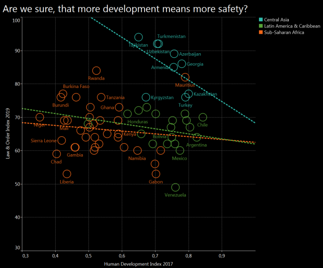
Are we sure, that more development means more safety?

I was sure that I will get the obvious result again – more development will mean more safety. However, after cherrypicking some regions and drawing a trend line for each, I got the opposite result. Central Asia seems to follow exactly the opposite trend, and Latin America with Sub-Saharan Africa seems to be quite chaotic.

What: Law and Order (L&O) Index compared to Human Development Index (HDI)
When: 2019 for L&O and 2017 for HDI
Where: 63 countries from Central Asia, Sub-Saharan Africa, Latin America & Carribean, which have both indices.
Source: Gallup for L&O and UNDP for HDI

Posted in charts | Tagged Safety, Scatterplot, Tableau

Does limited freedom make people feel safer?

chart planet Posted on 2020-01-15 by Chart Planet2023-03-18
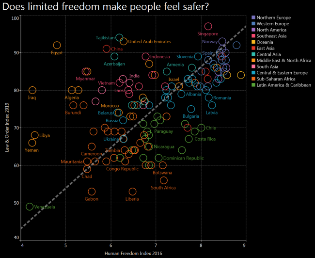
Does limited freedom make people feel safer?

After seeing Tajikistan and Azerbaijan among the safest countries I expected to see a U shaped distribution where both free countries and suppressed countries enjoy order and stability. However there is a clear line where freedom increases together with law and order, and many exceptions from the trend scattered around.

Also, many regional patterns are visible – blue Europe being at the top left corner, orange Africa and Middle East leaning towards bottom right, and green Latin America – towards bottom left.

What: Law & Order (L&O) Index compared to Human Freedom Index (HFI)
When: L&O is 2019 and HFI is 2016, both are most recent indices available at the moment of making the graph
Where: 135 countries of the world, that have both indices. For example, there is no Afghanistan on this graph because it does not have an HFI index calculated.
Source: Gallup for L&O and “The Human Freedom Index 2018: A Global Measurement of Personal, Civil, and Economic Freedom”

Posted in charts | Tagged Safety, Scatterplot, Tableau

What world regions are the safest?

chart planet Posted on 2020-01-13 by Chart Planet2023-03-18
What world regions are the safest?

But of course it’s Northern and Western Europe! What surprises me in this graph, it’s that Central Asian countries are relatively safe, Tajikistan being among the safest!

And the least safe is Latin America – or maybe it’s just a low number of Venezuela dragging all of them down.

What: Law & Order Index, which was calculated after telephone and face to face interviews, asking questions like “Do you feel safe walking alone at night in the city or area where you live?” and similar.
When: 2019
Where: 141 countries of the world
Source: Gallup

Posted in charts | Tagged Bar chart, Safety, Symbol map, Tableau

Does economic freedom make societies more or less equal?

chart planet Posted on 2020-01-06 by Chart Planet2023-03-18
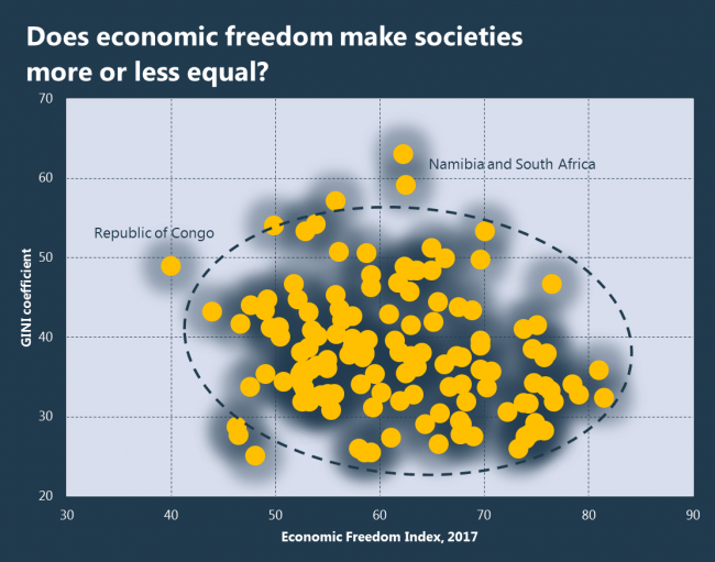
Does economic freedom make societies more or less equal?

The answer to whether economic opportunities cause society to diverge into “the rich” and “the poor” or to converge into a “strong middle class” remains unanswered, because only a slight negative trend is visible. If there is any effect of economic freedom on the distribution of income in a society, measurable by the GINI coefficient, then it is weak, and easily countered by various other effects.

What: GINI coefficient – the larger it is, the more equally is the income distributed, everyone having the same amount at 100, the smaller it is the more income is concentrated in hands of the few, only one person having all the wealth at 0. And Economic Freedom Index.
When: The date of GINI is different for each country, the modal year being 2015. Economic Freedom Index is of 2017.
Where: 138 countries of the world
Source: WB for GINI and The Heritage Foundation for Economic Freedom Index.

Posted in charts | Tagged Equality, Excel, Scatterplot

Is economic freedom needed for economic prosperity?

chart planet Posted on 2019-12-30 by Chart Planet2023-03-18
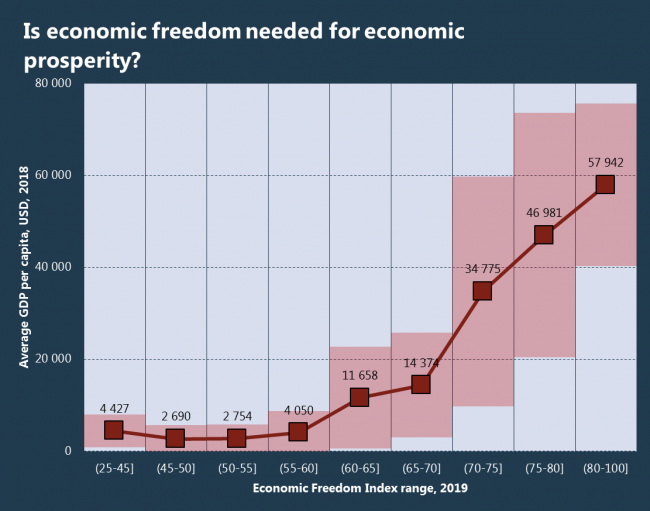
Is economic freedom needed for economic prosperity?

Pardon me for asking the obvious. But if less democratic countries manage to maintain high levels of HDI, maybe less economically free countries manage to reach high levels of GDP per capita? The answer is no, the relationship is clear and exponential – free economy is best. That might surprise, but even the United Arab Emirates are economically free, they rank the 9th in the world by economic freedom.

What: Average GDP per capita in USD in a given Economic Freedom Index range. The red area represents the standard deviation – with higher Index values, the GDP becomes more volatile.
When: I’d say the whole graph is 2018 because Economic Freedom Index represents previous years.
Where: 175 countries of the world.
Source: The Heritage Foundation and WB

Posted in charts | Tagged Boxplot, Excel, GDP

Is democracy essential for economic freedom?

chart planet Posted on 2019-12-23 by Chart Planet2023-03-18
Is democracy essential for economic freedom?

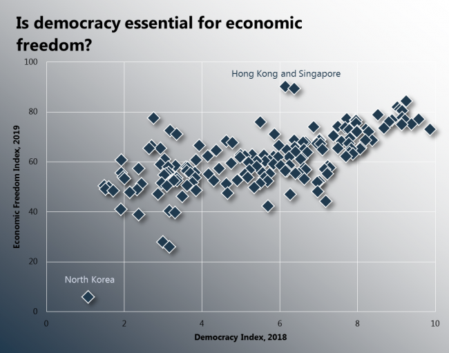
There are few real communist regimes left around the world, and even those are not really communist. So, maybe democracy and economic freedom do not correlate well? Apparently, they do. Democracy and economic freedom go together!

What: Democracy Index and Economic Freedom Index
When: 2018 for Democracy and 2019 for Economic Freedom Index, which covers years 2017-2018.
Where: 162 countries of the world
Source: EIU for Democracy Index and The Heritage Foundation for Economic Freedom Index

Posted in charts | Tagged Democracy, Excel, Scatterplot

Which belief is related the most with freedom?

chart planet Posted on 2019-12-18 by Chart Planet2023-03-18
Which belief is related the most with freedom?

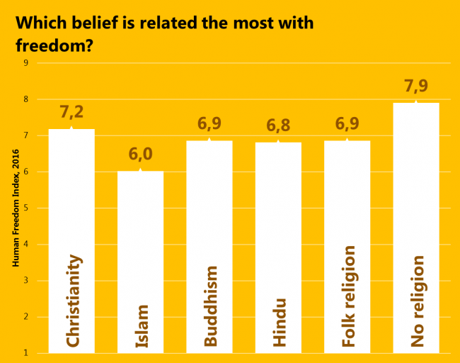
Since the freedom of religion has decreased since 2008, let’s see how beliefs themselves relate to freedom. Again, people living in the least religious countries are the freest, and those living in Islamic countries are the least free. There is a tiny nuance, that Christianity and “No religion” is the most common pair of significant beliefs in a country, so, they’re quite related. However, the second most common pair is Christianity and Islam.

What: Average Human Freedom Index by belief. It was calculated only for those countries where followers of a particular belief make more than 10% of the population and it was weighted by that percentage. Judaism and “Other beliefs” were excluded because they had only 1 country complying with such criteria.
When: 2016 for Freedom 2020 for religion (it’s an estimate) because the latest actual data were of 2010.
Where: 147 countries of the world.
Source: Pew Research Center and The Human Freedom Index 2018: A Global Measurement of Personal, Civil, and Economic Freedom

Posted in charts | Tagged Bar chart, Excel, Freedom

How have human freedoms changed?

chart planet Posted on 2019-12-16 by Chart Planet2023-03-18
How have human freedoms changed?

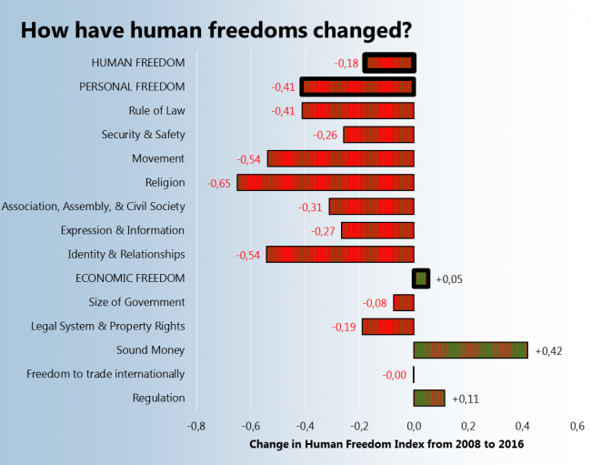
The Human Freedom Index consists of many subindexes covering various areas of people’s personal and economic life. After seeing that the average Human Freedom index of the world has decreased I decided to check what subindexes decreased the most and what increased. So, the winner is the “Sound Money” index which means, that money are safe from inflation and people can have foreign currency accounts. The loser is the “Religion” index, which mean that people have less freedom to establish and operate a religious organization.

What: Human Freedom Index – differences between subindex averages in 2016 and 2008.
When: 2008 and 2016
Where: 162 countries
Source: The Human Freedom Index 2018: A Global Measurement of Personal, Civil, and Economic Freedom

P.S. I must agree, those patterns on bars are terrible.

Posted in charts | Tagged Bar chart, Excel, Freedom

Is the world becoming freeer?

chart planet Posted on 2019-12-11 by Chart Planet2023-03-18
Is the world becoming freeer?

That’s rather disappointing. We talk a lot about same-sex marriage, which is allowed in more and more countries, but the overall situation is becoming worse.

Sadly the latest data is not very fresh, it’s 2016.

P.S. The word “freeer” is amazing, it has three consecutive letters “e”. Too bad it is not in the dictionary.

What: Human Freedom Index – the difference between regional averages in 2016 and 2008.
When: 2008 and 2016
Where: 162 countries grouped into regions
Source: The Human Freedom Index 2018: A Global Measurement of Personal, Civil, and Economic Freedom

Posted in charts | Tagged Bar chart, Excel, Freedom

Is freedom the source of happiness?

chart planet Posted on 2019-12-09 by Chart Planet2023-03-18
Is freedom the source of happiness?

After comparing the happiness score and Human Freedom Index it could be said that probably yes. The correlation is 63%, so we might say that people in freer countries consider themselves happier.

What: Happiness score from World Happiness Report and Human Freedom Index
When: 2016 for Freedom and 2017 for Happiness.
Where: 147 countries of the world
Source: WHR and The Human Freedom Index 2018: A Global Measurement of Personal, Civil, and Economic Freedom

Posted in charts | Tagged Excel, Happiness, Scatterplot

Is democracy essential for human freedom?

chart planet Posted on 2019-12-04 by Chart Planet2023-03-18
Is democracy essential for human freedom?

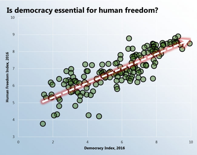
There is such Human Freedom Index, covering a wide range of areas including freedom of religion, freedom of movement, freedom to trade and many more. After plotting this index against the Democracy Index I saw a super clear relationship: democracy and freedom go together!

What: Human Freedom Index and Democracy Index
When: 2016
Where: 157 countries of the world
Source: EIU for Democracy Index and Ian Vásquez and Tanja Porčnik, The Human Freedom Index 2018: A Global Measurement of Personal, Civil, and Economic Freedom (Washington: Cato Institute, Fraser Institute, and the Friedrich Naumann Foundation for Freedom, 2018).

Posted in charts | Tagged Democracy, Excel, Scatterplot

Is the situation of democracy improving in the world?

chart planet Posted on 2019-12-02 by Chart Planet2023-03-18
Is the situation of democracy improving in the world?

The short answer is no – it is deteriorating. The world’s average Democracy Index decreased during the period from 2006 to 2018. In more parts of the world it is decreasing rather than increasing.

What: Democracy Index – the difference between regional averages in 2018 and 2006.
When: 2006 and 2018
Where: 167 countries grouped to regions
Source: EIU

Posted in charts | Tagged Bar chart, Democracy, Excel

Post navigation

<< 1 2 3 4 5 6 7 8 9 >>

subscribe to blog posts

Please check your email to confirm subscription

linkedin fb bluesky instagram tableau sessionize rss
MJDC privacy policy
↑
Cookies are used on chart planet.