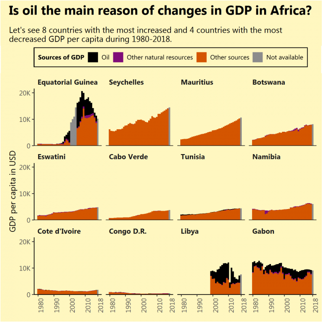
I saw that Equatorial Guinea, the African country that increased its GDP per capita the most during 1980-2018 had done this due to newly found oil. I saw that Gabon, the African country that decreased its GDP per capita the most during the same period, had done this due to diminishing its oil reserves. So I thought, the same applies to the most of rapidly growing (or contracting) African economies, but that is not true (except for Libya).
The sources of growth might not be very sustainable just like oil, but finding them requires a deeper analysis of every separate country.
What: GDP per capita divided into oil rents, rents from other natural resources and GDP from other sources. Grey bars indicate full GDP value with the unknown division. When: From 1980 till 2018. Not all countries had a full range of data. No country had its GDP divided for 2018. Where: Countries of the African continent with the biggest GDP per capita growth during 1980-2018 (top 8) and biggest fall (bottom 4, except South Sudan, which had very short data range) Source: WB
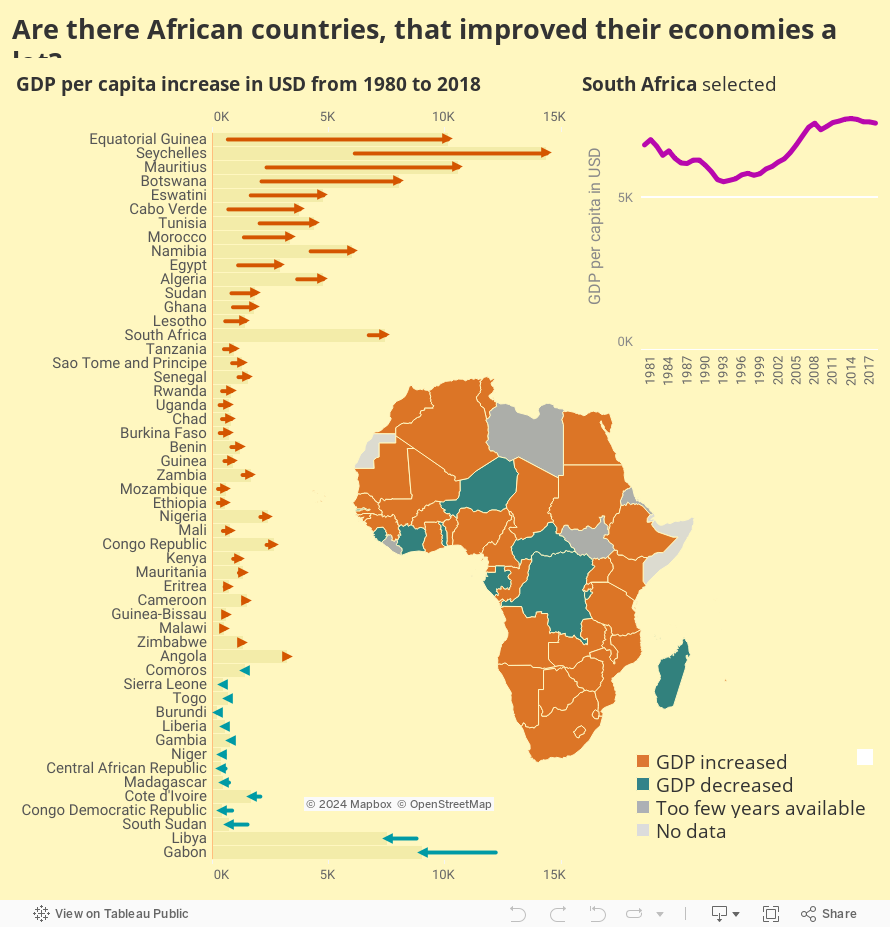
I will consider that improving economy simply means increasing GDP per capita.
And that happened in a handful of countries. What are the reasons for this increase? That is a question for the next image, but I expect to find oil. Also, what happened to Gabon?
What: GDP per capita. When: From 1980 till 2018. Not all countries had a full range of data. Where: Countries of the African continent Source: WB
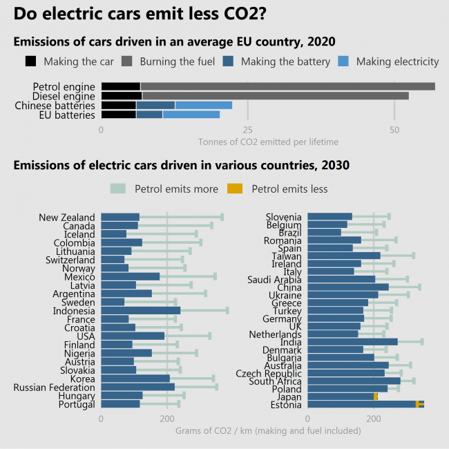
Many people still have doubts about whether the lower emissions of driving an electric car outweighs the additional impact on the environment caused by manufacturing the batteries.
Two studies (the latter is more trustworthy than the former) show that electric cars do help to reduce the CO2 emission. But how much – it depends. If the batteries are produced in a country where the industry is polluting more (China), reductions will be lower. If the car is driven in a country where electricity is produced by burning things (like Estonia or Poland) the reductions will be lower or even negative. A special case is Japan, where cars are so fuel-efficient, that electric cars even raise emissions.
So, YES, electric cars are more often better than not.
What: Top = Lifetime emissions of cars in tonnes of CO2. Bottom = Lifetime emissions of cars in grams of CO2 per 1 kilometer. When: Top = Estimate for 2020, Bottom = Estimate for 2030 with “current technological trajectory” scenario. Where: Top = EU countries, Bottom = selected countries of the world. Source: Top = European Federation for Transport and Environment, Bottom = Knobloch, F., Hanssen, S., Lam, A. et al. Net emission reductions from electric cars and heat pumps in 59 world regions over time. Nat Sustain (2020). https://doi.org/10.1038/s41893-020-0488-7
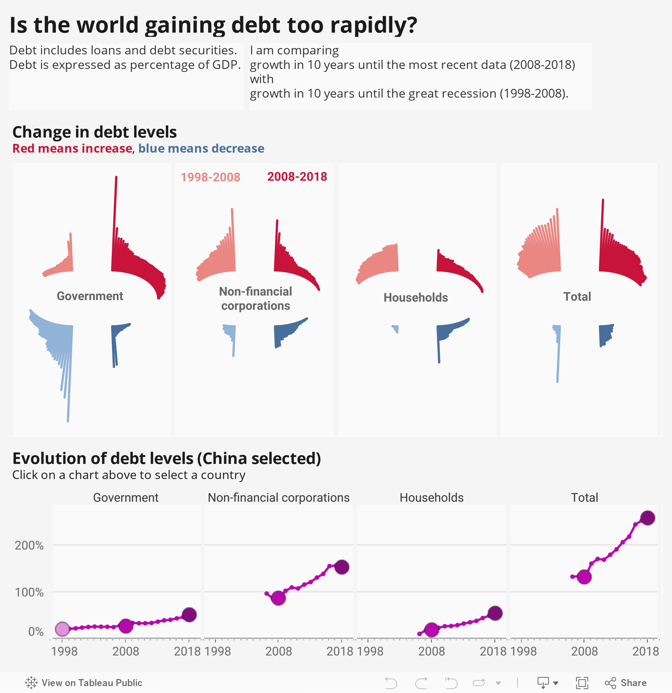
To see nominal numbers of debt increasing won’t tell us much, so it is better to look at debt expressed as percentage of GDP. Also we need to compare current growth to something, so I am comparing growth in 10 years until the most recent data (2008-2018) with growth in 10 years until the Great Recession (1998-2008).
One thing is seen at once – the governments in most countries are getting more debt than before.
Corporations and household are increasing their debt in more countries than decreasing, but the rate of increase is slower now and more countries are decreasing than before. We’re less crazy than in those crazy times.
What: Debt made of loans and debt securities expressed in % of GDP. When: 1998 – 2018 Where: 103 countries of the world. Iceland was removed from the chart and they know why. (Because of extreme numbers, debt levels reaching over 700%). Also, there might be some bias in the data, because not all countries have data for all periods and all debt receivers. Source: BIS
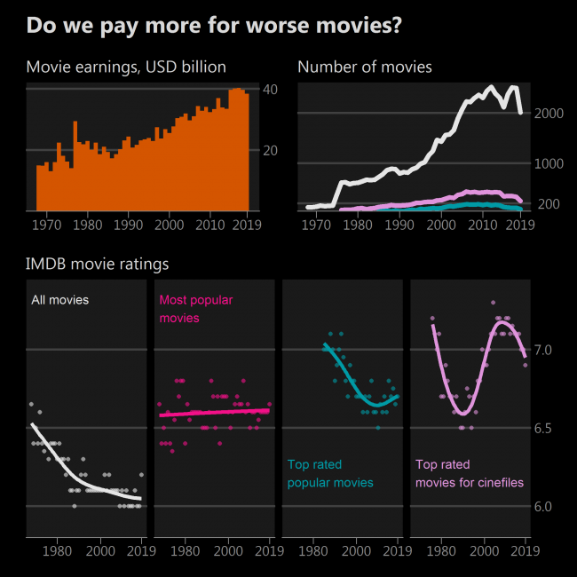
We spend more and more money on movies even in times of television and the internet. So, not a big surprise, that more and more movies are being made.
Median rating of all movies in the IMDB database is declining. Is it a sign of movies getting worse? No, its a sign of more movies being made, when this art is accessible to not only exceptional talents but mediocre talents as well. Anyway, who watches 2000 movies a year? Let’s become picky.
Let’s pick the most popular 200 movies each year and calculate their median. Now there is a stable trend – median popular movie usually has a rating of just around 6.4. (Movie popularity is measured in the number of ratings on IMDB). That’s good.
Now let’s take 200 top-rated movies each year with at least 25 000 ratings. A sharp decline becomes visible! And before the 80s not many such movies existed at all. So, if you like only top-rated popular movies, you might experience deterioration in their quality. Sequels of Transformers are getting worse and worse.
However there are great lesser-known movies, especially those made in non-English speaking countries, so they get less attention and therefore fewer ratings. I’d subjectively say that a good lesser-known movie has at least 4000 ratings. If we pick 200 best such movies, we get a different view – often a median movie will have a rating higher than 7, and no permanent downward trend is present. Great!
What: Movie earnings in USD billion adjusted for inflation. The number of movies – with more than 100, 4000 and 25 000 ratings. IMDB movie ratings indicate the median rating calculated for every year, and a trend line fitted using a generalized additive model. All movies – those which have at least 100 ratings Most popular movies – 200 most rated but having at least 100 ratings (because there were times when less than 200 movies were made). Top-rated popular movies – 200 top-rated movies from those having at least 25 000 ratings. Top-rated movies for cinephiles – 200 top-rated movies from those having at least 4000 ratings. If less than 40 movies left remaining after filtering – no rating calculated for that year. When: 1968 – 2019 Where: Movie earnings represent earnings around the globe. Source: IMDB for ratings and number of movies the-numbers.com for movie earnings. WB and IMF for inflation used to adjust earnings.
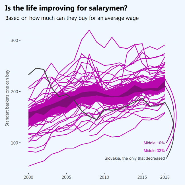
Based on how many average baskets of goods one can buy for an average salary while living alone and without children – yes, absolutely. There were wiggles after the crisis, but the overall trend is upwards – people can buy more and more stuff because salaries are increasing faster than prices. The only sad exception in the period analyzed is Slovakia.
What: Annual net earnings divided by price level index which result in the number of standard baskets of goods one can buy. The average wage is “annual net earnings of a full-time single worker without children earning an average wage” measured in Purchase Power Standards. Price level index is made to be 100 in 2020 for the EU as a whole for a standardized basket of goods. It is tailored for cross-country comparison. Data for OECD countries was estimated using “Price level ratio of PPP conversion factor (GDP) to market exchange rate” (provided by WB, very accurate estimates), and “Average annual wage in 2018 constant prices at 2018 USD PPPs” (provided by OECD, not very accurate estimates) When: 2000 – 2018 Where: 39 countries from the EU and OECD. Source: EUROSTAT, OECD, WB
Based on how many average baskets of goods one can buy for an average salary while living alone and without children – Poland takes the lead followed by Germany. For some time the United States seemed the best country for that. However in a few decades, things can change drastically – the Slovak Republic once at the top, now is somewhere at the bottom, and Poland itself climbed a long way up – the time between 2009 and 2010 was a mess.
It is very difficult to find time-series data about the average salary, so only the EU and OECD countries are included in this chart. It would be interesting to see how cheap is Thailand for Thai people!
What: Average wage divided by price level index which results in the number of standard baskets of goods one can buy. The average wage is “annual net earnings of a full-time single worker without children earning an average wage” measured in Purchase Power Standards. The price level index is made to be 100 in 2020 for the EU as a whole for a standardized basket of goods. It is tailored for cross-country comparison. Data for OECD countries was estimated using “Price level ratio of PPP conversion factor (GDP) to market exchange rate” (provided by WB, very accurate estimates), and “Average annual wage in 2018 constant prices at 2018 USD PPPs” (provided by OECD, not very accurate estimates) When: 2000 – 2018 Where: 39 countries of the world Source: EUROSTAT, OECD, WB
The good news is that we are really reducing poverty. Fewer and fewer people live for 1,90 dollars a day, fewer and fewer experience hunger, fewer and fewer experience struggle to get water.
The sad news is the realization that behind nice world trends there are still countries where one-third of the total population are poor, experience hunger and struggle to get water. And even worse – while over 40% of people in low-income countries don’t have access to BASIC drinking water service, 73% don’t have access to SAFE drinking water service.
But we’re reducing. There is still much to achieve and let’s hope for the best.
What: Very poor people = Poverty headcount ratio at $1.90 a day (2011 PPP) (% of population), Hungry people = Prevalence of undernourishment (% of population), People not having water = People not using at least basic drinking water services (% of population) When: Improvements by income class are shown between 2000 and 2017 with possible deviations a year or two for different category combinations. Where: Total world + the world divided into 4 income groups by the World Bank. Source: WB
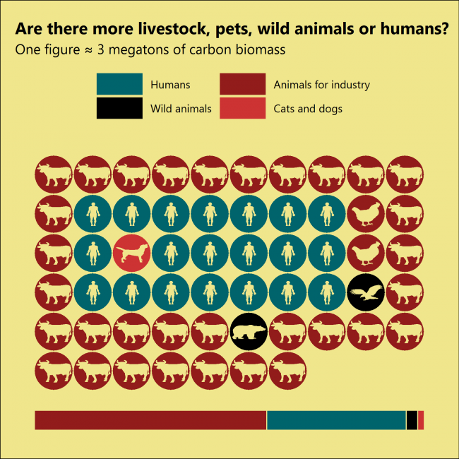
Livestock. All this data is very unreliable, especially for animals living in the wild, but some rough estimates were made, and we know that there are probably 30 times more mammals kept as livestock than wild land mammals, and 2 times more birds kept as livestock than wild birds. Also, there are as many cats and dogs as animals in the wild.
These “quantities” are actually a total mass of carbon, which according to the Source make roughly 15% of total body mass. So, there might be lots of chicken, but they don’t weight as much as cows. The same with little wild animals – there might be more rats than cows.
Also, some types of animals were not taken into account, for example, reptiles, arthropods, sea mammals. I decided to concentrate on mammals and birds living above the ground. I’d include reptiles, but there are no reliable estimations about them.
What: Mass of carbon inside mammals and birds. When: Data were taken from a study published in 2018, which used data from FAO. So, I guess it’s not very old. Where: Land and above. Source: Bar-On, Yinon M et al. “The biomass distribution on Earth.” Proceedings of the National Academy of Sciences of the United States of America vol. 115,25 (2018). Also, https://www.worldatlas.com used to estimate the mass of cats and dogs which were not included in the paper above.
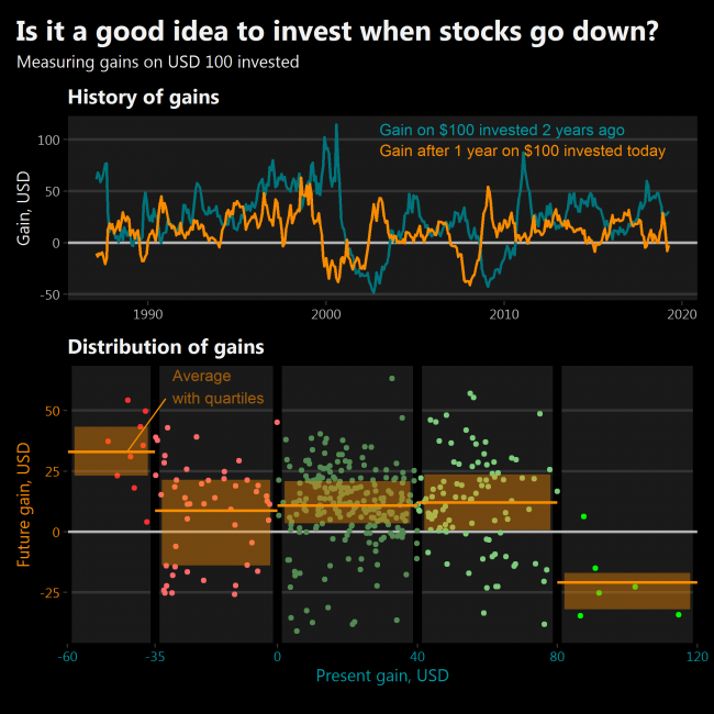
Yes, but only if the market has crashed very seriously. The same is with selling – historically it is good to sell only when markets have skyrocketed unprecedently.
Suppose I have invested USD 100 in stock two years ago. It has gained some positive or negative amount of dollars since then. What gains could I expect after one year if I invest USD 100 today? After analyzing historical data I see that future gains are almost certainly positive only when markets have had dropped more than 35% in two years from their original value. Also, future gains are almost certainly negative when markets have had grown more than 80% from their original value.
What: “Gain” is the amount in dollars one’s investment would change from the initial USD 100 invested. Investment is divided equally between Dow Jones Industrial Average and Nasdaq Composite indices. When: Monthly data between February 1985 and April 2020 Source: investing.com
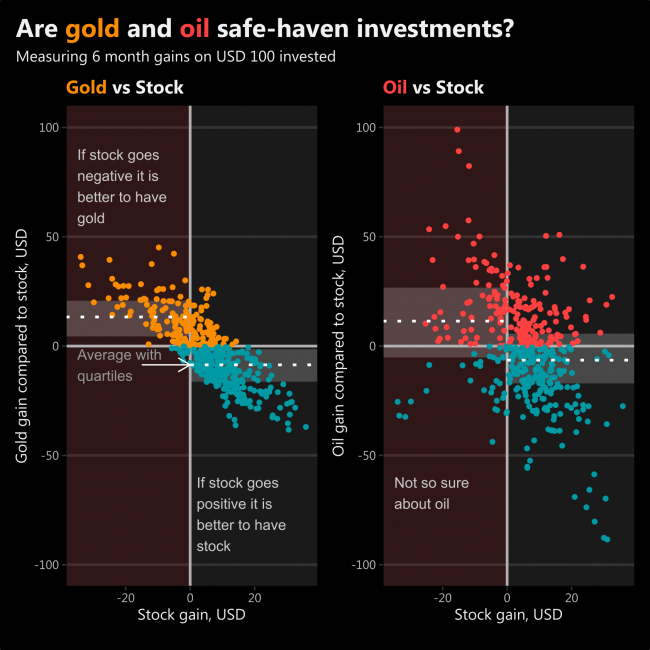
One dot represents one moment in time between February 1985 and April 2020. So, if you sense, that after 6 months the price of stocks will be lower than today, it might be a good idea to start buying gold. Based on historical data, it will probably end up gaining you positive returns. Whereas oil gains are not that consistent.
This tiny analysis of scatterplots shows that gold is a safe-haven investment and oil is not so.
What: “Gain” is the amount one’s investment would change if USD 100 were invested six months ago. Stock is made from Dow Jones Industrial Average and Nasdaq Composite indices. Oil is represented by Crude Oil. When: Monthly data between February 1985 and April 2020 Source: investing.com
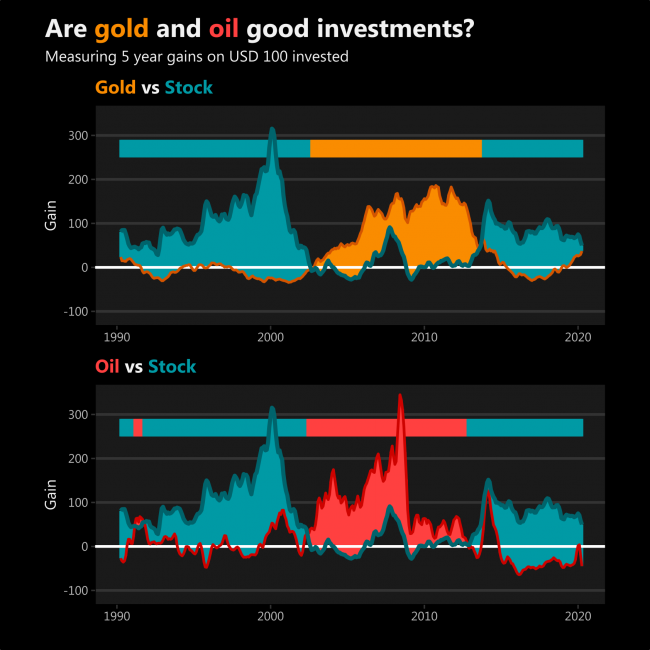
I never really understood investing in commodities. It seems that gold and oil gain more for long term investors when stock prices begin to go down and other investors seek alternative investments, thus raising the price of oil and gold.
After such interpretation, it seems that a recent increase in gold gain is probably caused by investors running from stock markets which are about to collapse, not anything related to gold itself. This might not be true.
However, oil gains have some significant fluctuations on their own.
What: “Gain” is the amount one’s investment would change if USD 100 were invested five years ago. Stock is made from Dow Jones Industrial Average and Nasdaq Composite indices. Oil is represented by Crude Oil. When: The chart begins in February 1990, but the data begins in February 1985. The most recent data is in April 2020. Source: investing.com
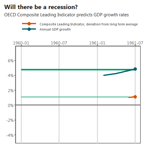
Sure. OECD Composite Leading Indicator (CLI) indicates it. It is surprising how sudden a drop in March 2020 is. Obviously, the only reason for it is the virus.
Will the recession become a crisis of a wider scope? Sadly, CLI does not reach that far into the future.
What: Composite Leading Indicator of OECD countries, amplitude adjusted, percentage deviations from long term average. GDP growth rate of OECD countries comparing month to the same month of the previous year. Both indicators are seasonally adjusted. When: February 1961 – March 2020. Where: OECD total, ~40 countries. Source: OECD
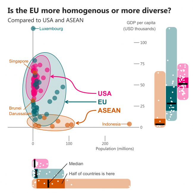
I believe you’ve heard about “Europe of two speeds”. But to understand whether those two speeds are really different we need to compare it to something. I picked two options – one is ASEAN, an organisation in Southeast Asia that promotes integration in economic, political and other fields. Another one is the USA and its states.
I’m comparing two core measures – GDP per capita and population. Boxplots at the bottom and the right side of the chart show us that the USA is a highly homogenous entity compared to the other two. If we look at population only, there seems to be a lot of variety in ASEAN, however, there are only 10 countries with one clear outlier – Indonesia. This country is not encircled in the scatterplot, and the encircling ellipses of the EU and ASEAN have quite similar widths. EU just has way more small countries.
Checking the GDP per capita gives a clear view of the diversity of the EU. If the two richest ASEAN countries are excluded, it becomes very homogenous – all the other countries are on the poor side.
Conclusion: EU is diverse even compared to Asian standards.
What: Population and GDP per capita in current USD (for ASEAN and EU) and GDP per capita in chained 2012 USD (for the USA). I believe this inconsistency is of minor influence since the diversity inside the group is what matters – comparisons of states and countries should not be made. When: 2018, except Population of the USA which is an estimate for 2019 Where: Countries of EU and ASEAN as well as states of the USA. Source: WB + BEA and USCB for USA states